2. Exploratory Analysis of Bayesian Models#
As we saw in Chapter 1, Bayesian inference is about conditioning models to the available data and obtaining posterior distributions. We can do this using pen and paper, computers, or other devices [1]. Additionally we can include, as part of the inference process, the computation of other quantities like the prior and posterior predictive distributions. However, Bayesian modeling is wider than inference. While it would be nice if Bayesian modeling was as simple as specifying model and calculating a posterior, it is typically not. The reality is that other equally important tasks are needed for successful Bayesian data analysis. In this chapter we will discuss some of these tasks, including checking model assumptions, diagnosing inference results, and model comparison.
2.1. There is Life After Inference, and Before Too!#
A successful Bayesian modeling approach requires performing additional tasks beyond inference [2]. Such as:
Diagnosing the quality of the inference results obtained using numerical methods.
Model criticism, including evaluations of both model assumptions and model predictions.
Comparison of models, including model selection or model averaging.
Preparation of the results for a particular audience.
These tasks require both numerical and visual summaries to help practitioners analyze their models. We collectively call these tasks Exploratory Analysis of Bayesian Models. The name is taken from the statistical approach known as Exploratory Data Analysis (EDA) [14]. This approach to data analysis aims at summarizing the main characteristics of a data set, often with visual methods. In the words of Persi Diaconis [15]:
Exploratory data analysis (EDA) seeks to reveal structure, or simple descriptions, in data. We look at numbers or graphs and try to find patterns. We pursue leads suggested by background information, imagination, patterns perceived, and experience with other data analyses.
EDA is generally performed before, or even instead of, an inferential step. We, as many others before us [16, 17], think that many of the ideas from EDA can be used, reinterpreted and expanded into a robust Bayesian modeling approach. In this book we will mainly use the Python library ArviZ [3] [3] to help us perform exploratory analysis of Bayesian models.
In a real life setting, Bayesian inference and exploratory analysis of Bayesian models get tangled into an iterative workflow, that includes silly coding mistakes, computational problems, doubts about the adequacy of models, doubts about our current understanding of the data, non-linear model building, model checking, etc. Trying to emulate this intricate workflow in a book is challenging. Thus throughout these pages we may omit some or even all the exploratory analysis steps or maybe leave them as exercises. This is not because they are not necessary or not important. On the contrary during writing this book we have performed many iterations “behind the scenes”. However, we omit them in certain areas so focus on other relevant aspects such as model details, computational features, or fundamental mathematics.
2.2. Understanding Your Assumptions#
As we discussed in Section A Few Options to Quantify Your Prior Information, “what is the best-ever prior?” is a tempting question to ask. However, it is difficult to give a straight satisfying answer other than: “it depends”. We can certainly find default priors for a given model or family of models that will yield good results for a wide range of datasets. But we can also find ways to outperform them for particular problems if we can generate more informative priors for those specific problems. Good default priors can serve as good priors for quick/default analysis and also as good placeholder for better priors if we can invest the time and effort to move into an iterative, exploratory Bayesian modelling workflow.
One problem when choosing priors is that it may be difficult to understand their effect as they propagate down the model into the data. The choices we made in the parameter space may induce something unexpected in the observable data space. A very helpful tool to better understand our assumptions is the prior predictive distribution, which we presented in Section Bayesian Inference and Equation (1.7). In practice we can compute a prior predictive distribution by sampling from the model, but without conditioning on the observed data. By sampling from the prior predictive distribution, the computer does the work of translating choices we made in the parameter space into the observed data space. Using these samples to evaluate priors is known as prior predictive checks.
Let us assume we want to build a model of football (or soccer for the people in USA). Specifically we are interested in the probability of scoring goals from the penalty point. After thinking for a while we decide to use a geometric model [4]. Following the sketch in Fig. 2.1 and a little bit of trigonometry we come up with the following formula for the probability of scoring a goal:
The intuition behind Equation (2.1) is that we are assuming the probability of scoring a goal is given by the absolute value of the angle \(\alpha\) being less than a threshold \(\tan^{-1}\left(\frac{L}{x}\right)\). Furthermore we are assuming that the player is trying to kick the ball straight, i.e at a zero angle, but then there are other factors that result in a trajectory with a deviation \(\sigma\).
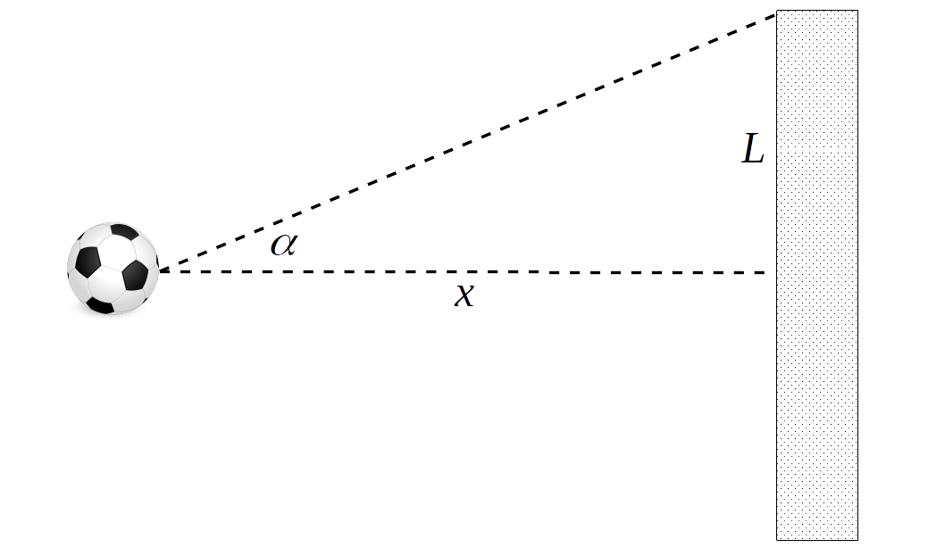
Fig. 2.1 Sketch of a penalty shot. The dashed lines represent the angle \(\alpha\) within which the ball must be kicked to score a goal. \(x\) represents the reglementary distance for a penalty shot (11 meters) and \(L\) half the length of a reglementary goal mouth (3.66 meters).#
The only unknown quantity in Equation (2.1) is \(\sigma\). We can get the values of \(L\) and \(x\) from the rules of football. As good Bayesians, when we do not know a quantity, we assign a prior to it and then try to build a Bayesian model, for example, we could write:
At this point we are not entirely certain how well our model encodes our domain knowledge about football, so we decide to first sample from the prior predictive to gain some intuition. Fig. 2.2 shows the results for three priors (encoded as three values of \(\sigma_{\sigma}\), 5, 20, and 60 degrees). The gray circular area represents the set of angles that should lead to scoring a goal assuming that the player kicks the ball completely straight and no other factors come in play like wind, friction, etc. We can see that our model assumes that it is possible to score goals even if the player kicks the ball with a greater angle than the gray area. Interestingly enough for large values of \(\sigma_{\sigma}\) the model thinks that kicking in the opposite direction is not that bad idea.
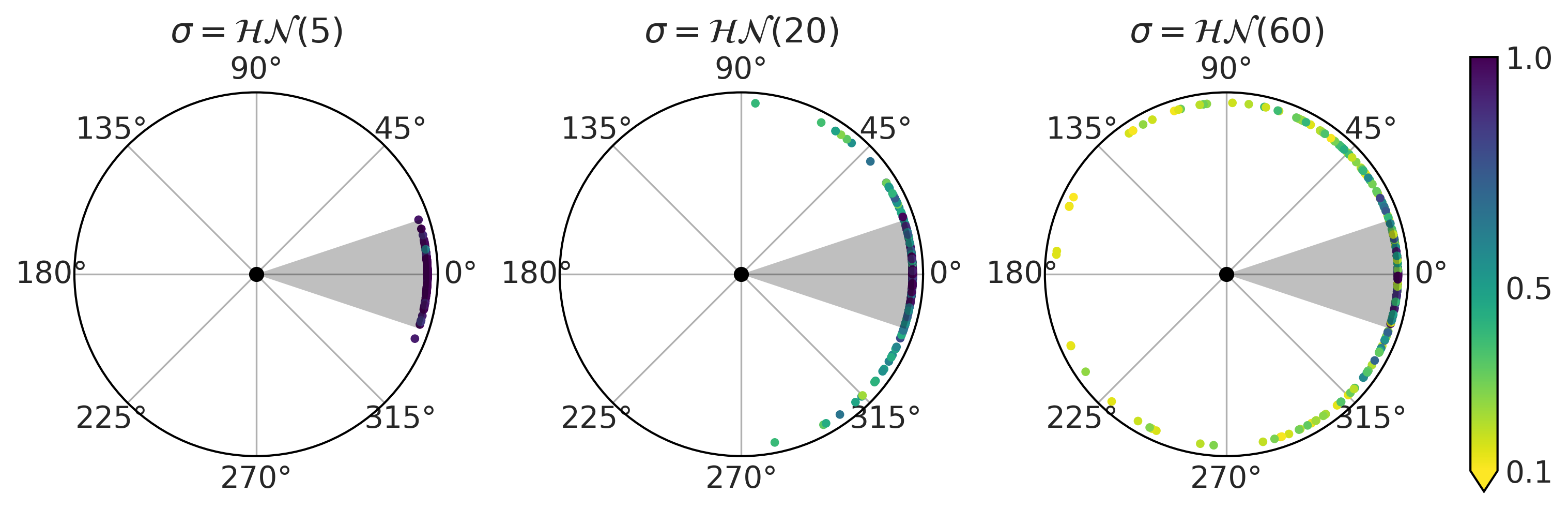
Fig. 2.2 Prior predictive checks for the model in Equation (2.2). Each subplot corresponds to a different value of the prior for \(\sigma\). The black dot at the center of each circular plot represents the penalty point. The dots at the edges represent shots, the position is the value of the angle \(\alpha\) (see Fig. 2.1), and the color represents the probability of scoring a goal.#
At this point we have a few alternatives: we can rethink our model to incorporate further geometric insights. Alternatively we can use a prior that reduces the chance of nonsensical results even if we do not exclude them completely, or we can just fit the data and see if the data is informative enough to estimate a posterior that excludes nonsensical values. Fig. 2.3 shows another example of what we may consider unexpected [5]. The example shows how for a logistic regression [6] with binary predictors and priors \(\mathcal{N}(0, 1)\) on the regression coefficients. As we increase the number of predictors, the mean of the prior predictive distributions shifts from being more concentrated around 0.5 (first panel) to Uniform (middle) to favor extreme, 0 or 1, values (last panel). This example shows us that as the number of predictors increase, the induced prior predictive distribution puts more mass on extreme values. Thus we need a stronger regularizing prior (e.g., Laplace distribution) in order to keep the model away from those extreme values.
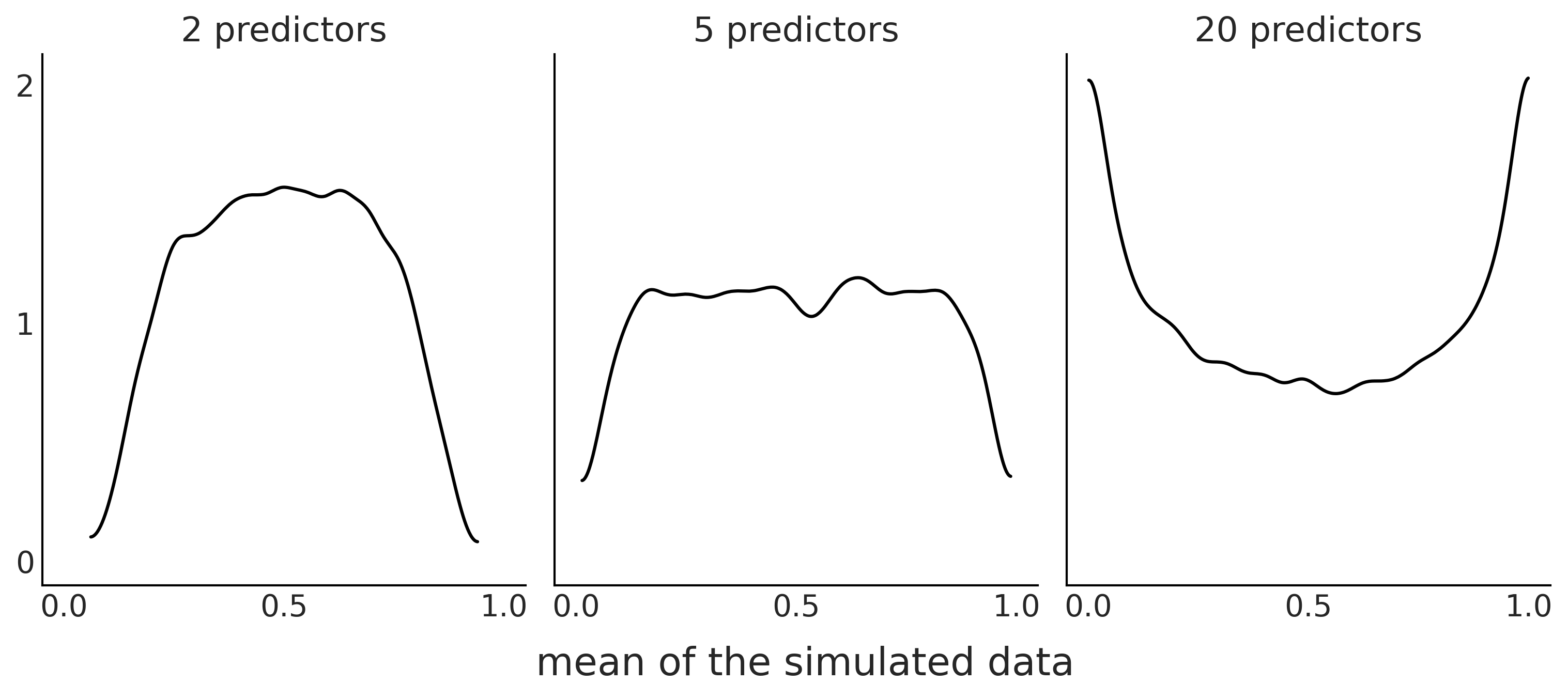
Fig. 2.3 Prior predictive distribution for a logistic regression models with 2, 5, or 15 binary predictors and with 100 data points. The KDE represents the distributions of the mean of the simulated data over 10000 simulations. Even when the prior for each coefficient, \(\mathcal{N}(0, 1)\), is the same for all 3 panels, increasing the numbers of the predictor is effectively equivalent to using a prior favoring extreme values.#
Both previous examples show that priors can not be understood in isolation, we need to put them in the context of a particular model. As thinking in terms of observed values is generally easier than thinking in terms of the model’s parameters, prior predictive distributions can help make model evaluation easier. This becomes even more useful for complex models where parameters get transformed through many mathematical operations, or multiple priors interact with each other. Additionally, prior predictive distributions can be used to present results or discuss models in a more intuitive way to a wide audience. A domain expert may not be familiar with statistical notation or code and thus using those devices may not lead to a productive discussion, but if you show them the implications of one or more models, you provide them more material to discuss. This can provide valuable insight both for your domain partner and yourself. And again computing the prior predictive has other advantages, such as helping us debug models, ensuring they are properly written and able to run in our computational environment.
2.3. Understanding Your Predictions#
As we can use synthetic data, that is generated data, from the prior predictive distribution to help us inspect our model, we can perform a similar analysis with the posterior predictive distribution, introduced in Section Bayesian Inference and Equation (1.8). This procedure is generally referred as posterior predictive checks. The basic idea is to evaluate how close the synthetic observations are to the actual observations. Ideally the way we assess closeness should be problem-dependent, but we can also use some general rules. We may even want to use more than one metric in order to assess different ways our models (mis)match the data.
Fig. 2.4 shows a very simple example for a binomial model and data. On the left panel we are comparing the number of observed successes in our data (blue line) with the number of predicted successes over 1000 samples from the posterior predictive distribution. On the right panel is an alternative way of representing the results, this time showing the proportion of success and failures in our data (blue line) against 1000 samples from the posterior distribution. As we can see the model is doing a very good job at capturing the mean value in this case, even when the model recognizes there is a lot of uncertainty. We should not be surprised that the model is doing a good job at capturing the mean. The reason is that we are directly modeling the mean of the binomial distribution. In the next chapters we will see examples when posterior predictive checks provide less obvious and thus more valuable information about our model’s fit to the data.
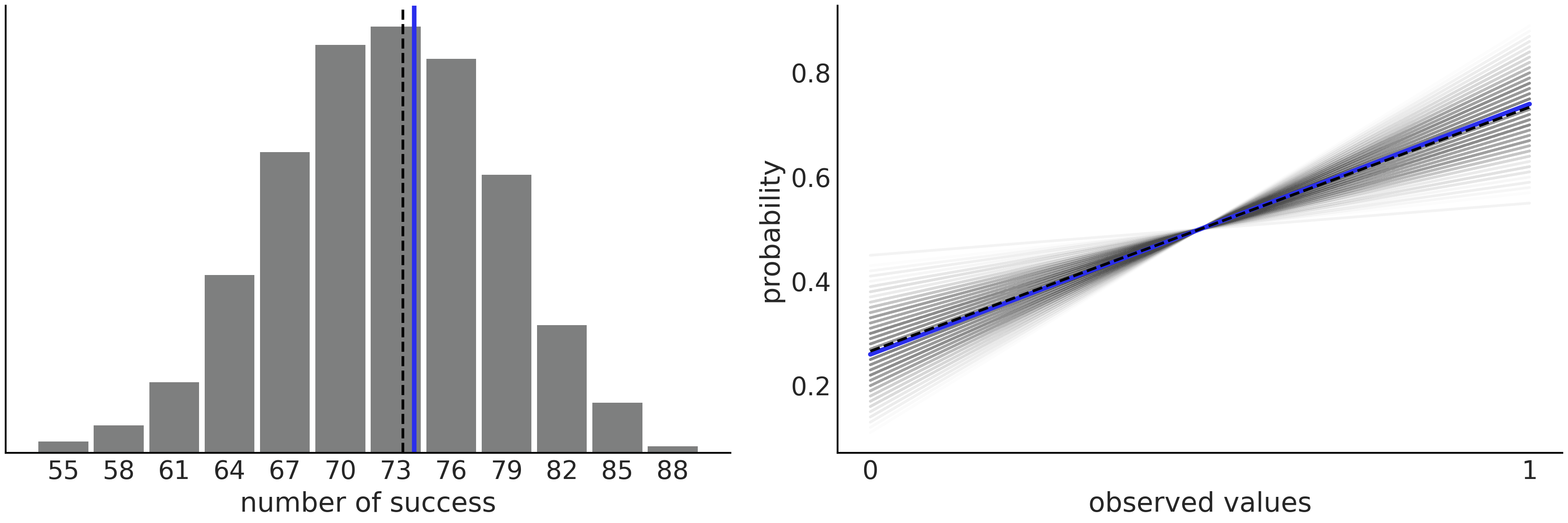
Fig. 2.4 Posterior predictive check for a Beta-Binomial model. On the left panel we have the number of predicted success (gray histogram), the dashed black line represents the mean predicted success. The blue line is the mean computed from the data. On the right panel we have the same information but represented in an alternative way. Instead of the number of success we are plotting the probability of getting 0’s or 1’s. We are using a line to represent that the probability of \(p(y=0) = 1-p(y=1)\). the dashed black line is the mean predicted probability, and the blue line is the mean computed from the data.#
Posterior predictive checks are not restricted to plots. We can also perform numerical tests [18]. One way of doing this is by computing:
where \(p_{B}\) is a Bayesian p-value and is defined as the probability the simulated test statistic \(T_{sim}\) is less or equal than the observed statistic \(T_{obs}\). The statistic \(T\) is basically any metric we may want to use to assess our models fit to the data. Following the binomial example we can choose \(T_{obs}\) as the observed success rate and then compare it against the posterior predictive distribution \(T_{sim}\). The ideal value of \(p_{B}=0.5\) means that we compute a \(T_{sim}\) statistic that half the time is below and half the time above the observed statistics \(T_{obs}\), which is the expected outcome for a good fit.
Because we love plots, we can also create plots with Bayesian p-values.
The first panel of Fig. 2.5
shows the distribution of Bayesian p-values in black solid line, the
dashed line represents the expected distribution for a dataset of the
same size. We can obtain such a plot with ArviZ
az.plot_bpv(., kind="p_value"). The second panel is conceptually
similar, the twist is that we evaluate how many of the simulations are
below (or above) the observed data “per observation”. For a
well-calibrated model, all observations should be equally well
predicted, that is the expected number of predictions above or below
should be the same. Thus we should get a Uniform distribution. As for
any finite dataset, even a perfectly calibrated model will show
deviations from a Uniform distribution, we plot a band where we expected
to see 94% of the Uniform-like curves.
Bayesian p-values
We call \(p_{B}\) Bayesian p-values as the quantity in Equation (2.3) is essentially the definition of a p-value, and we say they are Bayesian because, instead of using the distribution of the statistic \(T\) under the null hypothesis as the sampling distribution we are using the posterior predictive distribution. Notice that we are not conditioning on any null hypothesis. Neither are we using any predefined threshold to declare statistical significance or to perform hypothesis testing.
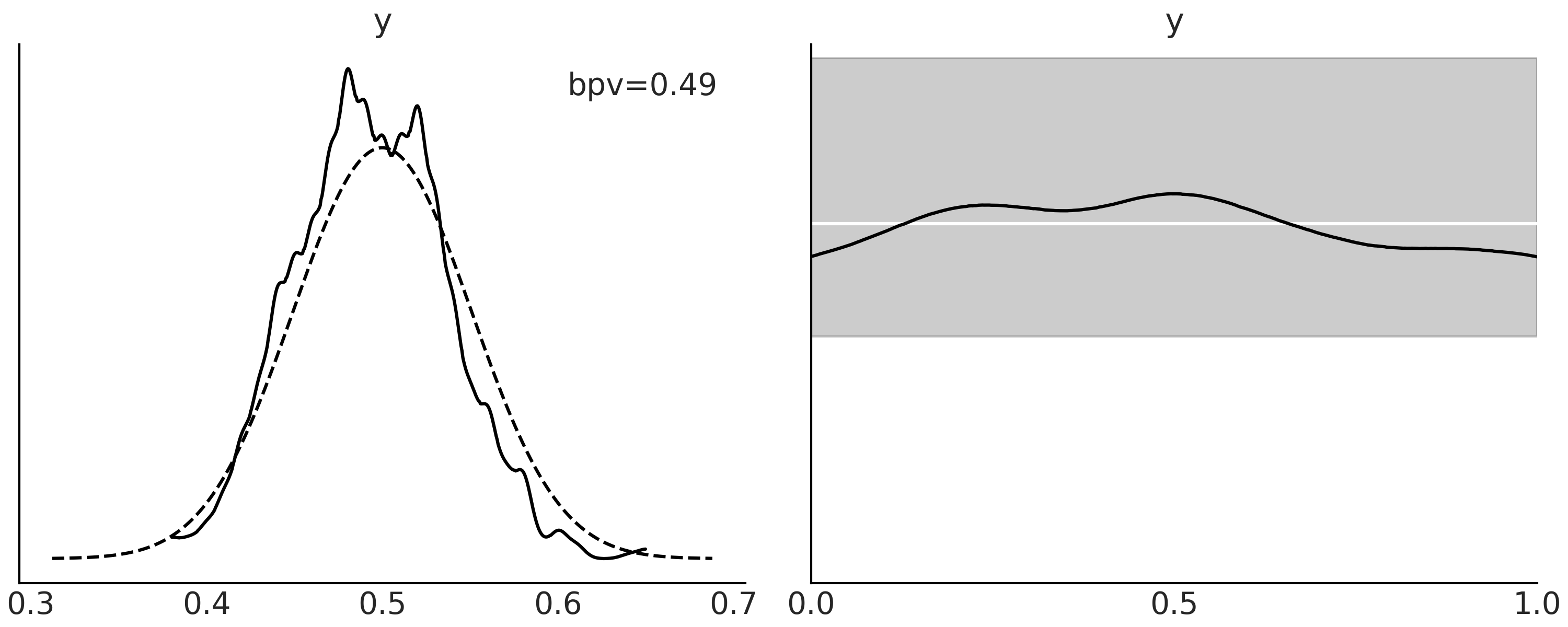
Fig. 2.5 Posterior predictive distribution for a Beta-Binomial model. In the first panel, the curve with the solid line is the KDE of the proportion of predicted values that are less or equal than the observed data. The dashed lines represent the expected distribution for a dataset of the same size as the observed data. On the second panel, the black line is a KDE for the proportion of predicted values that are less or equal than the observed computed per observation instead of over each simulation as in the first panel. The white line represents the ideal case, a standard Uniform distribution, and the gray band deviations of that Uniform distribution that we expect to see for a dataset of the same size.#
As we said before we can choose from many \(T\) statistics to summarize observations and predictions. Fig. 2.6 shows two examples, in the first panel \(T\) is the mean and in the second one \(T\) is the standard deviation. The curves are KDEs representing the distribution of the \(T\) statistics from the posterior predictive distribution and the dot is the value for the observed data.
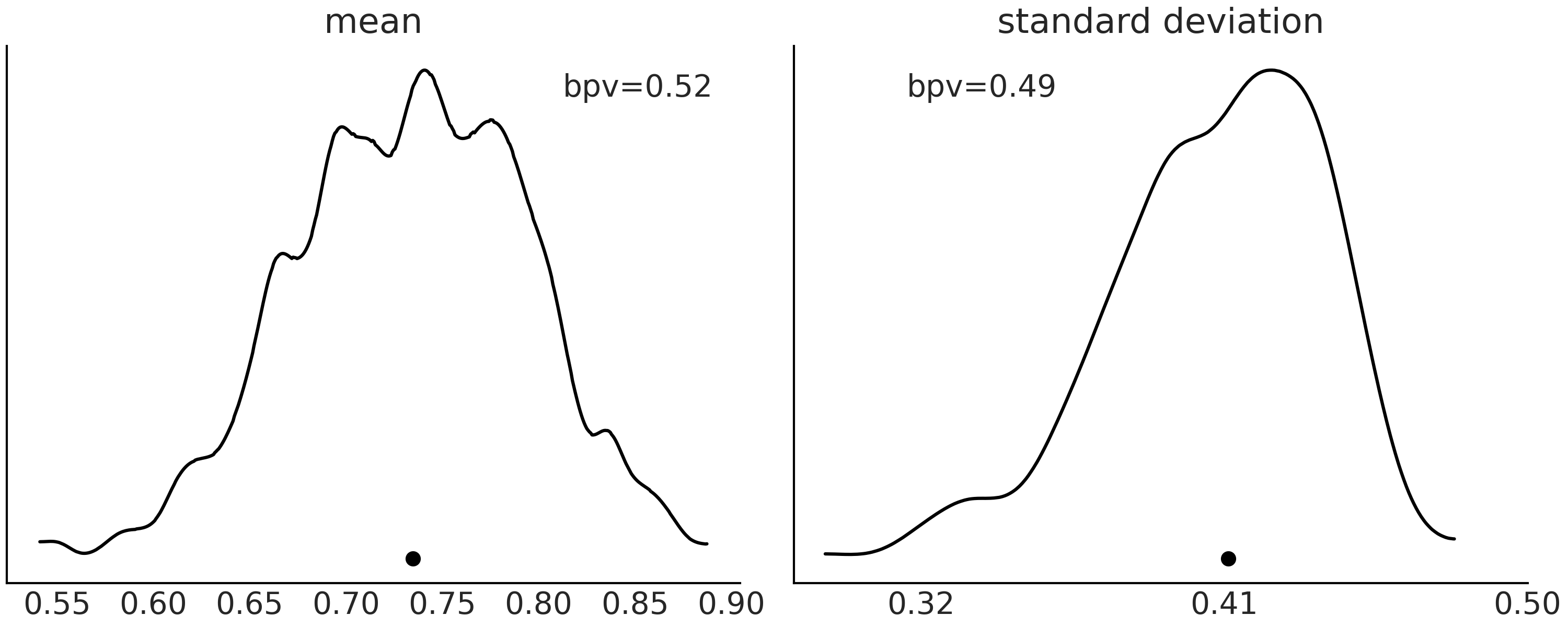
Fig. 2.6 Posterior predictive distribution for a Beta-Binomial model. In the first panel, the curve with the solid line is the KDE of the proportion of simulations of predicted values with mean values less or equal than the observed data. On the second panel, the same but for the standard deviation. The black dot represented the mean (first panel) or standard deviation (second panel) computed from the observed data.#
Before continue reading you should take a moment to carefully inspect Fig. 2.7 and try to understand why the plots look like they do. In this figure we have a series of simple examples to help us gain intuition about how to interpret posterior predictive checks plots[7]. In all these examples the observed data (in blue) follows a Gaussian distribution.
On the first row, the model predicts observations that are systematically shifted to higher values with respect to the observed data.
On the second row, the model is making predictions that are more spread than the observed data.
On the third row we have the opposite scenario, the model is not generating enough predictions at the tails.
On the last row shows a model making predictions following a mixture of Gaussians.
We are now going to pay special attention to the third column from Fig. 2.7. Plots in this column are very useful but at the same time they can be confusing at first. From top to bottom, you can read them as:
The model is missing observations on the left tail (and making more on the right).
The model is making less predictions at the middle (and more at the tails).
The model is making less predictions for both tails.
The model is making more or less well-calibrated predictions, but I am a skeptical person so I should run another posterior predictive check to confirm.
If this way of reading the plots still sounds confusing to you, we could try from a different perspective that is totally equivalent, but it may be more intuitive, as long as you remember that you can change the model, not the observations [8]. From top to bottom, you can read them as:
There are more observations on the left
There are more observations on the middle
There are more observations at the tails.
Observations seem well distributed (at least within the expected boundaries), but you should not trust me. I am just a platonic model in a platonic world.
We hope Fig. 2.7 and the accompanying discussion provide you with enough intuition to better perform model checking in real scenarios.
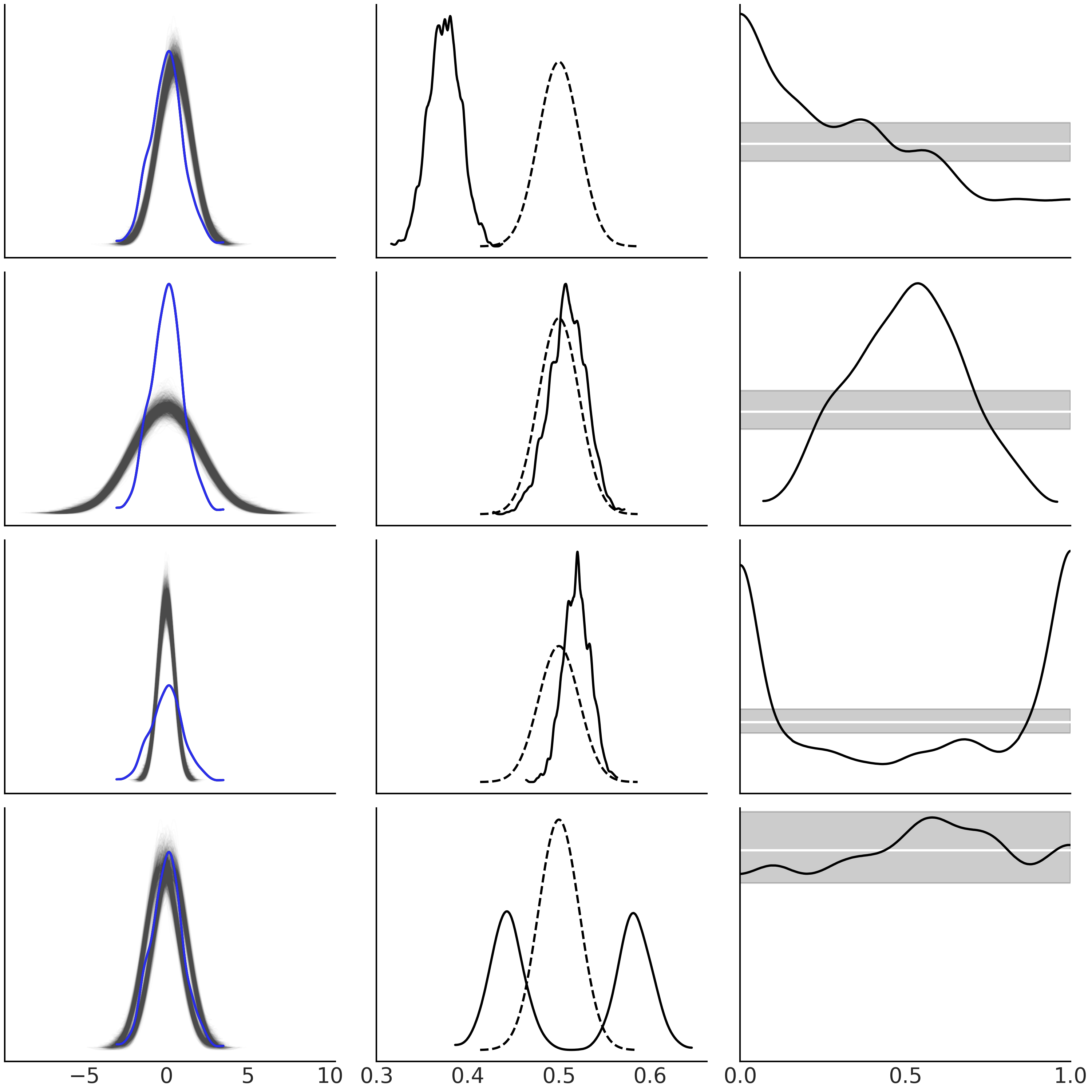
Fig. 2.7 Posterior predictive checks for a set of simple hypothetical models. On
the first column, the blue solid line represents the observed data and
the light-gray ones predictions from an hypothetical model. On the
second column, the solid line is the KDE of the proportion of predicted
values that are less or equal than the observed data. The dashed lines
represent the expected distribution for a dataset of the same size as
the observed data. On the third panel, the KDE is for the proportion of
predicted values that are less or equal than the observed computed per
each observation. The white lines represent the expected Uniform
distribution and the gray band the expected deviations from uniformity
for a dataset of the same size as the one used. This figure was made
using the ArviZ’s functions az.plot_ppc(.),
az.plot_bpv(., kind="p_values") and az.plot_bpv(., kind="u_values").#
Posterior predictive checks, either using plots or numerical summaries, or even a combination of both, is a very flexible idea. This concept is general enough to let the practitioner use their imagination to come up with different ways to explore, evaluate, and better understand model through their predictions and how well a model (or models) work for a particular problem.
2.4. Diagnosing Numerical Inference#
Using numerical methods to approximate the posterior distribution allows us to solve Bayesian models that could be tedious to solve with pen and paper or that could be mathematically intractable. Unfortunately, they do not always work as expected. For that reason we must always evaluate if the results they offer are of any use. We can do that using a collection of numerical and visual diagnostic tools. In this section we will discuss the most common and useful diagnostics tools for Markov chain Monte Carlo methods.
To help us understand these diagnostic tools, we are going to create
three synthetic posteriors. The first one is a sample from a
\(\text{Beta}(2, 5)\). We generate it using SciPy, and we call it
good_chains. This is an example of a “good” sample because we are
generating independent and identically distributed (iid) draws and
ideally this is what we want in order to approximate the posterior. The
second one is called bad_chains0 and represents a poor sample from the
posterior. We generate it by sorting good_chains and then adding a
small Gaussian error. bad_chains0 is a poor sample for two reasons:
The values are not independent. On the contrary they are highly autocorrelated, meaning that given any number at any position in the sequence we can compute the values coming before and after with high precision.
The values are not identically distributed, as we are reshaping a previously flattened and sorted array into a 2D array, representing two chains.
The third synthetic posterior called bad_chains1 is generated from
good_chains, and we are turning it into a representation of a poor
sample from the posterior, by randomly introducing portions where
consecutive samples are highly correlated to each other. bad_chains1
represents a very common scenario, a sampler can resolve a region of the
parameter space very well, but one or more regions are difficult to
sample.
good_chains = stats.beta.rvs(2, 5,size=(2, 2000))
bad_chains0 = np.random.normal(np.sort(good_chains, axis=None), 0.05,
                               size=4000).reshape(2, -1)

bad_chains1 = good_chains.copy()
for i in np.random.randint(1900, size=4):
    bad_chains1[i%2:,i:i+100] = np.random.beta(i, 950, size=100)

chains = {"good_chains":good_chains,
          "bad_chains0":bad_chains0,
          "bad_chains1":bad_chains1}
Notice that the 3 synthetic posteriors are samples from a scalar (single parameter) posterior distribution. This is enough for our current discussion as all the diagnostics we will see are computed per parameter in the model.
2.4.1. Effective Sample Size#
When using MCMC sampling methods, it is reasonable to wonder if a particular sample is large enough to confidently compute the quantities of interest, like a mean or an HDI. This is something we can not directly answer just by looking at the number of samples, the reason is that samples from MCMC methods will have some degree of autocorrelation, thus the actual amount of information contained in that sample will be less than the one we would get from an iid sample of the same size. We say a series of values are autocorrelated when we can observe a similarity between them as a function of the time lag between them. For example, if today the sunset was at 6:03 am, you know tomorrow the sunset will be about the same time. In fact the closer you are to the equator the longer you will be able to predict the time for future sunsets given the value of today. That is, the autocorrelation is larger at the equator than closer to the poles [9].
We can think of the effective sample size (ESS) as an estimator that takes autocorrelation into account and provides the number of draws we would have if our sample was actually iid. This interpretation is appealing, but we have to be careful about not over-interpreting it as we will see next.
Using ArviZ we can compute the effective sample size for the mean with
az.ess()
az.ess(chains)
<xarray.Dataset>
Dimensions:      ()
Data variables:
    good_chains  float64 4.389e+03
    bad_chains0  float64 2.436
    bad_chains1  float64 111.1
We can see that even when the count of actual samples in our synthetic
posteriors is 4000, bad_chains0 has efficiency equivalent to an iid
sample of size \(\approx 2\). This is certainly a low number indicating a
problem with the sampler. Given the method used by ArviZ to compute the
ESS and how we created bad_chains0, this result is totally expected.
bad_chains0 is a bimodal distribution with each chain stuck in each
mode. For such cases the ESS will be approximately equal to the number
of modes the MCMC chains explored. For bad_chains1 we also get a low
number \(\approx 111\) and only ESS for good_chains is close to the
actual number of samples.
On the effectiveness of effective samples
If you rerun the generation of these synthetic posteriors, using a different random seed,
you will see that the effective sample size you get will be different each time. This
is expected as the samples will not be exactly the same, they are after
all samples. For good_chains, on average, the value of effective
sample size will be lower than the number of samples. But notice that
ESS could be in fact larger! When using the NUTS sampler (see Section
Inference Methods) values of ESS larger than
the total number of samples can happen for parameters which posterior
distributions are close to Gaussian and which are almost independent of
other parameters in the model.
Convergence of Markov chains is not uniform across the parameter space
[19], intuitively it is easier to get a good
approximation from the bulk of a distribution than from the tails,
simply because the tails are dominated by rare events. The default value
returned by az.ess() is bulk-ESS which mainly assesses how well the
center of the distribution was resolved. If you also want to report
posterior intervals or you are interested in rare events, you should
check the value of tail-ESS, which corresponds to the minimum ESS at
the percentiles 5 and 95. If you are interested in specific quantiles,
you can ask ArviZ for those specific values using
az.ess(., method='quantile').
As the ESS values vary across the parameter space, we may find it useful
to visualize this variation in a single plot. We have at least two ways
to do it. Plotting the ESS for specifics quantiles
az.plot_ess(., kind="quantiles") or for small intervals defined between
two quantiles az.plot_ess(., kind="local") as shown in
Fig. 2.8.
_, axes = plt.subplots(2, 3, sharey=True, sharex=True)
az.plot_ess(chains, kind="local", ax=axes[0]);
az.plot_ess(chains, kind="quantile", ax=axes[1]);
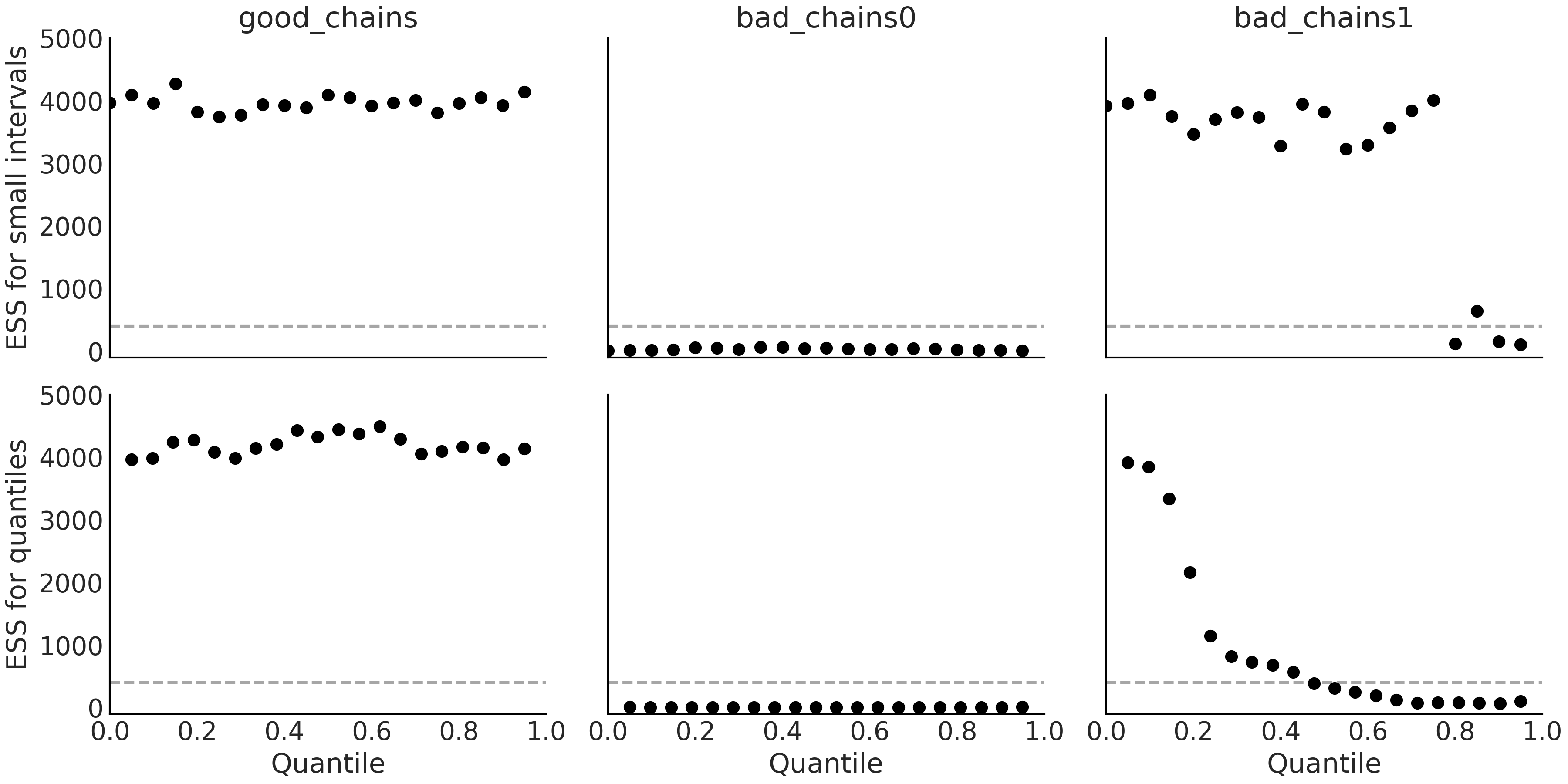
Fig. 2.8 Top: Local ESS of small interval probability estimates. Bottom: Quantile ESS estimates. The dashed lines represent the minimum suggested value of 400 at which we would consider the effective sample size to be sufficient. Ideally, we want the local and quantile ESS to be high across all regions of the parameter space.#
As a general rule of thumb we recommend a value of ESS greater than 400, otherwise, the estimation of the ESS itself and the estimation of other quantities, like \(\hat R\) that we will see next, will be basically unreliable [19]. Finally, we said that the ESS provides the number of draws we would have if our sample was actually iid. Nevertheless, we have to be careful with this interpretation as the actual value of ESS will not be the same for different regions of the parameter space. Taking that detail into account, the intuition still seems useful.
2.4.2. Potential Scale Reduction Factor \(\hat R\)#
Under very general conditions Markov chain Monte Carlo methods have theoretical guarantees that they will get the right answer irrespective of the starting point. Unfortunately, the fine print says that the guarantees are valid only for infinite samples. Thus in practice we need ways to estimate convergence for finite samples. One pervasive idea is to run more than one chain, starting from very different points and then check the resulting chains to see if they look similar to each other. This intuitive notion can be formalized into a numerical diagnostic known as \(\hat R\). There are many versions of this estimator, as it has been refined over the years [19]. Originally the \(\hat R\) diagnostic was interpreted as the overestimation of variance due to MCMC finite sampling. Meaning that if you continue sampling infinitely you should get a reduction of the variance of your estimation by a \(\hat R\) factor. And hence the name “potential scale reduction factor”, with the target value of 1 meaning that increasing the number of samples will not reduce the variance of the estimation further. Nevertheless, in practice it is better to just think of it as a diagnostic tool without trying to over-interpret it.
The \(\hat R\) for the parameter \(\theta\) is computed as the standard deviation of all the samples of \(\theta\), that is including all chains together, divided by the root mean square of the separated within-chain standard deviations. The actual computation is a little bit more involved but the overall idea remains true [19]. Ideally we should get a value of 1, as the variance between chains should be the same as the variance within-chain. From a practical point of view values of \(\hat R \lessapprox 1.01\) are considered safe.
Using ArviZ we can compute the \(\hat R\) diagnostics with the az.rhat()
function
az.rhat(chains)
<xarray.Dataset>
Dimensions:      ()
Data variables:
    good_chains  float64 1.000
    bad_chains0  float64 2.408
    bad_chains1  float64 1.033
From this result we can see that \(\hat R\) correctly identifies
good_chains as a good sample and bad_chains0 and bad_chains1 as
samples with different degree of problems. While bad_chains0 is a
total disaster, bad_chains1 seems to be closer to reaching the
ok-chain status, but still off.
2.4.3. Monte Carlo Standard Error#
When using MCMC methods we introduce an additional layer of uncertainty as we are approximating the posterior with a finite number of samples. We can estimate the amount of error introduced using the Monte Carlo standard error (MCSE), which is based on Markov chain central limit theorem (see Section Markov Chains). The MCSE takes into account that the samples are not truly independent of each other and are in fact computed from the ESS [19]. While the values of ESS and \(\hat R\) are independent of the scale of the parameters, interpreting whether MCSE is small enough requires domain expertise. If we want to report the value of an estimated parameter to the second decimal, we need to be sure the MCSE is below the second decimal otherwise, we will be, wrongly, reporting a higher precision than we really have. We should check the MCSE only once we are sure ESS is high enough and \(\hat R\) is low enough; otherwise, MCSE is of no use.
Using ArviZ we can compute the MCSE with the function az.mcse()
az.mcse(chains)
<xarray.Dataset>
Dimensions:      ()
Data variables:
    good_chains  float64 0.002381
    bad_chains0  float64 0.1077
    bad_chains1  float64 0.01781
As with the ESS the MCSE varies across the parameter space and then we may also want to evaluate it for different regions, like specific quantiles. Additionally, we may also want to visualize several values at once as in Fig. 2.9.
az.plot_mcse(chains)
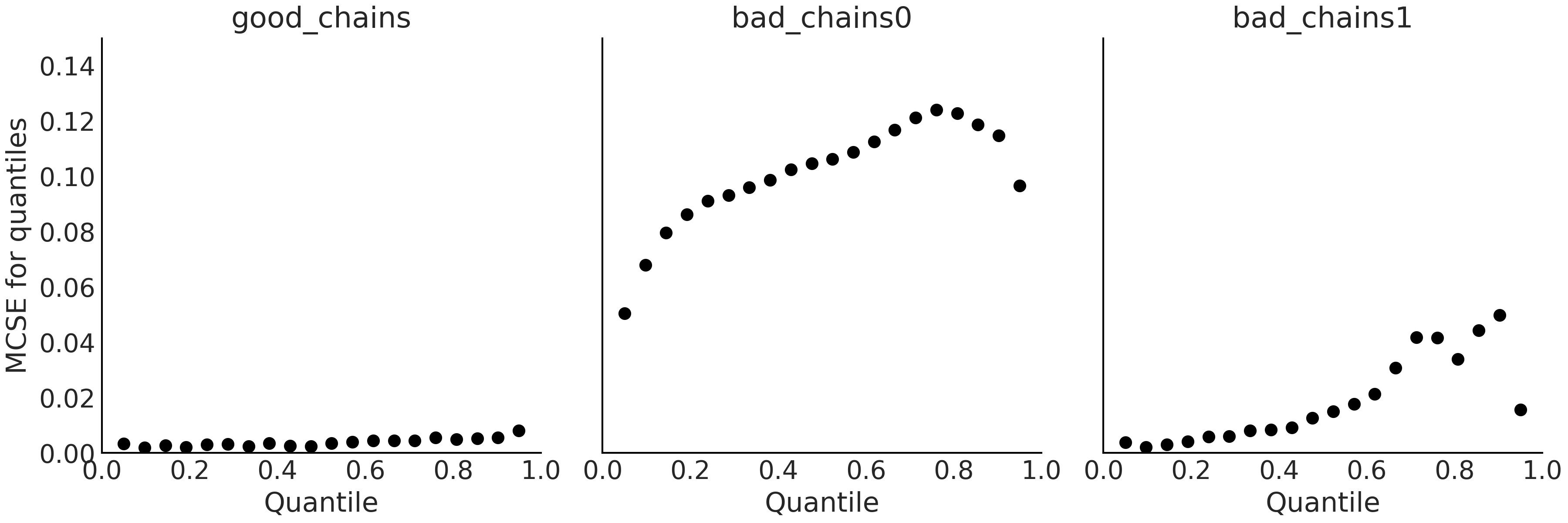
Fig. 2.9 Local MCSE for quantiles. Subplots y-axis share the same scale to ease
comparison between them. Ideally, we want the MCSE to be small across
all regions of the parameter space. Note how the MCSE values for
good_chains is relatively low across all values compared to MCSE of
both bad chains.#
Finally, the ESS, \(\hat R\), and MCSE can all be computed with a single
call to the az.summary(.) function.
az.summary(chains, kind="diagnostics")
mcse_mean* |
mcse_sd |
ess_bulk |
ess_tail |
r_hat |
|
good_chains |
0.002 |
0.002 |
4389.0 |
3966.0 |
1.00 |
bad_chains0 |
0.108 |
0.088 |
2.0 |
11.0 |
2.41 |
bad_chains1 |
0.018 |
0.013 |
111.0 |
105.0 |
1.03 |
The first column is the Monte Carlo standard error for the mean or (expectation), the second one is the Monte Carlo standard error for the standard deviation [10]. Then we have the bulk and tail effective sample size and finally the \(\hat R\) diagnostic.
2.4.4. Trace Plots#
Trace plots are probably the most popular plots in Bayesian literature.
They are often the first plot we make after inference, to visually check
what we got. A trace plot is made by drawing the sampled values at
each iteration step. From these plots we should be able to see if
different chains converge to the same distribution, we can get a sense
of the degree of autocorrelation, etc. In ArviZ by calling the function
az.plot_trace(.) we get a trace plot on the right plus a
representation of the distribution of the sample values, using a KDE for
continuous variables and a histogram for discrete ones on the left.
az.plot_trace(chains)
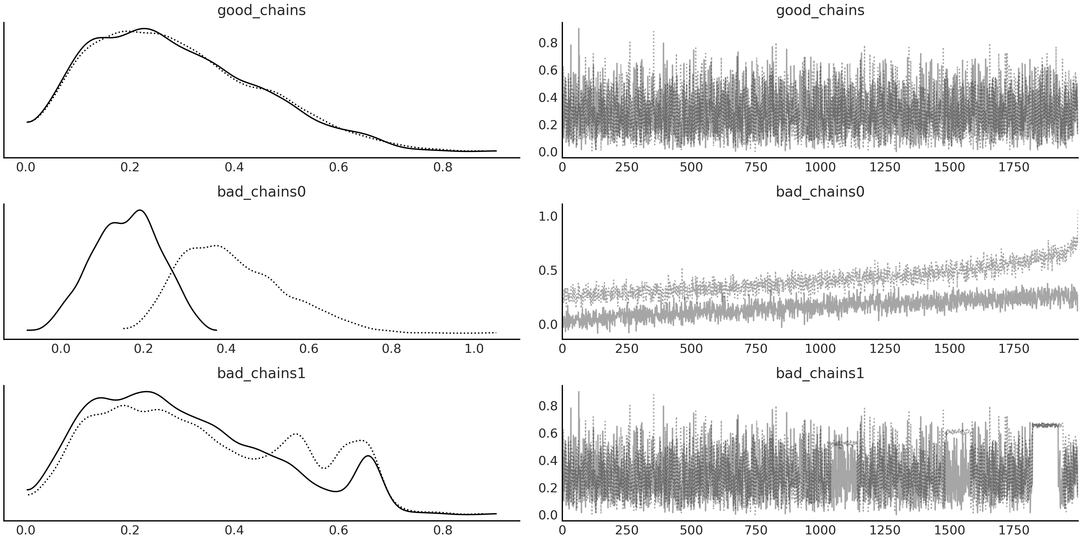
Fig. 2.10 On the left column, we see one KDE per chain. On the right, column we
see the values of the sampled values per chain per step. Note the
differences in the KDE and trace plots between each of the example
chains, particularly the fuzzy caterpillar appearance in good_chains
versus the irregularities in the other two.#
Fig. 2.10 shows the trace plots for chains. From it,
we can see that the draws in good_chains belong to the same
distribution as there are only small (random) differences between both
chains. When we see the draws ordered by iteration (i.e. the trace
itself) we can see that chains look rather noisy with no apparent
trend or pattern, it is also difficult to distinguish one chain from the
other. This is in clear contrast to what we get for bad_chains0. For
this sample we clearly see two different distributions with only some
overlap. This is easy to see both from the KDE and from the trace. The
chains are exploring two different regions of the parameter space. The
situation for bad_chains1 is a little bit more subtle. The KDE shows
distributions that seem to be similar to those from good_chains the
differences between the two chains are more clear. Do we have 2 or 3
peaks? The distributions do not seem to agree, maybe we just have one
mode and the extra peaks are artifacts! Peaks generally look suspicious
unless we have reasons to believe in multi-modal distributions arising,
for example, from sub-populations in our data. The trace also seems to
be somehow similar to the one from good_chains, but a more careful
inspection reveals the presence of long regions of monotonicity (the
lines parallel to the x-axis). This is a clear indication that the
sampler is getting stuck in some regions of the parameter space, maybe
because we have a multimodal posterior with barrier between modes of
very low probability or perhaps because we have some regions of the
parameter space with a curvature that is too different from the rest.
2.4.5. Autocorrelation Plots#
As we saw when we discussed the effective sample size, autocorrelation
decreases the actual amount of information contained in a sample and
thus something we want to keep at a minimum. We can directly inspect the
autocorrelation with az.plot_autocorr.
az.plot_autocorr(chains, combined=True)
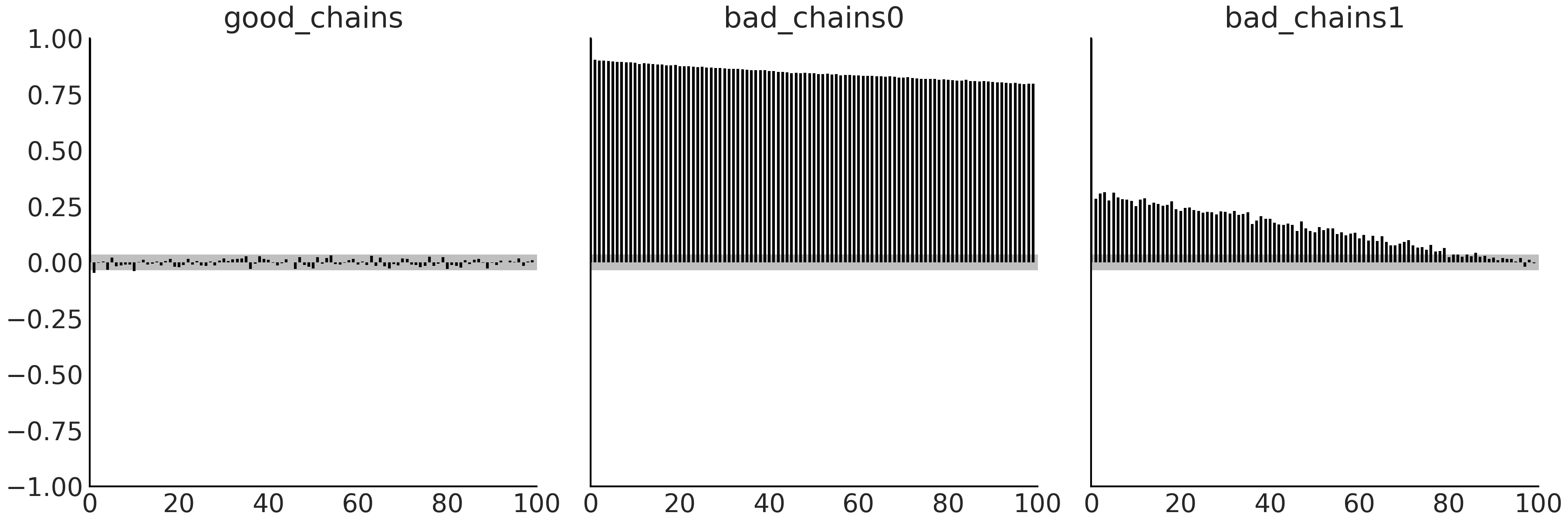
Fig. 2.11 Bar plot of the autocorrelation function over a 100 steps window. The
height of the bars for good_chains is close to zero (and mostly inside
the gray band) for the entire plot, which indicates very low
autocorrelation. The tall bars in bad_chains0 and bad_chains1
indicate large values of autocorrelation, which is undesirable. The gray
band represents the 95% confidence interval.#
What we see in Fig. 2.11 is at least
qualitatively expected after seeing the results from az.ess.
good_chains shows essentially zero autocorrelation, bad_chains0 is
highly correlated and bad_chains1 is not that bad, but autocorrelation
is still noticeable and is long-range, i.e. it does not drop quickly.
2.4.6. Rank Plots#
Rank plots are another visual diagnostic we can use to compare the sampling behavior both within and between chains. Rank plots, simply put, are histograms of the ranked samples. The ranks are computed by first combining all chains but then plotting the results separately for each chain. If all of the chains are targeting the same distribution, we expect the ranks to have a Uniform distribution. Additionally if rank plots of all chains look similar, this indicates good mixing of the chains [19].
az.plot_rank(chains, ax=ax[0], kind="bars")
Fig. 2.12 Rank plots using the bar representation. In particular, compare the
height of the bar to the dashed line representing a Uniform
distribution. Ideally, the bars should follow a Uniform distribution.#
One alternative to the “bars” representation is vertical lines, shortened to “vlines”.
az.plot_rank(chains, kind="vlines")
Fig. 2.13 Rank plots using the vline representation. The shorter the vertical
lines the better. vertical lines above the dashed line indicate an
excess sampled values for a particular rank, vertical lines below
indicate a lack of sampled values.#
We can see in Figures Fig. 2.12 and
Fig. 2.13 that for good_chains the ranks are very
close to Uniform and that both chains look similar to each other with
not distinctive pattern. This is in clear contrast with the results for
bad_chains0 where the chains depart from uniformity, and they are
exploring two separate sets of value, with some overlap over the middle
ranks. Notice how this is consistent to the way we created bad_chains0
and also with what we saw in its trace plot. bad_chains1 is somehow
Uniform but with a few large deviations here and there, reflecting that
the problems are more local than those from bad_chains0.
Rank plots can be more sensitive than trace plots, and thus we recommend
them over the latter. We can obtain them using
az.plot_trace(., kind="rank_bars") or
az.plot_trace(., kind="rank_vlines"). These functions not only plot
the ranks but also the marginal distributions of the posterior. This
kind of plot can be useful to quickly get a sense of what the posterior
looks like, which in many cases can help us to spot problems with
sampling or model definition, especially during the early phases of
modeling when we are most likely not sure about what we really want to
do and as a result, we need to explore many different alternatives. As
we progress and the model or models start to make more sense we can then
check that the ESS, \(\hat R\), and MCSE are okay and if not okay know
that our model needs further refinements.
2.4.7. Divergences#
So far we have been diagnosing how well a sampler works by studying the generated samples. Another way to perform a diagnostic is by monitoring the behavior of the inner workings of the sampling method. One prominent example of such diagnostics is the concept of divergences present in some Hamiltonian Monte Carlo (HMC) methods [11]. Divergences, or more correctly divergent transitions, are a powerful and sensitive way of diagnosing samples and works as complement to the diagnostics we saw in the previous sections.
Let us discuss divergences in the context of a very simple model, we will find more realistic examples later through the book. Our model consists of a parameter \(\theta2\) following a Uniform distribution in the interval \([-\theta1, \theta1]\), and \(\theta1\) is sampled from a normal distribution. When \(\theta1\) is large \(\theta2\) will follow a Uniform distribution spanning a wide range, and when \(\theta1\) approaches zero, the width of \(\theta2\) will also approach zero. Using PyMC3 we can write this model as:
with pm.Model() as model_0:
    θ1 = pm.Normal("θ1", 0, 1, testval=0.1)
    θ2 = pm.Uniform("θ2", -θ1, θ1)
    idata_0 = pm.sample(return_inferencedata=True)
The ArviZ InferenceData format
az.InferenceData is a specialized data format designed for MCMC Bayesian users.
It is based on xarray
[20], a flexible N dimensional array package. The main purpose
of the InferenceData object is to provide a convenient way to store and
manipulate the information generated during a Bayesian workflow,
including samples from distributions like the posterior, prior,
posterior predictive, prior predictive and other information and
diagnostics generated during sampling. InferenceData objects keeps all
this information organized using a concept called groups.
In this book we extensively utilize az.InferenceData. We use it to
store Bayesian inference results, calculate diagnostics, generate plots,
and read and write from disk. Refer to the ArviZ documentation for a
full technical specification and API.
Notice how the model in Code Block divm0 is not
conditioned on any observations, which means model_0 specifies a
posterior distribution parameterized by two unknowns (θ1 and θ2).
You may have also noticed that we have included the argument
testval=0.1. We do this to instruct PyMC3 to start sampling from a
particular value (\(0.1\) in this example), instead of from its default.
The default value is \(\theta1 = 0\) and for that value the probability
density function of \(\theta2\) is a Dirac delta [12], which will produce
an error. Using testval=0.1 only affects how the sampling is
initialized.
In Fig. 2.14 we can see vertical bars at the
bottom of the KDEs for model0. Each one of these bars represents a
divergence, indicating that something went wrong during sampling. We can
see something similar using other plots, like with
az.plot_pair(., divergences=True) as shown in
Fig. 2.15, here the divergences are the blue dots,
which are everywhere!
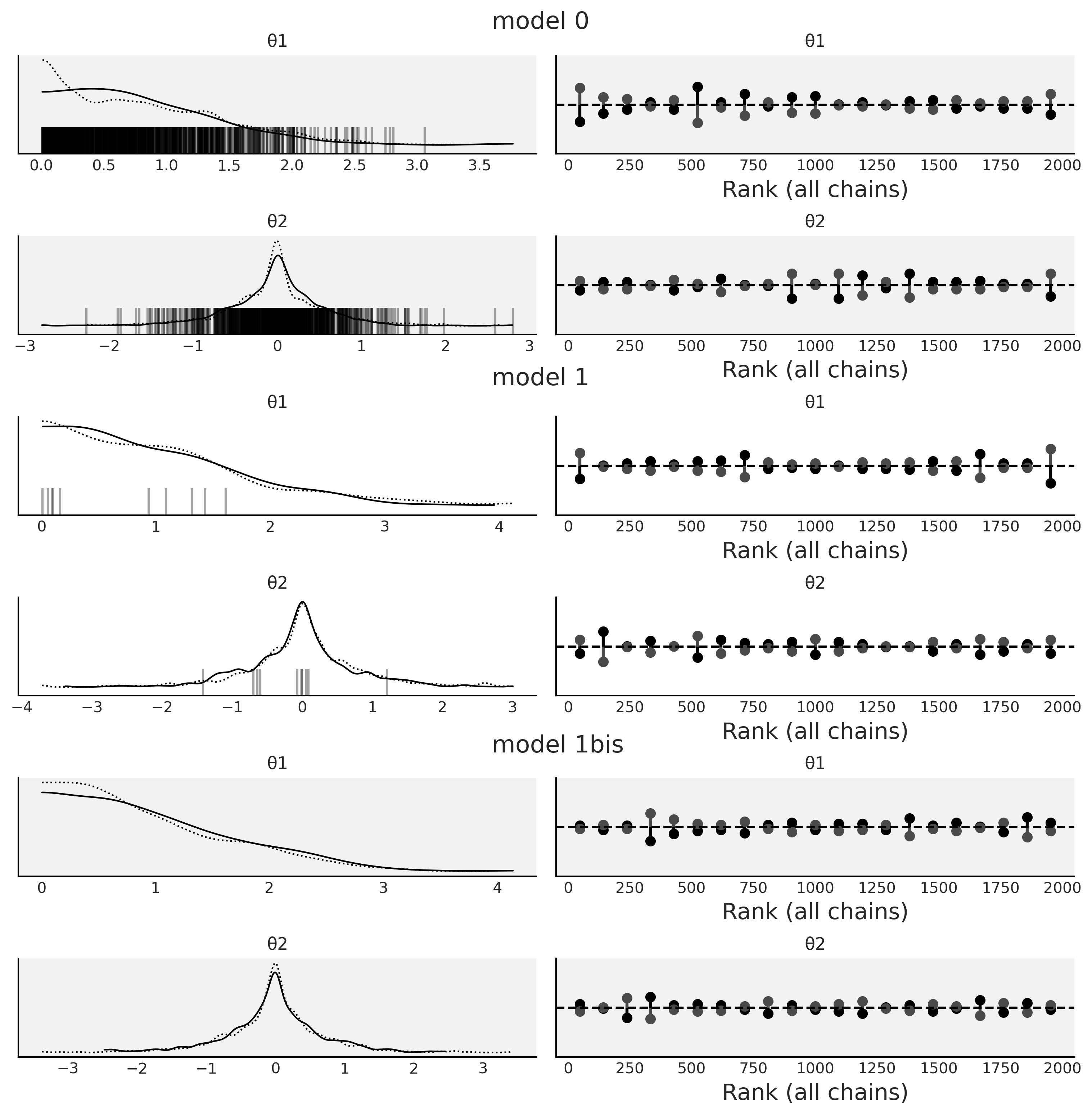
Fig. 2.14 KDEs and rank plots for Model 0 Code divm0, Model
1 divm1 and Model 1bis, which is the same as
Model 1 divm1 but with
pm.sample(., target_accept=0.95). The black vertical bars represent
divergences.#
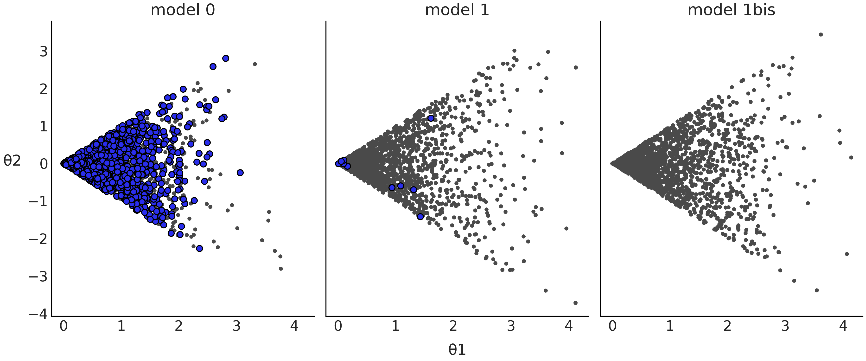
Fig. 2.15 Scatter plot of the posterior samples from Model 0 from Code
divm0, Model 1 from Code Block
divm1, and Model 1bis, which is the same as Model
1 in Code Block divm1 but with
pm.sample(., target_accept=0.95). The blue dots represent divergences.#
Something is definitely problematic with model0. Upon inspection of
the model definition in Code Block divm0 we may
realize that we defined it in a weird way. \(\theta1\) is a Normal
distribution centered at 0, and thus we should expect half of the values
to be negative, but for negative values \(\theta2\) will be defined in the
interval \([\theta1, -\theta1]\), which is at least a little bit weird.
So, let us try to reparameterize the model, i.e. express the model
in a different but mathematically equivalent way. For example, we can
do:
with pm.Model() as model_1:
    θ1 = pm.HalfNormal("θ1", 1 / (1-2/np.pi)**0.5)
    θ2 = pm.Uniform("θ2", -θ1, θ1)
    idata_1 = pm.sample(return_inferencedata=True)
Now \(\theta1\) will always provide reasonable values we can feed into the definition of \(\theta2\). Notice that we have defined the standard deviation of \(\theta1\) as \(\frac{1}{\sqrt{(1-\frac{2}{\pi})}}\) instead of just 1. This is because the standard deviation of the half-normal is \(\sigma \sqrt{(1-\frac{2}{\pi})}\) where \(\sigma\) is the scale parameter of the half-normal. In other words, \(\sigma\) is the standard deviation of the unfolded Normal, not the Half-normal distribution.
Anyway, let us see how these reparameterized models do with respect to
divergences. Fig. 2.14 and
Fig. 2.15 show that the number of divergences has
been reduced dramatically for model1, but we still can see a few of
them. One easy option we can try to reduce divergences is increasing the
value of target_accept as shown in Code Block
divm2, by default this value is 0.8 and the
maximum valid value is 1 (see Section Hamiltonian Monte Carlo for details).
with pm.Model() as model_1bis:
    θ1 = pm.HalfNormal("θ1", 1 / (1-2/np.pi)**0.5)
    θ2 = pm.Uniform("θ2", -θ1, θ1)
    idata_1bis = pm.sample(target_accept=.95, return_inferencedata=True)
model1bis in Fig. 2.14 and
Fig. 2.15 is the same as model1 but with we have
changed the default value of one of the sampling parameters
pm.sample(., target_accept=0.95). We can see that finally we have
removed all the divergences. This is already good news, but in order to
trust these samples, we still need to check the value of \(\hat R\) and
ESS as explained in previous sections.
Reparameterization
Reparameterization can be useful to turn a difficult to sample posterior geometry into an easier one. This could help to remove divergences, but it can also help even if no divergences are present. For example, we can use it to speed up sampling or increase the number of effective samples, without having to increase the computational cost. Additionally, reparameterization can also help to better interpret or communicate models and their results (see Alice and Bob example in Section Conjugate Priors).
2.4.8. Sampler Parameters and Other Diagnostics#
Most sampler methods have hyperparameters that affect the sampler
performance. While most PPLs try to use sensible defaults, in practice,
they will not work for every possible combination of data and models. As
we saw in the previous sections, divergences can sometimes be removed by
increasing the parameter target_accept, for example, if the
divergences originated from numerical imprecision. There are other
sampler parameters that can also help with sampling issues, for example,
we may want to increase the number of iterations used to tune MCMC
samplers. In PyMC3 we have pm.sample(.,tune=1000) by default. During
the tuning phase sampler parameters get automatically adjusted. Some
models are more complex and require more interactions for the sampler to
learn better parameters. Thus increasing the tuning steps can help to
increase the ESS or lower the \(\hat R\). Increasing the number of draws
can also help with convergence but in general other routes are more
productive. If a model is failing to converge with a few thousands of
draws, it will generally still fail with 10 times more draws or the
slight improvement will not justify the extra computational cost.
Reparameterization, improved model structure, more informative priors,
or even changing the model will most often be much more effective [13].
We want to note that in the early stages of modeling we could use a
relatively low number of draws to test that the model runs, that we have
actually written the intended model, that we broadly get reasonable
results. For this initial check around 200 or 300 is typically
sufficient., Then we can increase the number of draws to a few thousand,
maybe around 2000 or 4000, when we are more confident about the model.
In addition to the diagnostics shown in this chapter, additional diagnostics exist, such as parallel plots, and separation plots. All these diagnostics are useful and have their place but for the brevity of this text we have omitted them from this section. To see others we suggest visiting the ArviZ documentation and plot gallery which contains many more examples.
2.5. Model Comparison#
Usually we want to build models that are not too simple that they miss valuable information in our data nor too complex that they fit the noise in the data. Finding this sweet spot is a complex task. Partially because there is not a single criteria to define an optimal solution, partly because such optimal solution may not exist, and partly because in practice we need to choose from a limited set of models evaluated over a finite dataset.
Nevertheless, we can still try to find good general strategies. One useful solution is to compute the generalization error, also known as out-of-sample predictive accuracy. This is an estimate of how well a model behaves at predicting data not used to fit it. Ideally, any measure of predictive accuracy should take into account the details of the problem we are trying to solve, including the benefits and costs associated with the model’s predictions. That is, we should apply a decision theoretic approach. However, we can also rely on general devices that are applicable to a wide range of models and problems. Such devices are sometimes referred to as scoring rules, as they help us to score and rank models. From the many possible scoring rules it has been shown that the logarithmic scoring rule has very nice theoretical properties [21], and thus is widely used. Under a Bayesian setting the log scoring rule can be computed as.
where \(p_t(\tilde y_i)\) is the distribution of the true data-generating process for \(\tilde y_i\) and \(p(\tilde y_i \mid y_i)\) is the posterior predictive distribution. The quantity defined in Equation (2.4) is known as the expected log pointwise predictive density (ELPD). Expected because we are integrating over the true data-generating process i.e over all the possible datasets that could be generated from that process, and pointwise because we perform the computations per observation (\(y_i\)), over the \(n\) observations. For simplicity we use the term density for both continuous and discrete models [14].
For real problems we do not know \(p_t(\tilde y_i)\) and thus the ELPD as defined in Equation (2.4) is of no immediate use, in practice we can instead compute:
The quantity defined by Equation (2.5) (or that quantity multiplied by some constant) is usually known as the deviance, and it is used in both Bayesians and non-Bayesians contexts [15]. When the likelihood is Gaussian, then Equation (2.5) will be proportional to the quadratic mean error.
To compute Equation (2.5) we used the same data used to fit the model and thus we will, on average, overestimate the ELPD (Equation (2.4)) which will lead us to choose models prone to overfitting. Fortunately, there are a few ways to produce better estimations of the ELPD. One of them is cross-validation as we will see in the next section.
2.5.1. Cross-validation and LOO#
Cross-validation (CV) is a method of estimating out-of-sample predictive accuracy. This method requires re-fitting a model many times, each time excluding a different portion of the data. The excluded portion is then used to measure the accuracy of the model. This process is repeated many times and the estimated accuracy of the model will be the average over all runs. Then the entire dataset is used to fit the model one more time and this is the model used for further analysis and/or predictions. We can see CV as a way to simulate or approximate out-of-sample statistics, while still using all the data.
Leave-one-out cross-validation (LOO-CV) is a particular type of cross-validation when the data excluded is a single data-point. The ELPD computed using LOO-CV is \(\text{ELPD}_\text{LOO-CV}\):
Computing Equation (2.6) can easily become too costly as in practice we do not know \(\boldsymbol{\theta}\) and thus we need to compute \(n\) posteriors, i.e. as many values of \(\boldsymbol{\theta_{-i}}\) as observations we have in our dataset. Fortunately, we can approximate \(\text{ELPD}_\text{LOO-CV}\) from a single fit to the data by using a method known as Pareto smoothed importance sampling leave-one-out cross validation PSIS-LOO-CV (see Section LOO in Depth for details). For brevity, and for consistency with ArviZ, in this book we call this method LOO. It is important to remember we are talking about PSIS-LOO-CV and unless we state it otherwise when we refer to ELPD we are talking about the ELPD as estimated by this method.
ArviZ provides many LOO-related functions, using them is very simple but understanding the results may require a little bit of care. Thus, to illustrate how to interpret the output of these functions we are going to use 3 simple models. The models are defined in Code Block pymc3_models_for_loo.
y_obs = np.random.normal(0, 1, size=100)
idatas_cmp = {}

# Generate data from Skewnormal likelihood model
# with fixed mean and skewness and random standard deviation
with pm.Model() as mA:
    σ = pm.HalfNormal("σ", 1)
    y = pm.SkewNormal("y", 0, σ, alpha=1, observed=y_obs)
    idataA = pm.sample(return_inferencedata=True)

# add_groups modifies an existing az.InferenceData
idataA.add_groups({"posterior_predictive":
                  {"y":pm.sample_posterior_predictive(idataA)["y"][None,:]}})
idatas_cmp["mA"] = idataA

# Generate data from Normal likelihood model
# with fixed mean with random standard deviation
with pm.Model() as mB:
    σ = pm.HalfNormal("σ", 1)
    y = pm.Normal("y", 0, σ, observed=y_obs)
    idataB = pm.sample(return_inferencedata=True)

idataB.add_groups({"posterior_predictive":
                  {"y":pm.sample_posterior_predictive(idataB)["y"][None,:]}})
idatas_cmp["mB"] = idataB

# Generate data from Normal likelihood model
# with random mean and random standard deviation
with pm.Model() as mC:
    μ = pm.Normal("μ", 0, 1)
    σ = pm.HalfNormal("σ", 1)
    y = pm.Normal("y", μ, σ, observed=y_obs)
    idataC = pm.sample(return_inferencedata=True)

idataC.add_groups({"posterior_predictive":
                  {"y":pm.sample_posterior_predictive(idataC)["y"][None,:]}})
idatas_cmp["mC"] = idataC
To compute LOO we just need samples from the posterior [16]. Then we
can call az.loo(.), which allows us to compute LOO for a single model.
In practice it is common to compute LOO for two or more models, and thus
a commonly used function is az.compare(.).
Table 2.1 was generated using az.compare(idatas_cmp).
rank |
loo |
p_loo |
d_loo |
weight |
se |
dse |
warning |
loo_scale |
|
mB |
0 |
-137.87 |
0.96 |
0.00 |
1.0 |
7.06 |
0.00 |
False |
log |
mC |
1 |
-138.61 |
2.03 |
0.74 |
0.0 |
7.05 |
0.85 |
False |
log |
mA |
2 |
-168.06 |
1.35 |
30.19 |
0.0 |
10.32 |
6.54 |
False |
log |
There are many columns in Table 2.1 so let us detail their meaning one by one:
The first column is the index which lists the names of the models taken from the keys of the dictionary passed to
az.compare(.).rank: The ranking of the models starting from 0 (the model with the highest predictive accuracy) to the number of models.loo: The list of ELPD values. The DataFrame is always sorted from best ELPD to worst.p_loo: The list of values for the penalization term. We can roughly think of this value as the estimated effective number of parameters (but do not take that too seriously). This value can be lower than the actual number of parameters in a model that has more structure like a hierarchical model or can be much higher than the actual number when the model has very weak predictive capability and may indicate a severe model misspecification.d_loo: The list of relative differences between the value of LOO for the top-ranked model and the value of LOO for each model. For this reason we will always get a value of 0 for the first model.weight: The weights assigned to each model. These weights can be loosely interpreted as the probability of each model (among the compared models) given the data. See Section Model Averaging for details.se: The standard error for the ELPD computations.dse: The standard errors of the difference between two values of the ELPD.dseis not necessarily the same as thesebecause the uncertainty about the ELPD can be correlated between models. The value ofdseis always 0 for the top-ranked model.warning: IfTruethis is a warning that the LOO approximation may not be reliable (see Section Pareto Shape Parameter for details).loo_scale: The scale of the reported values. The default is the log scale. Other options are deviance, this is the log-score multiplied by -2 (this will reverse the order: a lower ELPD will be better). And negative-log, this is the log-score multiplied by -1, as with the deviance scale, a lower value is better.
We can also represent part of the information in
Table 2.1 graphically in Fig. 2.16.
Models are also ranked from higher predictive accuracy to lower. The
open dots represent the values of loo, the black dots are the
predictive accuracy without the p_loo penalization term. The black
segments represent the standard error for the LOO computations se. The
grey segments, centered at the triangles, represent the standard errors
of the difference dse between the values of LOO for each model and the
best ranked model. We can see that mB \(\approx\) mC \(>\) mA.
From Table 2.1 and Fig. 2.16 we
can see that model mA is ranked as the lowest one and clearly
separated from the other two. We will now discuss the other two as their
differences are more subtle. mB is the one with the highest predictive
accuracy, but the difference is negligible when compared with mC. As a
rule of thumb a difference of LOO (d_loo) below 4 is considered small.
The difference between these two models is that for mB the mean is
fixed at 0 and for mC the mean has a prior distribution. LOO penalizes
the addition of this prior, indicated by the value of p_loo which is
larger for mC than mB, and the distance between the black dot
(unpenalized ELPD) and open dot (\(\text{ELPD}_\text{LOO-CV}\)) is larger
for mC than mB. We can also see that dse between these two models
is much lower than their respective se, indicating their predictions
are highly correlated.
Given the small difference between mB and mC, it is expected that
under a slightly different dataset the rank of these model could swap,
with mC becoming the highest ranked model. Also the values of the
weights are expected to change (see Section Model Averaging). We can
easily check this is true by changing the random seed and refitting the
model a few times.
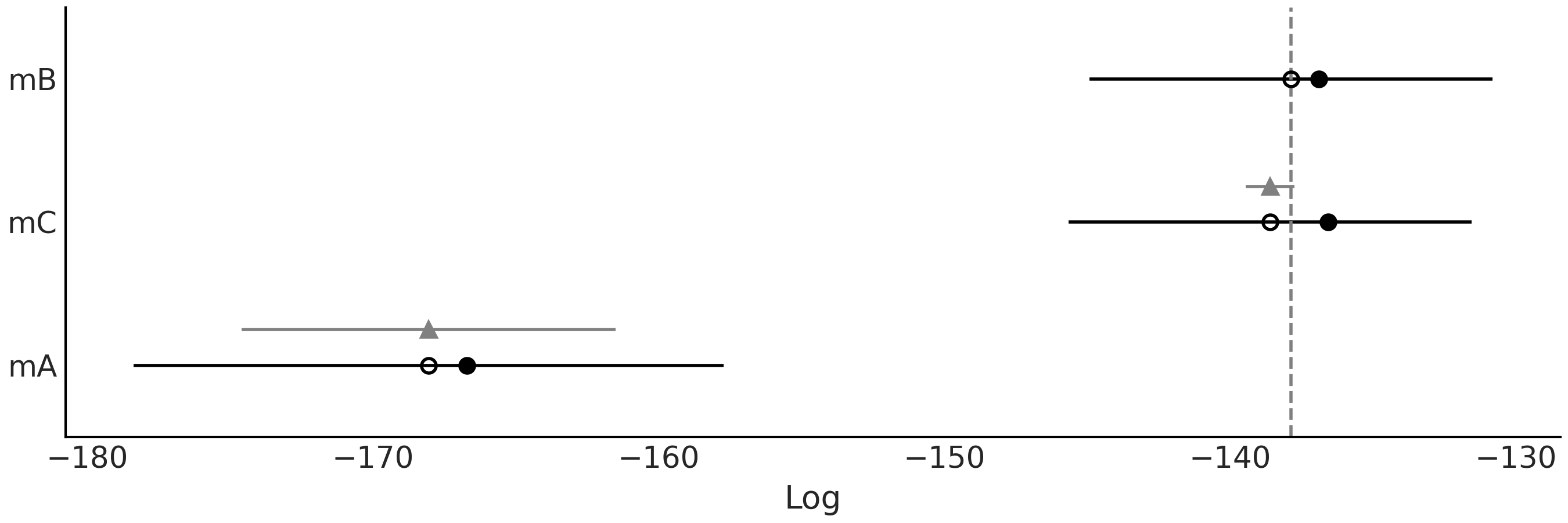
Fig. 2.16 Model comparison using LOO. The open dots represent the values of loo,
the black dots are the predictive accuracy without the p_loo
penalization term. The black segments represent the standard error for
the LOO computations se. The grey segments, centered at the triangles,
represent the standard errors of the difference dse between the values
of LOO for each model and the best ranked model.#
2.5.2. Expected Log Predictive Density#
In the previous section we computed a value of the ELPD for each model. Since this is a global comparison it reduces a model, and data, to a single number. But from Equation (2.5) and (2.6) we can see that LOO is computed as a sum of point-wise values, one for each observation. Thus we can also perform local comparisons. We can think of the individual values of the ELPD as an indicator of how difficult it is for the model to predict a particular observation.
To compare models based on the per-observation ELPD, ArviZ offers the
az.plot_elpd(.) function. Fig. 2.17 shows the
comparison between models mA, mB and mC in a pairwise fashion.
Positive values indicate that observations are better resolved by the
first model than by the second. For example, if we observed the first
plot (mA- mB), observation 49 and 72 are better resolved by model mA
than model mB, and the opposite happens for observations 75 and 95. We
can see that the first two plots mA- mB and mA- mC are very similar,
the reason is that model mB and model mC are in fact very similar to
each other. Fig. 2.19 shows that observations 34, 49,
72, 75 and 82 are in fact the five most extreme observations.
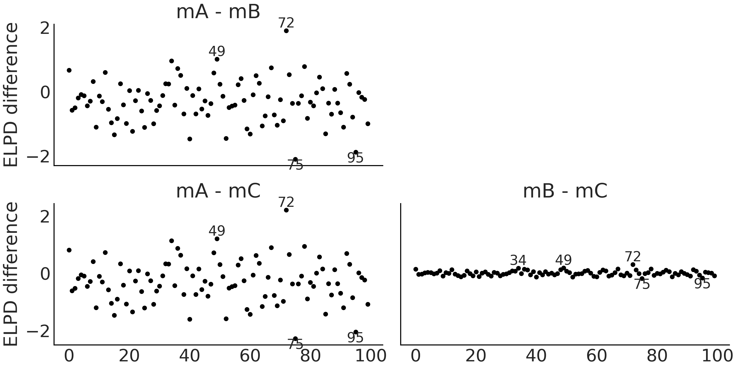
Fig. 2.17 Pointwise ELPD differences. Annotated points correspond to observations
with an ELPD difference 2 times the standard deviation of the computed
ELPD differences. Differences are small in all 3 examples, especially
between mB and mC. Positive values indicate that observations are
better resolved for the first model than the second.#
2.5.3. Pareto Shape Parameter#
As we already mentioned we use LOO to approximate \(\text{ELPD}_\text{LOO-CV}\). This approximation involves the computation of a Pareto distribution (see details in Section LOO in Depth), the main purpose is to obtain a more robust estimation, the side-effect of this computation is that the \(\hat \kappa\) parameter of such Pareto distribution can be used to detect highly influential observations, i.e. observations that have a large effect on the predictive distribution when they are left out. In general, higher values of \(\hat \kappa\) can indicate problems with the data or model, especially when \(\hat \kappa > 0.7\) [16, 22]. When this is the case the recommendations are [23]:
Use the matching moment method [24] [17]. With some additional computations, it is possible to transform the MCMC draws from the posterior distribution to obtain more reliable importance sampling estimates.
Perform exact leave-one-out cross validation for the problematic observations or use k-fold cross-validation.
Use a model that is more robust to anomalous observations.
When we get at least one value of \(\hat \kappa > 0.7\) we will get a
warning when calling az.loo(.) or az.compare(.). The warning
column in Table 2.1 has only False values because
all the computed values of \(\hat \kappa\) are \(< 0.7\) which we can check
by ourselves from Fig. 2.18. We have annotated the
observations with \(\hat \kappa > 0.09\) values in
Fig. 2.18, \(0.09\) is just an arbitrary number we picked,
you can try with other cutoff value if you want. Comparing
Fig. 2.17 against Fig. 2.18 we can see
that the highest values of \(\hat \kappa\) are not necessarily the ones
with the highest values of ELPD or vice versa.
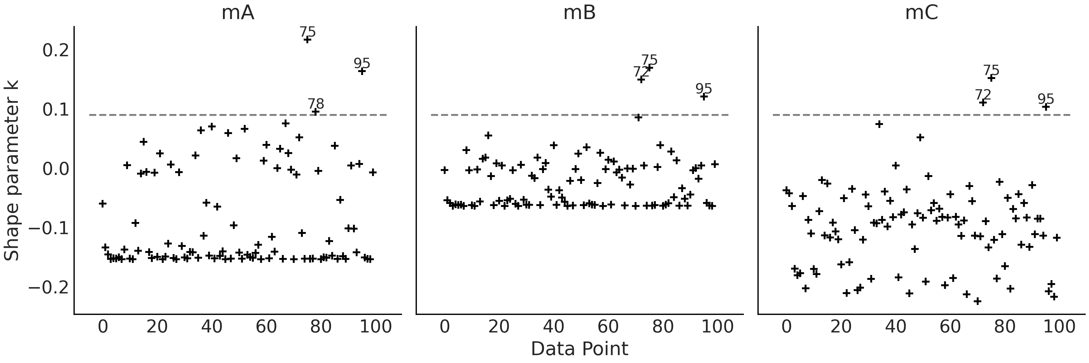
Fig. 2.18 \(\hat \kappa\) values. Annotated points correspond to observations with \(\hat \kappa > 0.09\), a totally arbitrary threshold.#
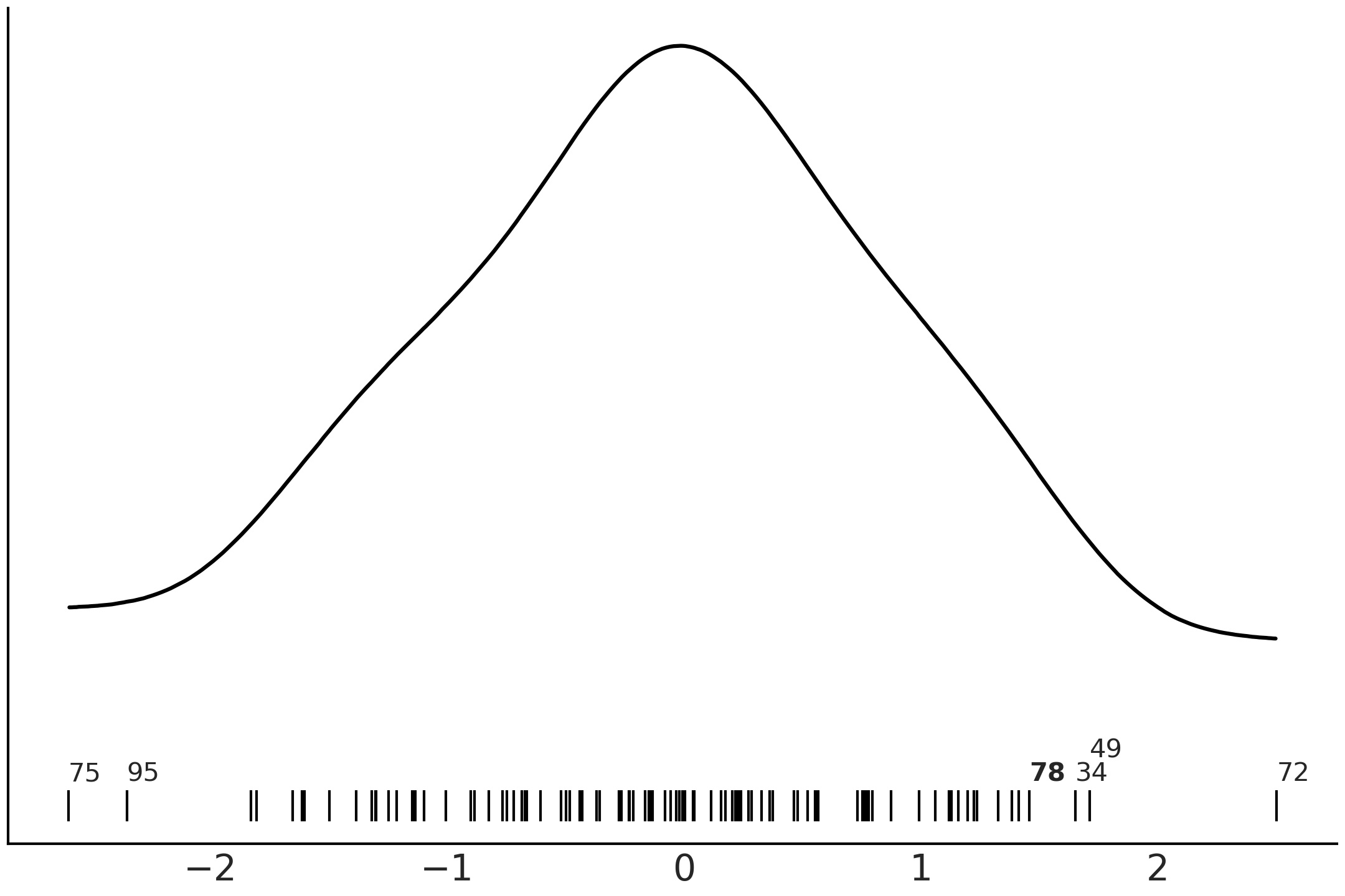
Fig. 2.19 Kernel density estimate of the observations fitted with mA, mB and
mC. The black lines represent the values of each observation. The
annotated observations are the same one highlighted in
Fig. 2.17 except for the observation 78, annotated in
boldface, which is only highlighted in Fig. 2.18.#
2.5.4. Interpreting p_loo When Pareto \(\hat \kappa\) is Large#
As previously said p_loo can be loosely interpreted as the estimated effective number of parameters in a model. Nevertheless, for models with large values of \(\hat \kappa\) we can obtain some additional information. If \(\hat \kappa > 0.7\) then comparing p_loo to the number of parameters \(p\) can provide us with some additional information [23]:
If \(p\_loo << p\), then the model is likely to be misspecified. You usually also see problems in the posterior predictive checks that the posterior predictive samples match the observations poorly.
If \(p\_loo < p\) and \(p\) is relatively large compared to the number of observations (e.g., \(p > \frac{N}{5}\), where \(N\) is the total number of observations), it is usually an indication that the model is too flexible or the priors are too uninformative. Thus it becomes difficult to predict the left out observation.
If \(p\_loo > p\), then the model is also likely to be badly misspecified. If the number of parameters is \(p << N\), then posterior predictive checks are also likely to already reveal some problem [18]. However, if \(p\) is relatively large compared to the number of observations, say \(p > \frac{N}{5}\), it is possible you do not see problems in the posterior predictive checks.
A few heuristics for fixing model misspecification you may try are: adding more structure to the model, for example, adding nonlinear components; using a different likelihood, for example, using an overdispersed likelihood like a NegativeBinomial instead of a Poisson distribution, or using mixture likelihood.
2.5.5. LOO-PIT#
As we just saw in Sections Expected Log Predictive Density and Pareto Shape Parameter model comparison, and LOO in particular, can be used for purposes other than declaring a model is better than another model. We can compare models as a way to better understand them. As the complexity of a model increases it becomes more difficult to understand it just by looking at its mathematical definition or the code we use to implement it. Thus, comparing models using LOO or other tools like posterior predictive checks, can help us to better understand them.
One criticism of posterior predictive checks is that we are using the
data twice, once to fit the model and once to criticize it. The LOO-PIT
plot offers an answer to this concern. The main idea is that we can use
LOO as a fast and reliable approximation to cross-validation in order to
avoid using the data twice. The “PIT part”, stands for Probability
Integral Transform[19], which is a transformation in 1D where we can get
a \(\mathcal{U}(0, 1)\) distribution from any continuous random variable
if we transform that random variable using its own CDF (for details see Section
LOO in Depth). In LOO-PIT we do not know the true CDF, but
we approximate it with the empirical CDF. Putting aside these
mathematical details for a moment, the take-home-message is that for a
well calibrated model we should expect an approximately Uniform
distribution. If you are experiencing a Déjà vu, do not worry you do not
have extrasensory powers nor is this a glitch in the matrix. This may
sound familiar because this is in fact the very same idea we discussed
in Understanding Your Predictions with the function
az.plot_bpv(idata, kind="u_value").
LOO-PIT is obtained by comparing the observed data \(y\) to posterior predicted data \(\tilde y\). The comparison is done point-wise. We have:
Intuitively, LOO-PIT is computing the probability that the posterior
predicted data \(\tilde y_i\) has lower value than the observed data
\(y_i\), when we remove the \(i\) observation. Thus the difference between
az.plot_bpv(idata, kind="u_value") and LOO-PIT is that with the latter
we are approximately avoiding using the data twice, but the overall
interpretation of the plots is the same.
Fig. 2.20 shows the LOO-PIT for models mA, mB and
mC. We can observe that from the perspective of model mA there is
more observed data than expected for low values and less data for high
values, i.e. the model is biased. On the contrary, models mB and mC
seem to be very well calibrated.
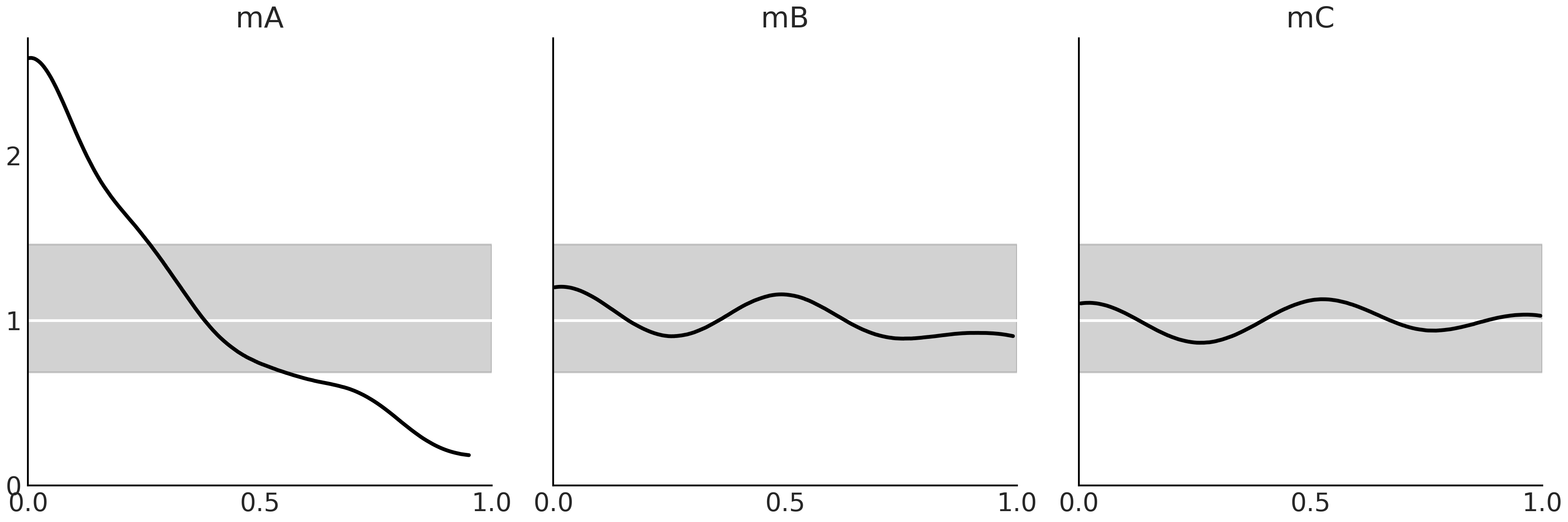
Fig. 2.20 The black lines are a KDE of LOO-PIT, i.e. the proportion of predicted values that are less or equal than the observed data, computed per each observation. The white lines represent the expected Uniform distribution and the gray band the expected deviation for a dataset of the same size as the one used.#
2.5.6. Model Averaging#
Model averaging can be justified as being Bayesian about model uncertainty as we are Bayesian about parameter uncertainty. If we can not absolutely be sure that a model is the model (and generally we can not), then we should somehow take that uncertainty into account for our analysis. One way of taking into account model uncertainty is by performing a weighted average of all the considered models, giving more weight to the models that seem to explain or predict the data better.
A natural way to weight Bayesian models is by their marginal likelihoods, this is known as Bayesian Model Averaging [25]. While this is theoretically appealing, it is problematic in practice (see Section Marginal Likelihood) for details). An alternative is to use the values of LOO to estimate weights for each model. We can do this by using the following formula:
where \(\Delta_i\) is the difference between the \(i\) value of LOO and the highest one, assuming we are using the log- scale, which is the default in ArviZ.
This approach is called pseudo Bayesian model averaging, or Akaike-like [20] weighting and is an heuristic way to compute the relative probability of each model (given a fixed set of models) from LOO[21]. See how the denominator is just a normalization term ensuring that the weights sum up to one. The solution offered by Equation (2.8) for computing weights is a very nice and simple approach. One major caveat is that it does not take into account the uncertainty in the computation of the values of LOO. We could compute the standard error assuming a Gaussian approximation and modify Equation (2.8) accordingly. Or we can do something more robust, like using Bayesian Bootstrapping.
Yet another option for model averaging is stacking of predictive distributions [26]. The main idea is to combine several models in a meta-model in such a way that we minimize the divergence between the meta-model and the true generating model. When using a logarithmic scoring rule this is equivalent to computing:
where \(n\) is the number of data points and \(k\) the number of models. To enforce a solution we constrain \(w\) to be \(w_j \ge 0\) and \(\sum_{j=1}^{k} w_j = 1\). The quantity \(p(y_i \mid y_{-i}, M_j)\) is the leave-one-out predictive distribution for the \(M_j\) model. As we already said computing it can bee too costly and thus in practice we can use LOO to approximate it.
Stacking has more interesting properties than pseudo Bayesian model
averaging. We can see this from their definitions, Equation
(2.8) is just a normalization of weights that have been
computed for each model independently of the rest of the models. Instead
in Equation (2.9) the weights are computed by maximizing the
combined log-score, i.e. even when the models have been fitted
independently as in pseudo Bayesian model averaging, the computation of
the weights takes into account all models together. This helps to explain
why model mB gets a weight of 1 and mC a weight of 0 (see
Table 2.1 ), even if they are very similar models. Why are
the weights not around 0.5 for each one of them? The reason is that
according to the stacking procedure once mB is included in our set of
compared models, mC does not provide new information. In other words
including it will be redundant.
The function pm.sample_posterior_predictive_w(.) accepts a list of
traces and a list of weights allowing us to easily generate weighted
posterior predictive samples. The weights can be taken from anywhere,
but using the weights computed with az.compare(., method="stacking")
makes a lot of sense.
2.6. Exercises#
2E1. Using your own words, what are the main differences between prior predictive checks and posterior predictive checks? How are these empirical evaluations related to Equations (1.7) and (1.8).
2E2. Using your own words explain: ESS, \(\hat R\) and MCSE. Focus your explanation on what these quantities are measuring and what potential issue with MCMC they are identifying.
2E3. ArviZ includes precomputed InferenceData objects
for a few models. We are going to load an InferenceData object generated
from a classical example in Bayesian statistic, the eight schools model
[27]. The InferenceData object includes prior samples, prior
predictive samples and posterior samples. We can load the InferenceData
object using the command az.load_arviz_data("centered_eight"). Use
ArviZ to:
List all the groups available on the InferenceData object.
Identify the number of chains and the total number of posterior samples.
Plot the posterior.
Plot the posterior predictive distribution.
Calculate the estimated mean of the parameters, and the Highest Density Intervals.
If necessary check the ArviZ documentation to help you do these tasks https://arviz-devs.github.io/arviz/
2E4. Load az.load_arviz_data("non_centered_eight"),
which is a reparametrized version of the “centered_eight” model in the
previous exercise. Use ArviZ to assess the MCMC sampling convergence for
both models by using:
Autocorrelation plots
Rank plots.
\(\hat R\) values.
Focus on the plots for the mu and tau parameters. What do these three
different diagnostics show? Compare these to the InferenceData results
loaded from az.load_arviz_data("centered_eight"). Do all three
diagnostics tend to agree on which model is preferred? Which one of the
models has better convergence diagnostics?
2E5. InferenceData object can store statistics related
to the sampling algorithm. You will find them in the sample_stats
group, including divergences (diverging):
Count the number of divergences for “centered_eight” and “non_centered_eight” models.
Use
az.plot_parallelto identify where the divergences tend to concentrate in the parameter space.
2E6. In the GitHub repository we have included an
InferenceData object with a Poisson model and one with a
NegativeBinomial, both models are fitted to the same dataset. Use
az.from_netcdf(.) to load them, and then use ArviZ functions to
answer the following questions:
Which model provides a better fit to the data? Use the functions
az.compare(.)andaz.plot_compare(.)Explain why one model provides a better fit than the other. Use
az.plot_ppc(.)andaz.plot_loo_pit(.)Compare both models in terms of their pointwise ELPD values. Identify the 5 observations with the largest (absolute) difference. Which model is predicting them better? For which model p_loo is closer to the actual number of parameters? Could you explain why? Hint: the Poisson model has a single parameter that controls both the variance and mean. Instead, the NegativeBinomial has two parameters.
Diagnose LOO using the \(\hat \kappa\) values. Is there any reason to be concerned about the accuracy of LOO for this particular case?
2E7. Reproduce
Fig. 2.7, but using
az.plot_loo_pit(ecdf=True) in place of az.plot_bpv(.). Interpret the
results. Hint: when using the option ecdf=True, instead of the LOO-PIT
KDE you will get a plot of the difference between the LOO-PIT Empirical
Cumulative Distribution Function (ECDF) and the Uniform CDF. The ideal
plot will be one with a difference of zero.
2E8. In your own words explain why MCMC posterior estimation techniques need convergence diagnostics. In particular contrast these to the conjugate methods described in Section Conjugate Priors which do not need those diagnostics. What is different about the two inference methods?
2E9. Visit the ArviZ plot gallery at https://arviz-devs.github.io/arviz/examples/index.html. What diagnoses can you find there that are not covered in this chapter? From the documentation what is this diagnostic assessing?
2E10. List some plots and numerical quantities that are useful at each step during the Bayesian workflow (shown visually in Fig. 9.1). Explain how they work and what they are assessing. Feel free to use anything you have seen in this chapter or in the ArviZ documentation.
Prior selection.
MCMC sampling.
Posterior predictions.
2M11. We want to model a football league with \(N\) teams. As usual, we start with a simpler version of the model in mind, just a single team. We assume the scores are Poisson distributed according to a scoring rate \(\mu\). We choose the prior \(\text{Gamma}(0.5, 0.00001)\) because this is sometimes recommend as an “objective” prior.
with pm.Model() as model:
    μ = pm.Gamma("μ", 0.5, 0.00001)
    score = pm.Poisson("score", μ)
    trace = pm.sample_prior_predictive()
Generate and plot the prior predictive distribution. How reasonable it looks to you?
Use your knowledge of sports in order to refine the prior choice.
Instead of soccer you now want to model basketball. Could you come with a reasonable prior for that instance? Define the prior in a model and generate a prior predictive distribution to validate your intuition.
Hint: You can parameterize the Gamma distribution using the rate and shape parameters as in Code Block poisson_football or alternatively using the mean and standard deviation.
2M12. In Code Block metropolis_hastings from
Chapter 1, change the value of can_sd and run the
Metropolis sampler. Try values like 0.2 and 1.
Use ArviZ to compare the sampled values using diagnostics such as the autocorrelation plot, trace plot and the ESS. Explain the observed differences.
Modify Code Block metropolis_hastings so you get more than one independent chain. Use ArviZ to compute rank plots and \(\hat R\).
2M13. Generate a random sample using
np.random.binomial(n=1, p=0.5, size=200) and fit it using a
Beta-Binomial model.
Use pm.sample(., step=pm.Metropolis()) (Metropolis-Hastings sampler)
and pm.sample(.) (the standard sampler). Compare the results in terms
of the ESS, \(\hat R\), autocorrelation, trace plots and rank plots.
Reading the PyMC3 logging statements what sampler is autoassigned? What
is your conclusion about this sampler performance compared to
Metropolis-Hastings?
2M14. Generate your own example of a synthetic
posterior with convergence issues, let us call it bad_chains3.
Explain why the synthetic posterior you generated is “bad”. What about it would we not want to see in an actual modeling scenario?
Run the same diagnostics we run in the book for
bad_chains0andbad_chains1. Compare your results with those in the book and explain the differences and similarities.Did the results of the diagnostics from the previous point made you reconsider why
bad_chains3is a “bad chain”?
2H15. Generate a random sample using
np.random.binomial(n=1, p=0.5, size=200) and fit it using a
Beta-Binomial model.
Check that LOO-PIT is approximately Uniform.
Tweak the prior to make the model a bad fit and get a LOO-PIT that is low for values closer to zero and high for values closer to one. Justify your prior choice.
Tweak the prior to make the model a bad fit and get a LOO-PIT that is high for values closer to zero and low for values closer to one. Justify your prior choice.
Tweak the prior to make the model a bad fit and get a LOO-PIT that is high for values close to 0.5 and low for values closer to zero and one. Could you do it? Explain why.
2H16. Use PyMC3 to write a model with Normal likelihood. Use the following random samples as data and the following priors for the mean. Fix the standard deviation parameter in the likelihood at 1.
A random sample of size 200 from a \(\mathcal{N}(0,1)\) and prior distribution \(\mathcal{N}(0,20)\)
A random sample of size 2 from a \(\mathcal{N}(0,1)\) and prior distribution \(\mathcal{N}(0,20)\)
A random sample of size 200 from a \(\mathcal{N}(0,1)\) and prior distribution \(\mathcal{N}(20, 1)\)
A random sample of size 200 from a \(\mathcal{U}(0,1)\) and prior distribution \(\mathcal{N}(10, 20)\)
A random sample of size 200 from a \(\mathcal{HN}(0,1)\) and a prior distribution \(\mathcal{N}(10,20)\)
Assess convergence by running the same diagnostics we run in the book
for bad_chains0 and bad_chains1. Compare your results with those in
the book and explain the differences and similarities.
2H17. Each of the four sections in this chapter, prior predictive checks, posterior predictive checks, numerical inference diagnostics, and model comparison, detail a specific step in the Bayesian workflow. In your own words explain what the purpose of each step is, and conversely what is lacking if the step is omitted. What does each tell us about our statistical models?