9. End to End Bayesian Workflows#
Some restaurants offer a style of dining called menu dégustation, or in English a tasting menu. In this dining style, the guest is provided a curated series of dishes, typically starting with amuse bouche, then progressing through courses that could vary from soups, salads, proteins, and finally dessert. To create this experience a recipe book alone will do nothing. A chef is responsible for using good judgement to determine selecting specific recipes, preparing each one, and structuring the courses as a whole to create an impactful experience for the guest all with impeccable quality and presentation.
This same idea holds true for Bayesian analysis. A book of math and code alone will do nothing. A statistician haphazardly applying techniques will not get far either. Successful statisticians must be able to identify the desired outcome, determine the techniques needed, and work through a series of steps to achieve that outcome.
9.1. Workflows, Contexts, and Questions#
Generically all cooking recipes follow a similar structure: ingredients are selected, processed through one or more methods, and then finally assembled. How it is done specifically depends on the diner. If they want a sandwich the ingredients include tomatoes and bread, and a knife for processing. If they want tomato soup, tomatoes are still needed but now a stove is also needed for processing. Considering the surroundings is relevant as well. If the meal is being prepared at a picnic and there is no stove, making soup, from scratch, is not possible.
At a high level performing Bayesian analysis shares some similarities with a cooking recipe, but the resemblance is only superficial. The Bayesian data analysis process is generally very iterative, with the steps performed in a non-linear fashion. Moreover, the exact necessary steps needed to obtain good results are more difficult to anticipate. This process is called Bayesian workflow [17] and a simplified version of it is shown in Fig. 9.1. The Bayesian workflow includes the three steps of model building: inference, model checking/improvement, and model comparison. In this context the purpose of model comparison is not necessarily restricted to pick the best model, but more importantly to better understand the models. A Bayesian workflow, and not just Bayesian inference, is important for several reasons. Bayesian computation can be challenging and generally requires exploration and iteration over alternative models in order to achieve inference that we can trust. Even more, for complex problems we typically do not know ahead of time what models we want to fit and even if so, we would still want to understand the fitted model and its relation to the data. Some common elements to all Bayesian analyses, that are reflected in Fig. 9.1, are the need of data and some prior (or domain) knowledge, some technique used to process the data, and an audience typically wanting a report of some kind with the conclusion of what we learn.
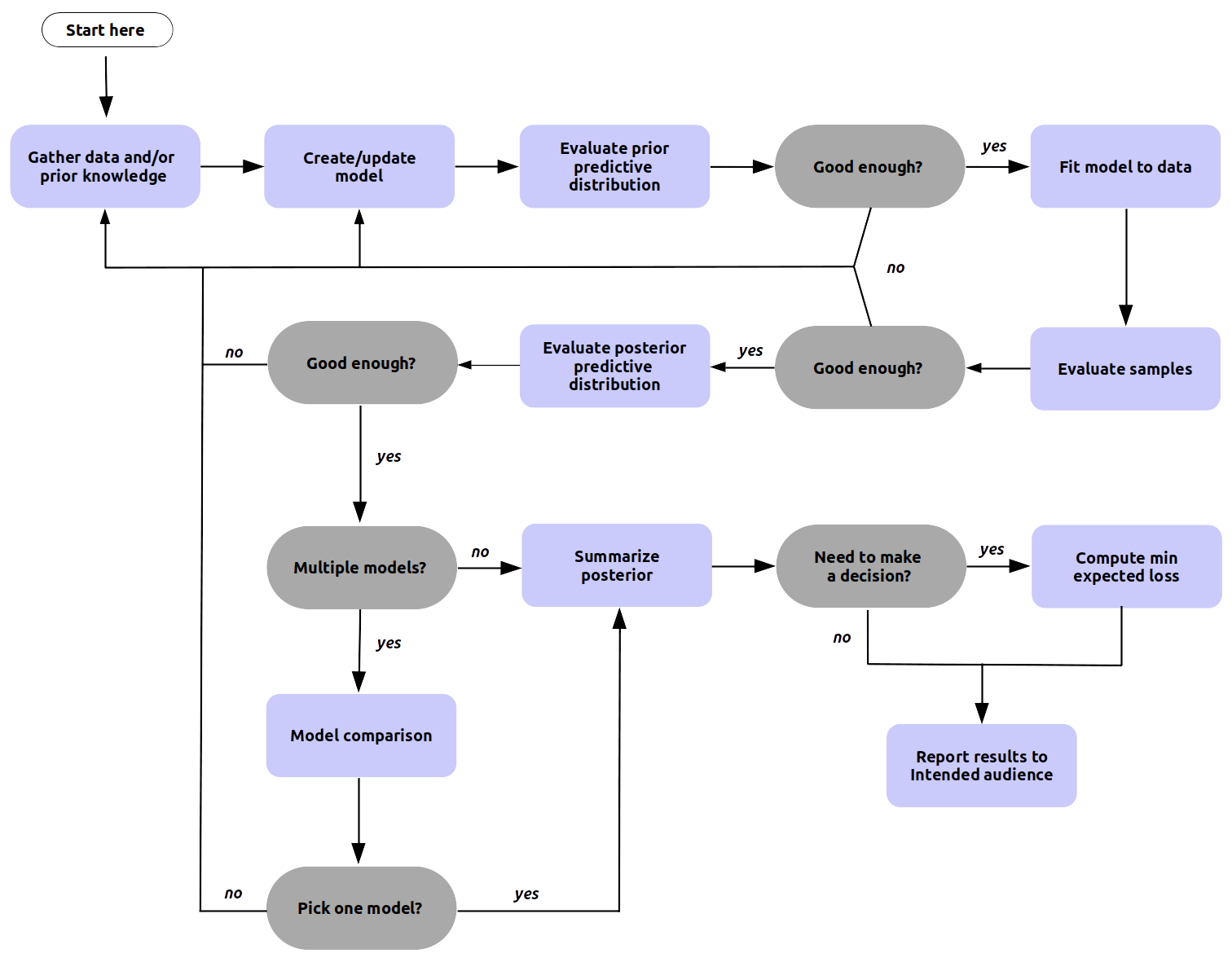
Fig. 9.1 A high level generic Bayesian workflow showing the main steps involved. The workflow has many junctures requiring decisions, and some steps may be omitted entirely. It is the responsibility of the practitioner to make this determination in each situation. For example, “pick a model” could mean choosing a single model, averaging some or all of them, or even presenting all the models and discussing their strengths and shortcomings. Also notice that all the “evaluate” steps can be used for model comparison. We can compare models based on their posterior predictive distributions or pick a model with good convergence diagnostics or the one with the prior predictive distribution closer to our domain knowledge. Finally, we must notice that sometimes we, unfortunately, will need to give up. Even if we are not entirely happy with some model it may be the best model we can achieve given the available resources. A more detailed version of the Bayesian workflow can be seen in a paper aptly titled Bayesian Workflow by Gelman et al [17] and the article Towards a Principled Bayesian Workflow by Betancourt [43].#
The most influential factor in the specific techniques used is what we will refer to as the driving question. This is the question that is of value to our colleagues and stakeholders, that we are trying to answer with our analysis, and is worth the time and effort to try to find an answer. It is important to differentiate this question from any others. During our analysis we will run into many other questions, such as data questions, modeling questions, inference questions, which answer “How should we conduct our analysis”; but should not be confused with the driving question, which is “why we are conducting our analysis”.
So before starting any statistical analysis, the first and foremost task is to clearly define the questions you are trying to answer. The simple reason is that the driving question affects every downstream choice in a Bayesian workflow. This will help us determine, what data you should collect, what tools are needed, if a model is appropriate, what model is appropriate, how to formulate models, how to choose priors, what to expect from the posterior, how to pick between models, what the results are indicating, how to summarize results, what conclusion to communicate. The answers to each of these affect whether the analysis will be useful to your audience or will just collect digital dust in a hard drive. And equally as important how much time and effort is worthwhile in pursuit of the answer.
All too often data practitioners, given an idea of a question, decide it needs an answer and instantly reach for the most complex and nuanced statistical tools, spending little to no time understanding the need. Consider the equivalent situation if we were a chef. They hear someone is hungry so they prepare a $10,000 dish of caviar only to learn a simple bowl of cereal would have sufficed. Yet there have been actual instances where Data Scientists generate $10,000 cloud computing bills on big GPU machines using neural networks when a linear regression may have been sufficient. Do not be the Data Scientist and statistician that immediately reaches for Bayesian Methods, Neural Networks, Distributed Computing Clusters, or other complex tools before truly understanding the need.
9.1.1. Applied Example: Airlines Flight Delays Problem#
For most sections in this chapter each example will build upon the previous section, which we will start with here. Let us imagine we work at the Madison Wisconsin airport, in the United States, as a statistician. Delays in flight arrivals are leading to frustrations and our mathematical skills can help quantify the situation. We first recognize there are multiple individuals involved, a traveler who has to decide when to arrive at an airport, an accountant working for the airport, or the CEO of the airport who has to manage the whole operation.
Each of these folks has different concerns, which leads to different questions, some of which could be:
What is the chance my flight departure is going to get delayed?
What is the chance my flight arrival is going to get delayed?
How many flight arrivals were delayed last week?
How much do flight delays cost the airport?
Given two business choices which one should I make?
What correlates with flight departure delays?
What is causing flight departure delays?
Each of these questions, while all related, are subtly different. The traveler is concerned with the delay of their particular flight, but the airport accountant and executives care about the delays across all flights. The accountant is not worried about the time duration of flight delays, but is interested in the cost of those delays for financial records. The executive is less concerned about history, and more concerned about what strategic decision to make given future flight delays.
At this point you as the reader might be asking, I came here to learn Bayesian Modeling, when are we getting to that? Before we get there consider this case. If the driving question is “How many plane arrivals were late last week?” do we need a Bayesian model? The unsatisfying answer is no, inference is not needed, just basic counting. Do not assume that Bayesian statistics is needed for every problem. Strongly consider whether summary statistics such as simple counts, means, and plots, will be enough to answer the driving question.
Now, suppose the airport CEO comes to you, the airport statistician, with a dilemma. For each arrival the airport must keep staff on standby to guide the airplane landing and a gate available to unload passengers. This means when airplanes arrive late, staff and airport infrastructure are left idle waiting for the arrival and ultimately money wasted on unused resources. Because of this the airport and airlines have an agreement that for each minute late the airline will pay the airport 300 dollars a minute. The airlines however have now asked this agreement be changed. They propose all delays under 10 minutes to cost a flat rate of 1000 dollars, a delay between 10 minutes and 100 minutes to cost 5000 dollars, and a delay over 100 minutes to cost 30,000 dollars. Your CEO suspects the airlines are proposing this structure to save themselves money. The airport CEO asks you to use your data abilities to answer the question, “Should we accept the new late fee structure or keep the old one?”. The airline CEO mentions how expensive this decision could be if it was made incorrectly and asks you to prepare a report regarding the potential financial effects. As experienced statistician you decide to quantify the underlying distribution of delays and use decision analysis to aid with the infrastructure investment choice. We believe an integrated End to End Bayesian analysis will provide a more complete understanding of future outcomes. You are able to justify the cost and complexity of model development as the financial risk of making a poor decision far outweighs the time and cost to make a Bayesian model. If you are not sure how we reached this conclusion do not worry, we will walk through the thought process step by step in subsequent sections. We come back to this flight delay problem in the sub-sections with titles starting with Applied Example.
9.2. Getting Data#
Cooking a good dish is impossible for a chef without ingredients and challenging with poor quality ingredients. Likewise, inference is impossible without data and challenging with poor quality data. The best statisticians dedicate a fair amount of time understanding the nuance and detail of their information. Unfortunately there is no one-size-fits-all strategy for what data is available or how to collect it for every driving question. Considerations span topics from the precision required, to cost, to ethics, to speed of collection. There are however, some broad categories of data collection that we can consider, each with its pros and cons.
9.2.1. Sample Surveys#
In American history there is this folk idea of “asking for your neighbors for a cup of sugar”, convenient for the times when you run out. For statistician the equivalent is sample surveys, also known as polling. The typical motivation of polling is to estimate a population parameter, \(Y\), using a finite number of observations. Sample surveys also can include covariates, for example age, gender, nationality, to find correlations. Various methodologies for sampling exist, such as random sampling, stratified sampling, and cluster sampling. Different methods make tradeoffs between cost, ignorability and other factors.
9.2.2. Experimental Design#
A very popular dining concept these days is farm to table. For a chef this can be appealing as they are free from the constraints of what is typically available, and can instead acquire a much broader range of ingredients while maintaining control over every aspect. For statisticians the equivalent process is called experimental design. In experiments statisticians are able to decide what they want to study, then design the data generating process that will help them best understand their topic of interest. Typically this involves a “treatment” where the experimenter can change part of the process, or in other words vary a covariate, to see the effect on \(\boldsymbol{y}_{obs}\). The typical example is pharmaceutical drug trials, where the effectiveness of new drugs is tested withholding the drug from one group and giving the drug to another group. Examples of treatment patterns in experimental design include randomization, blocking, and factorial design. Examples of data collection methodologies include topics such as double blind studies, where neither the subject nor the data collector know which treatment was applied. Experimental design is typically the best choice to identify causality, but running experiments typically comes at a high cost.
9.2.3. Observational Studies#
Farming your own ingredients can be expensive, so a cheaper alternative could be foraging for ingredients that are growing by themselves. The statistician’s version of this is observational studies. In observational studies the statistician has little to no control over the treatments or the data collection. This makes inference challenging as the available data may not be adequate to achieve the goals of the analysis effort. The benefit however is that, especially in modern times, observational studies are occurring all the time. For example when studying the use of public transportation during inclement weather, it is not feasible to randomize rain or no rain, but the effect can be estimated by recording the weather for the day with other measurements like ticket sales of the day. Like experimental design, observational studies can be used to determine causality, but much more care must be taken to ensure data collection is ignorable (you will see a definition shortly below) and that the model does not exclude any hidden effects.
9.2.4. Missing Data#
All data collection is susceptible to missing data. Folks may fail to respond to a poll, an experimenter could forget to write things down, or in observational studies a day’s logs could be deleted accidentally. Missing data is not always a binary condition either, it could also mean part of the data is missing. For example, failing to record digits after a decimal points leading e.g. missing precision.
To account for this we can extend our formulation of Bayes’ theorem to account for missingness by adding a terms as shown in Equation (9.1) [18]. In this formulation \(\boldsymbol{I}\) is the inclusion vector that denotes which data points are missing or included, and \(\boldsymbol{\phi}\) represents the parameters of the distribution inclusion vector.
Even if missing data is not explicitly modeled it is prudent to remain aware that your observed data is biased just due to the fact that it has been observed! When collecting data be sure to not only pay attention to what is present, but consider also what may not be present.
9.2.5. Applied Example: Collecting Airline Flight Delays Data#
Working at the airport you have access to many datasets, from current temperature, to revenue from the restaurants and shops, to airport hours, number of gates, to data regarding the flight.
Recalling our driving question, “Based on the late arrivals of airplanes, which late fee structure would we prefer?”. We need a dataset the quantifies that notion of lateness. If the late fee structures had been binary, for example, 100 dollars for each late arrival, then a boolean True/False would have sufficed. In this case both the current late fee structure and previous late fee structure require minute level data on arrival delays.
You realize that as a small airport, Madison has never had a flight arrival from far off destinations such as London Gatwick Airport, or Singapore Changi Airport, a big gap in your observed dataset. You ask your CEO about this and she mentions this agreement will only apply to flights coming from Minneapolis and Detroit airports. With all this information you feel comfortable that you understand the data you will need to model the relevant flight delays.
From knowledge of the “data generating process” you know that weather and airline companies have an effect on flight delays. However you decide not to include these in your analysis for three reasons. Your boss is not asking why flights are delayed, obviating the need for an analysis of covariates. You independently assume that historical weather and airline company behavior will remain consistent, meaning you will not need to perform any counterfactual adjustments for expected future scenarios. And lastly you know your boss is under a short deadline so you specifically designed a simple model that can be completed relatively quickly.
With all that your data needs have narrowed down to minute level dataset of flight arrival delays. In this situation using the prior history of observational data is the clear choice above experimental designs or surveys. The United States Bureau of Transportation Statistics keeps detailed logs of flight data which includes delays information. The information is kept to the minute precision which is adequate for our analysis, and given how regulated airline travel is we expect the data to be reliable. With our data in hand we can move to our first dedicated Bayesian task.
9.3. Making a Model and Probably More Than One#
With our question and data firmly in hand we are ready to start constructing our model. Remember model building is iterative and your first model will likely be wrong in some way. While this may seem concerning, it actually can be freeing, as we can start from good fundamentals and then use the feedback we get from our computational tools to iterate to a model that answers our driving question.
9.3.1. Questions to Ask Before Building a Bayesian Model#
In the construction of a Bayesian model a natural place to start is the Bayes Formula. We could use the original formulation but instead we suggest using Formula (9.1) and thinking through each parameter individually
\(p(Y)\): (Likelihood) What distribution describes the observed data given X?
\(p(X)\): (Covariates) What is the structure of the latent data generating process?
\(p(\boldsymbol{I})\): (Ignorability) Do we need to model the data collection process?
\(p(\boldsymbol{\theta})\): (Priors) Before seeing any data what is a reasonable set of parameters?
Additionally since we are computational Bayesians we must also answer another set of questions
Can I express my model in a Probabilistic Programming framework?
Can we estimate the posterior distributions in a reasonable amount of time?
Does the posterior computation show any deficiencies?
All of these questions do not need to be answered immediately and nearly everyone gets them wrong when initially building a new model. While the ultimate goal of the final model is to answer the driving question, this is not typically the goal of the first model. The goal of the first model is to express the simplest reasonable and computable model. We then use this simple model to inform our understanding, tweak the model, and rerun as shown in Fig. 9.1. We do this using the numerous tools, diagnostics, and visualizations that we have seen throughout this book.
Types of Statistical Models
If we refer to D. R. Cox [112] there are two general ways to think about building statistical models, a model based approach where “The parameters of interest are intended to capture important and interpretable features of that generating process, separated from the accidental features of the particular data. Or a design based approach where “sampling existing populations and of experimental design there is a different approach in which the probability calculations are based on the randomization used by the investigator in the planning phases of the investigation”. The fundamentals of Bayes formula have no opinion on which approach is used and Bayesian methods can be used in both approaches. Our airline example is a model based approach, whereas the experimental model at the end of the chapter is a design based approach. For example, it can be argued that most frequentist based analyses follow the design based approach. This does not make them right or wrong, just different approaches for different situations.
9.3.2. Applied Example: Picking Flight Delay Likelihoods#
For our flight delay dilemma we decide to start the modeling journey by picking a likelihood for the observed flight delays. We take a moment to collect in detail our existing domain knowledge. In our dataset, delays can be negative or positive valued. Positive valued means flight is late, negative valued means flight is early. We could make choice here to only model delays and ignore all early arrivals. However, we will choose to model all arrivals so we can build a generative model for all flight arrivals. This may come in handy for the decision analysis we will be doing later.
Our driving question does not pose any questions about correlation or causation, so we will model the observed distribution without any covariates for simplicity. This way we can just focus on likelihood and priors. Adding covariates may help modeling the observed distribution even if they are of no individual interest themselves, but we do not want to get ahead of ourselves. Let us plot the observed data to get a sense of its distribution using Code Block plot_flight_data, the result is shown in Fig. 9.2.
df = pd.read_csv("../data/948363589_T_ONTIME_MARKETING.zip")
fig, ax = plt.subplots(figsize=(10,4))

msn_arrivals = df[(df["DEST"] == "MSN") & df["ORIGIN"].isin(["MSP", "DTW"])]["ARR_DELAY"]

az.plot_kde(msn_arrivals.values, ax=ax)
ax.set_yticks([])
ax.set_xlabel("Minutes late")
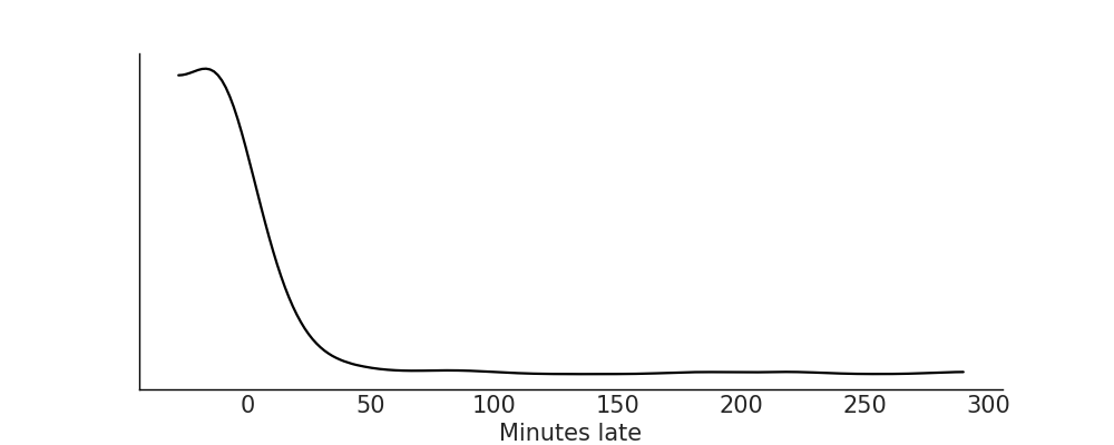
Fig. 9.2 Kernel density estimate plot for the observed arrival delay data. Note a couple of interesting features. The bulk of all flight arrivals is between -20 and 40 and in this region there is a general bell shaped pattern. However, there is a long tail of large values indicating that while relatively few flights are late, some of them can be really late in arriving to the Madison airport.#
Thinking through likelihood we have a couple of choices. We could model this as a discrete categorical distribution, where every possible minute is assigned a probability. But this might pose some challenges: from a statistical perspective we need to pick the number of buckets. While there are non-parametric techniques that allow the number of buckets to vary, this now means we also have to create a model that can estimate bucket number, on top of estimating each probability for each bucket.
From domain expertise we know each minute is not quite independent of each other. If many planes are 5 minutes late, it makes intuitive sense that many planes will also be 4 minutes late or 6 minutes late. Because of this a continuous distribution seems more natural. We would like to model both early and late arrivals so distribution must have support over negative and positive numbers. Combining statistical and domain knowledge we know that most planes are on time, and that flights usually arrive a little early or a little late, but if they are late they can be really late.
Exhausting our domain expertise we can now plot the data, checking for both consistency with our domain expertise and for further clues to help form our model. From Fig. 9.2, we have a few reasonable choices of likelihood distributions: Normal, Skew-Normal, and Gumbel distribution. A plain Normal is symmetrical which is inconsistent with the skewness of the distribution, but it is an intuitive distribution that could be used for baseline comparison. The Skew-Normal as the name suggests has an additional parameter \(\alpha\) controlling the skewness of the distribution. And lastly the Gumbel distribution is specifically designed to describe the maximum value of a set of values. If we imagine that an airplane delay is caused from the maximum value of luggage loading, passenger loading, and other latent factors the idea of this distribution fits with the reality of flight arrival processes.
As airline processes are tightly regulated we do not feel that we need to model missing data at this time. Additionally we choose to ignore covariates to simplify our Bayesian workflow. It is generally advised to start with a simple model, and let the full Bayesian workflow inform your decisions to add complexity as needed, versus starting with a complex model that becomes more challenging to debug in later steps. Typically we would pick one likelihood and work all the way through the Bayesian workflow before trying another. But to avoid backtracking this example we will continue through two in parallel. For now we will move forward with the Normal and Gumbel likelihood in Code Block plane_likelihoods, leaving the Skew-Normal likelihood model as an exercise for the reader.
with pm.Model() as normal_model:
    normal_alpha = ...
    normal_sd = ...

    normal_delay = pm.Normal("delays", mu=mu, sigma=sd,
                             observed=delays_obs)

with pm.Model() as gumbel_model:
    gumbel_beta = ...
    gumbel_mu = ...

    gumbel_delays = pm.Gumbel("delays", mu=mu, beta=beta,
                              observed=delays_obs)
For now all the priors have the placeholder Ellipsis operator (…). Picking priors will be the topic of the next section.
9.4. Choosing Priors and Predictive Priors#
Now that we have settled on likelihoods we need to pick priors. Similar to before there are some general questions that help guide the choice of prior.
Does the prior make sense in the context of math?
Does the prior make sense in the context of the domain?
Can our inference engine produce a posterior with the chosen prior?
We have covered the priors extensively in previous sections. In Section A Few Options to Quantify Your Prior Information we showed multiple principled options for prior selected, such as Jeffrey’s prior or weakly informative priors. In Section Understanding Your Assumptions we showed how to evaluate choices of priors computationally as well. As a quick refresher, prior choice should be justified in context with likelihood, model goal such as whether that is parameter estimation or prediction. And we can also use prior distributions to codify our prior domain knowledge about the data generating process. We may also use priors as a tool to focus the inference process, to avoid spending time and computation exploring parameter spaces that are “clearly wrong”, at least as we would expect using our domain expertise.
In a workflow, sampling and plotting the prior and prior predictive distribution gives us two key pieces of information. The first is that we can express our model in our PPL of choice, and the second is an understanding of the characteristics of our model choice, and the sensitivity to our priors. If our model fails in prior predictive sampling, or we realize we do not understand our model’s response in the absence of data we may need to repeat previous steps before moving forward. Luckily with PPLs we can change the parameterization of our priors, or the structure of our model, to understand its effects and ultimately the informativeness of the chosen specification.
There should be no illusion that the prior distribution or likelihood distributions are preordained. What is printed in this book is the result of numerous trials and tweaking to find parameters that provided a sensible prior predictive distribution. When writing your own models expect that you should also iterate on the priors and likelihood before moving onto the next step, inference.
9.4.1. Applied Example: Picking Priors for Flight Delays Model#
Before making any specific numerical choices we take stock of our domain knowledge about flight arrivals. Airline flight arrivals can be early or late (negative or positive respectively) but exhibit some bounds. For example, it seems unlikely that a flight would arrive more than 3 hours late, but also unlikely it will be more than 3 hours early. Let us specify a parameterization and plot the prior predictive to ensure consistency with our domain knowledge, shown in Code Block airline_model_definition.
with pm.Model() as normal_model:
    normal_sd = pm.HalfStudentT("sd",sigma=60, nu=5)
    normal_mu = pm.Normal("mu", 0, 30)

    normal_delay = pm.Normal("delays",mu=normal_mu,
                             sigma=normal_sd, observed=msn_arrivals)
    normal_prior_predictive = pm.sample_prior_predictive()

with pm.Model() as gumbel_model:
    gumbel_beta = pm.HalfStudentT("beta", sigma=60, nu=5)
    gumbel_mu = pm.Normal("mu", 0, 40)

    gumbel_delays = pm.Gumbel("delays",
                              mu=gumbel_mu,
                              beta=gumbel_beta,
                              observed=msn_arrivals)
    gumbel_prior_predictive = pm.sample_prior_predictive()
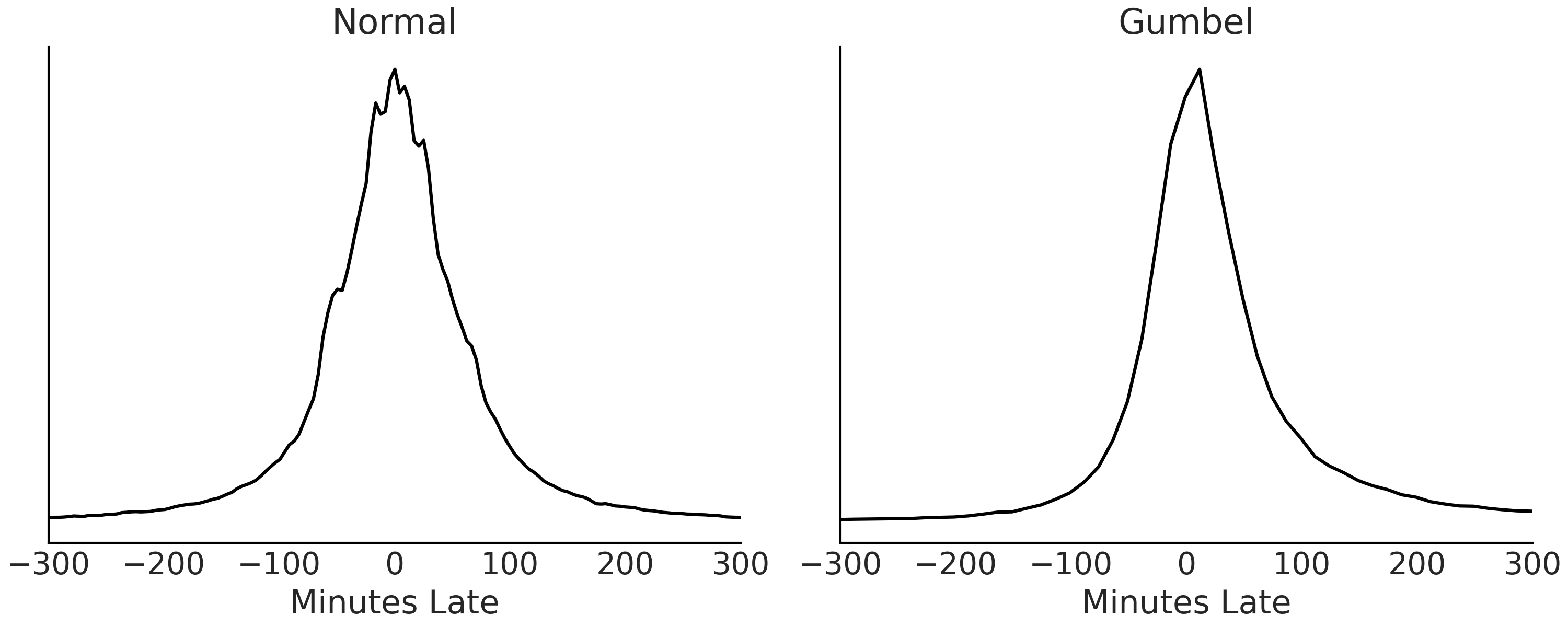
Fig. 9.3 Prior predictive distributions for each of the models. Prior to conditioning on data both distributions look reasonable for our domain problem and similar to each other.#
With no errors in our prior predictive simulation reported from the PPL and with reasonable prior predictive distributions in Fig. 9.3 we decide our choice of priors are sufficient to continue to our next steps.
9.5. Inference and Inference Diagnostics#
Dear reader, we hope that you have not skipped straight to this section. Inference is the “most fun” part where everything comes together and the computer gives us “the answer”. But inference without a good understanding of the question, data, and model (including priors) could be useless, and misleading. In a Bayesian workflow inference builds upon the previous steps. A common mistake is to attempt to fix divergences by first tweaking sampler parameters, or running extra long chains, when really it is the choice of priors or likelihood that is the root cause of the issue. The folk theorem of statistical computing says: “when you have computational problems, often there is a problem with your model [113].
That being said we have a strong prior that if you made it this far you are a diligent reader and understand all our choices thus far so let us dive into inference.
9.5.1. Applied Example: Running Inference on Flight Delays Models#
We choose to use the default HMC sampler in PyMC3 to sample from the posterior distribution.
Let us run our samplers and evaluate our MCMC chains using the typical diagnostics. Our first indication of sampling challenges would be divergences during MCMC sampling. With this data and model none were raised. If some were raised however, this would indicate that further exploration should be done such as the steps we performed in Section Posterior Geometry Matters.
with normal_model:
    normal_delay_trace = pm.sample(random_seed=0, chains=2)
az.plot_rank(normal_delay_trace)

with gumbel_model:
    gumbel_delay_trace = pm.sample(chains=2)
az.plot_rank(gumbel_delay_trace)
Fig. 9.4 Rank plot of the posterior samples from the model with Normal likelihood.#
Fig. 9.5 Rank plot of the posterior samples from the model with Gumbel likelihood.#
For both models the rank plots, shown in Figures Fig. 9.4 and Fig. 9.5, look fairly uniform across all ranks, which indicates little bias across chains. Due to the lack of challenges in this example it seems that inference is as easy as “pushing a button and getting results”. However, it was easy because we had already spent time up front understanding the data, thinking about good model architectures, and setting good priors. In the exercises you will be asked to deliberately make “bad” choices and then run inference to see what occurs during sampling.
Satisfied with the posterior samples generated from NUTS sampler we will move onto our next step, generating posterior predictive samples of estimated delays.
9.6. Posterior Plots#
As we have discussed posterior plots are primarily used to visualize the posterior distribution. Sometimes a posterior plot is the end goal of an analysis, see Experimental Example: Comparing Between Two Groups for an example. In some other cases direct inspection of the posterior distribution is of very little interest. This is the case for our airline example which we elaborate on further below.
9.6.1. Applied Example: Posterior of Flight Delays Models#
After ensuring there are no inference errors in our model we quickly check the posterior plots of the Normal and Gumbel models in Figures Fig. 9.6 and Fig. 9.7. At a glance they look well formed, with no unexpected aberrations. In both distributions, from a domain perspective it is reasonable to see the mean value for \(\mu\) estimated below zero, indicating that most planes are on time. Other than those two observations the parameters themselves are not very meaningful. After all your boss needs to make a decision of whether to stay with the current fee structure or accept the airlines proposal for a new one. Given that a decision is the goal of our analysis, after a quick sanity check we continue with the workflow.
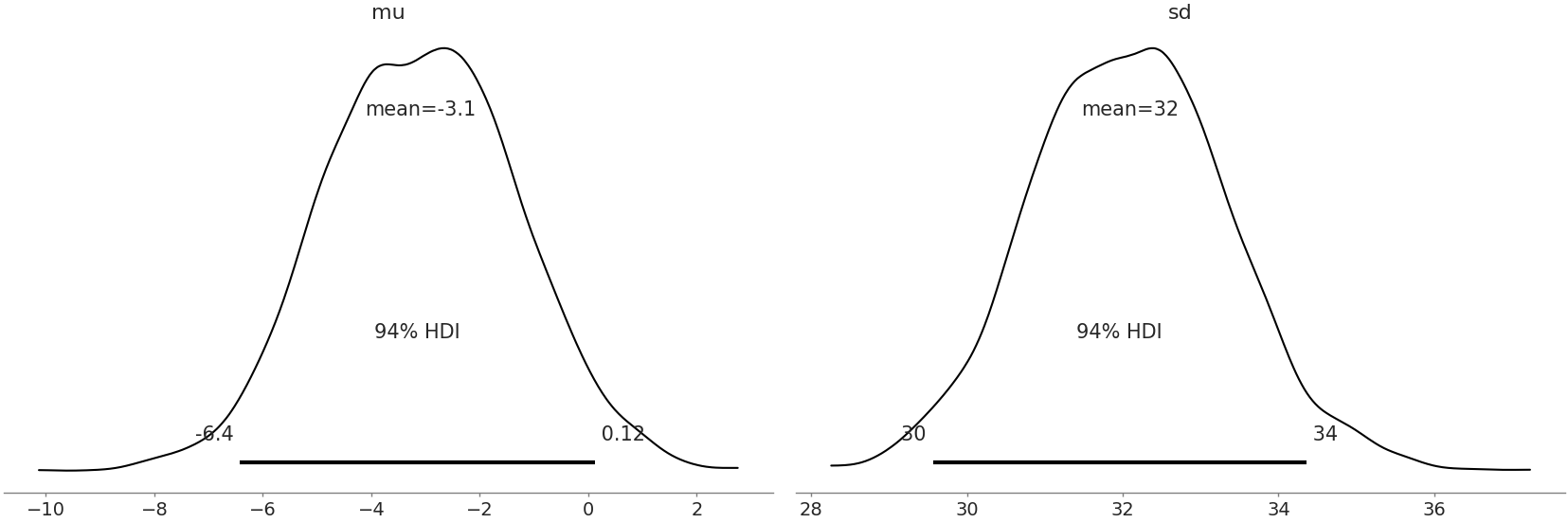
Fig. 9.6 Posterior plot for Normal model. Both distributions looks reasonably formed and there are no divergences adding more evidence that our sampler has reasonably estimated the parameters.#
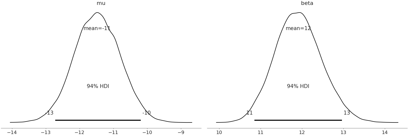
Fig. 9.7 Posterior plot for Gumbel model parameters. Similar to Fig. 9.6 these estimates look well formed and give us confidence in our parameter estimates.#
9.7. Evaluating Posterior Predictive Distributions#
As shown in the workflow in Fig. 9.1, a Bayesian analysis does not concludes once the posterior estimates are obtained. We can take many additional steps, like for example generating posterior predictive distributions if any of the following are desired.
We want to use posterior predictive checks to evaluate our model calibration.
We want to obtain predictions or perform counterfactual analyses
We want to be able to communicate our results in the units of the observed data, and not in term of the parameters of our model.
We specified the mathematical definition for a posterior predictive distribution in Equation (1.8). Using modern PPLs sampling from the posterior predictive distribution is easy as adding a couple lines of code shown in Code Block posterior_predictive_airlines.
9.7.1. Applied Example: Posterior Predictive Distributions of Flight Delays#
In our airline example we have been asked to help make a decision based on unseen future flight delays. To do that we will need estimates of the distribution of future flight delays. Currently however, we have two models and need to pick between the two. We can use posterior predictive checks to evaluate the fit against the observed data visually as well as using test statistics to compare certain specific features.
Let us generate posterior predictive samples for our Normal likelihood model shown in Code Block posterior_predictive_airlines.
with normal_model:
    normal_delay_trace = pm.sample(random_seed=0)
    normal_ppc = pm.sample_posterior_predictive(normal_delay_trace)
    normal_data = az.from_pymc3(trace=normal_delay_trace,
                            posterior_predictive=normal_ppc)
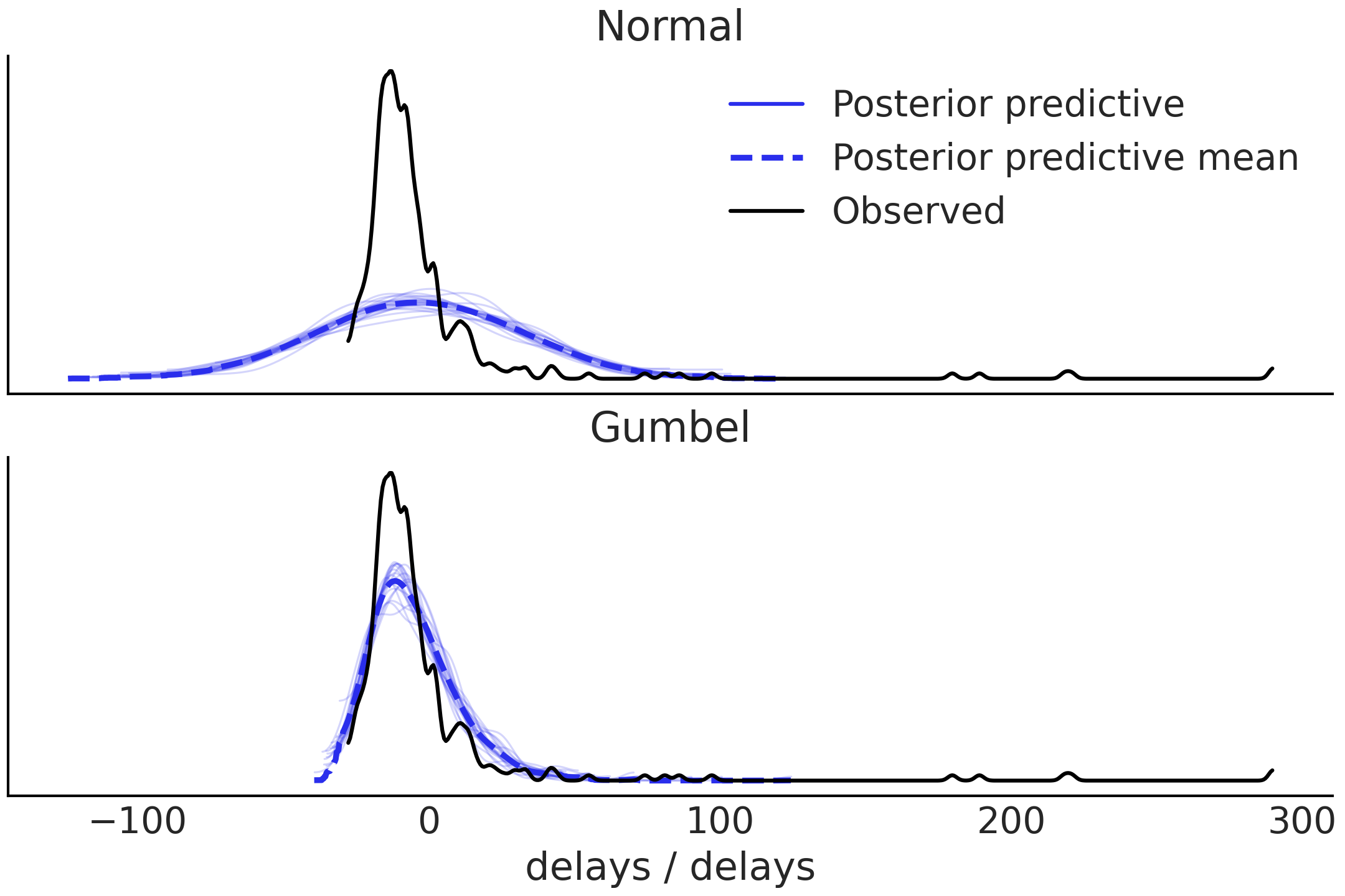
Fig. 9.8 Posterior predictive checks for Normal and Gumbel models. The Normal model does not capture the long tail well and also return more predictions below the bound of the observed data. The Gumbel model fit is better but there is still quite a bit of mismatch for values below 0 and the tail.#
From Fig. 9.8 we can see that the Normal model is failing to capture the distribution of arrival times. Moving onto the Gumbel model we can see that the posterior predictive samples seem to do a poor job at predicting flights that arrive early, but a better job at simulating flights that arrive late. We can run posterior predictive checks using two test statistics to confirm. The first is to check the proportion of flights arriving late, and the second is to check the median of flight delays (in minutes) between the posterior predictive distribution and the observed data. Fig. 9.9 shows that the Gumbel model does a better job of fitting the median of flight delays than the Normal model, but does a poor job of fitting the proportion of on time arrivals. The Gumbel model also does a better job of fitting the median of flight delays.
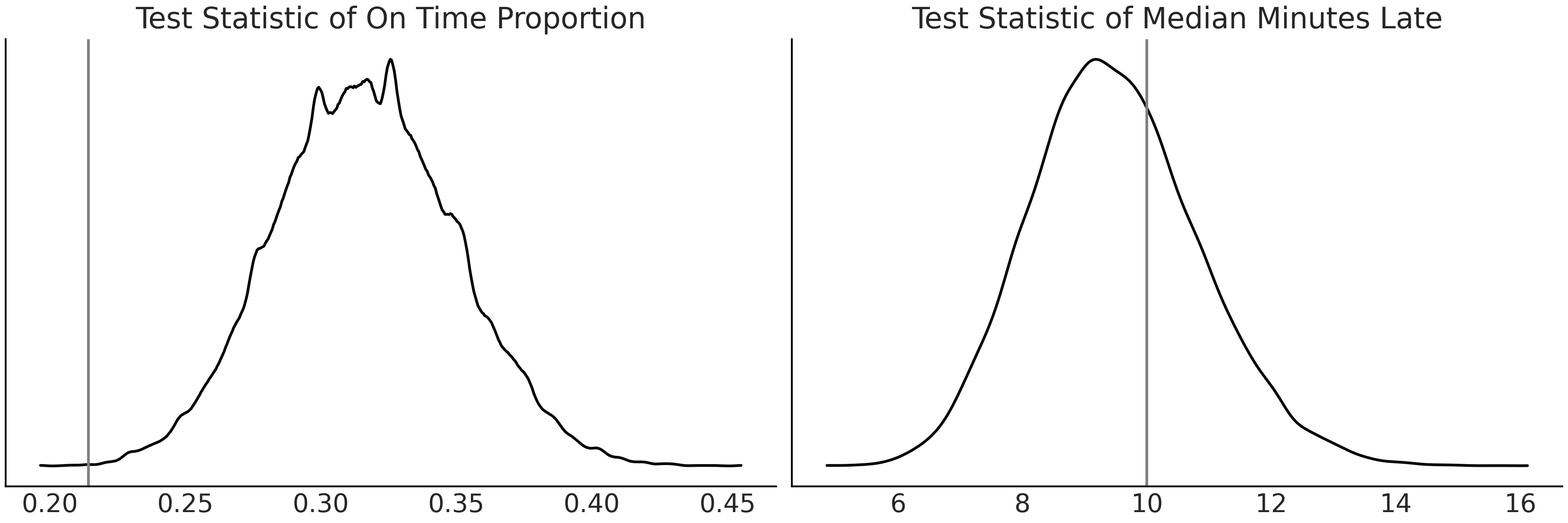
Fig. 9.9 Posterior predictive checks with test statistics for Gumbel model. On the left we see the estimated distribution of on time proportion compared to the observed proportion. On the right is the test statistic of median minutes late. It seems the Gumbel model is better at estimating how late a flight will be versus what proportion of flights will be late.#
9.8. Model Comparison#
So far we have used posterior predictive checks to evaluate each model independently. That type of evaluation is useful to understand each model individually. When we have multiple models however, it begs the question how models perform relative to each other. Model comparison can further help us understand in what regions one model may be performing well, where another is struggling, or which data points are particularly challenging to fit.
9.8.1. Applied Example: Model Comparison with LOO of Flight Delays#
For our flight delay model we have two candidate models. From our previous visual posterior predictive check it seemed clear that the Normal likelihood did not tend to fit the skewed distribution of flight delays well, particularly compared to the Gumbel distribution. We can verify this observation using the comparison method in ArviZ:
compare_dict = {"normal": normal_data,"gumbel": gumbel_data}
comp = az.compare(compare_dict, ic="loo")
comp
rank |
loo |
p_loo |
d_loo |
weight |
se |
dse |
warning |
loo_scale |
|
gumbel |
0 |
-1410.39 |
5.85324 |
0 |
1 |
67.4823 |
0 |
False |
log |
normal |
1 |
-1654.16 |
21.8291 |
243.767 |
0 |
46.1046 |
27.5559 |
True |
log |
Table 9.1, generated with Code Block delays_comparison, shows the model ranked by their ELPD. It should be no surprise that the Gumbel model does much better job modeling the observed data.
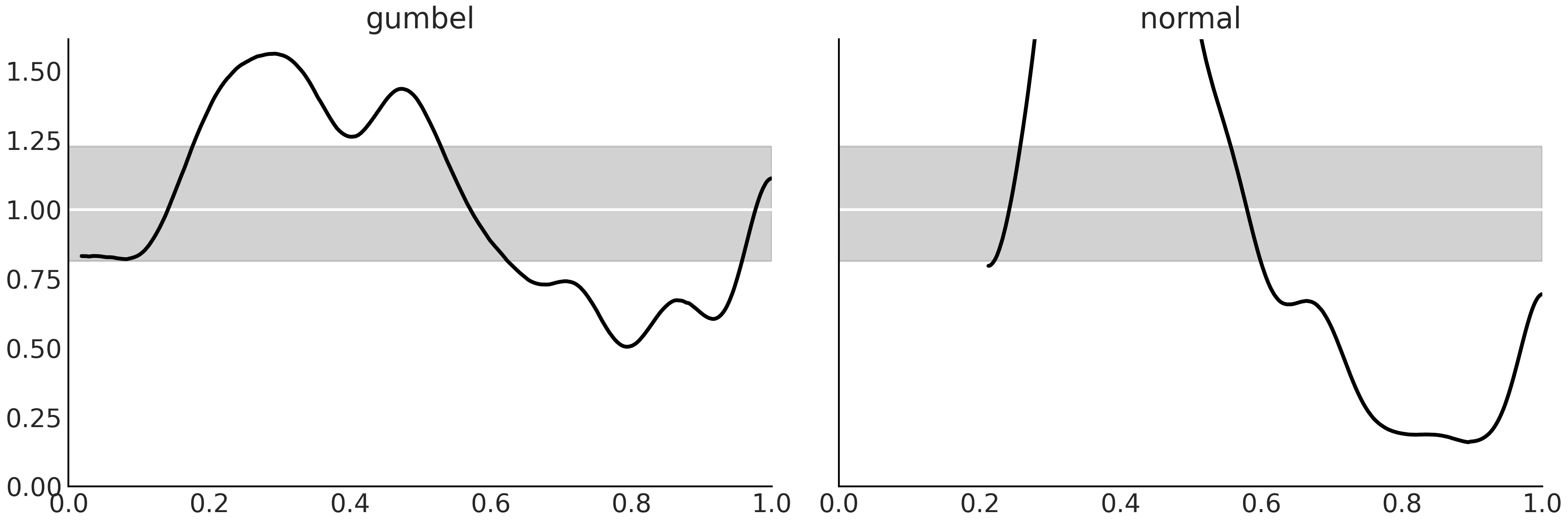
Fig. 9.10 Model calibration using LOO-PIT. We can see that both models have problems at capturing the same portion of the data. The models are underestimating the largest observations (largest delays) and over estimating earlier arrivals. These observations are in line with Fig. 9.8. Even when both models show problems the Gumbel model has smaller deviations from the expected Uniform distribution.#
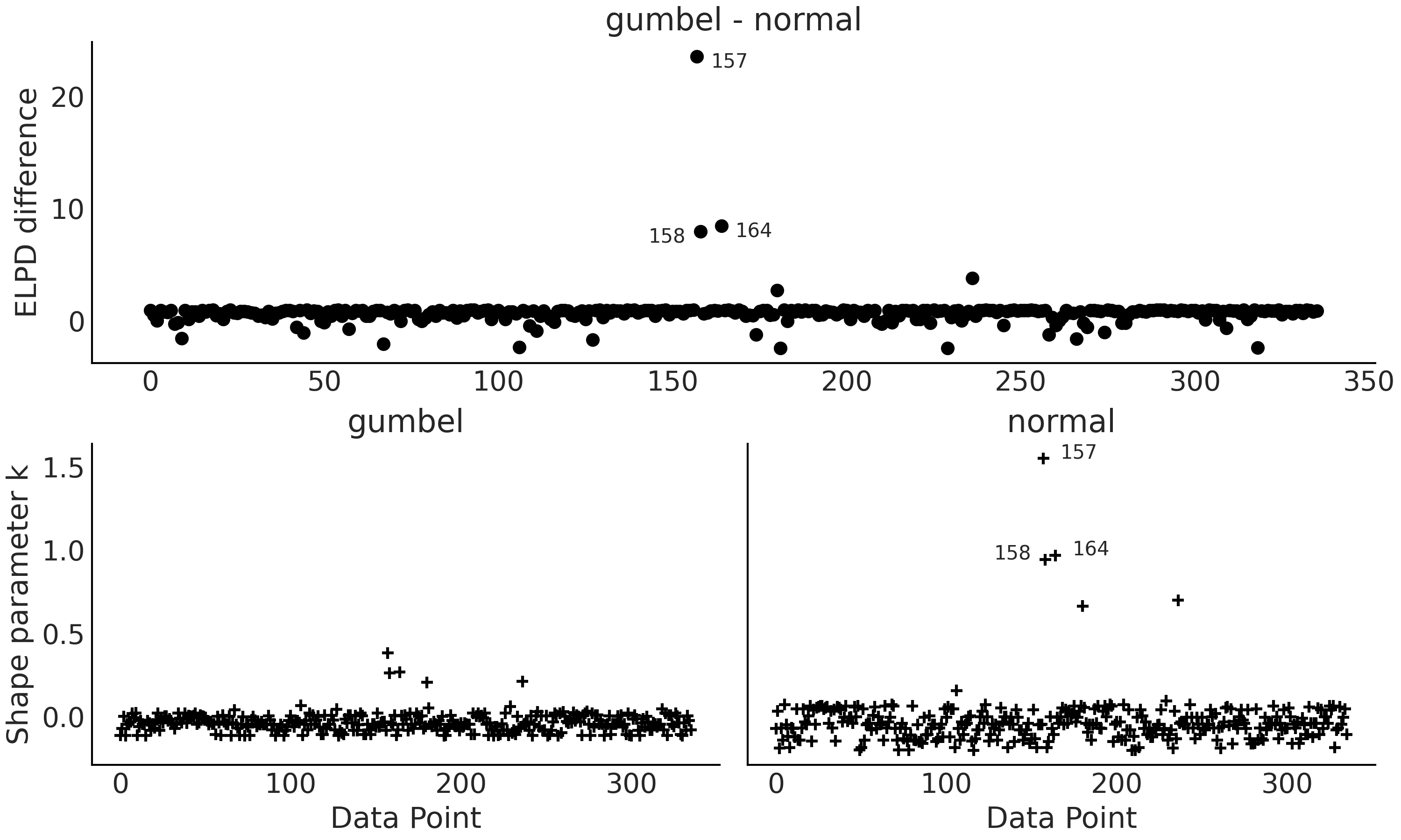
Fig. 9.11 Top panel ELPD difference between the Gumbel and Normal model. The 3 observations with the largest deviation are annotated (157, 158 and 164). Bottom panels, plots for the \(\hat \kappa\) values from the Pareto smooth importance sampling. Observations 157, 158 and 164 has values larger than 0.7#
From Table 9.1 we can see that the Normal
model is giving a value of p_loo way higher than the number of
parameters in the model, showing the model is missespecified. Also we
are getting a warning indicating that we have at least one high value of
\(\hat \kappa\). From Fig. 9.11 (bottom right panel)
we can see that the offending observation is the datapoint 157. From top panel we can
also see (Figure Fig. 9.11 top panel) that the
Normal model is having a hard time at capturing this observation
together with observations 158 and 164. Inspection of the data reveals
that these 3 observations are the ones with the largest delays.
We can also generate a visual check with Code Block delays_comparison_plot which results in Fig. 9.12. We see that even when considering the uncertainty in LOO the Gumbel model is better representation of the data than the Normal model.
az.plot_compare(comp)
Fig. 9.12 Model comparison using LOO of the two flight delay models from Code Block delays_comparison_plot. We confirm our notion that the Gumbel data is better at estimating the observed distribution than the Normal model.#
From our previous comparison of the posterior predictive check, and our direct LOO comparison, we can make the informed choice to proceed only with the Gumbel model. This does not imply our Normal model was useless, in fact quite the opposite. Developing multiple models helps build confidence in our selection of one, or a subset of models. It also does not mean that the Gumbel model is the true or even the best possible model, in fact we have evidence of it shortcomings. Thus, there is still room for improvement if we explore different likelihoods, collect more data, or make some other modification. What is important at this step is that we are sufficiently convinced that the Gumbel model is the most “adequate” model from all the reasonable models we have evaluated.
9.9. Reward Functions and Decisions#
Throughout this book we have seen how converting a set of quantities in one space to another allows us to make calculations simpler or shifts our mode of thinking. For example, in the last section we used the posterior predictive sampling to move from parameter space to observed quantity space. Reward functions, also sometimes referred to as cost, loss, or utility functions, are yet another transformation from observed quantity space to the reward derived from an outcome (or the decision space). Recall the example in Section BART Bikes we have the posterior estimates of the count of bikes rented in each hour (see e.g. Fig. 7.5. If we were instead interested in revenue per day we could use a reward function to calculate the revenue per rental and sum the total counts, effectively converting counts to revenue. Another example is to estimate a person’s level of happiness if they are rained on, versus if they are dry. If we have a model and an estimate of whether it will rain or not (based on weather data), and we have a function that maps how wet or dry a person’s clothes are to a happiness value, we can map our weather estimate to an expected happiness estimate.
Where reward functions become particularly useful is in the presence of a decision. By being able to estimate all future outcomes, and map those outcomes to expected rewards, you are able to make the choice that is likely to yield the maximum reward. An intuitive example is deciding to pack an umbrella in the morning. Carrying an umbrella is annoying, which can be considered a negative reward, but being wet from rain is a worse outcome. The choice of whether you pack an umbrella depends on how likely it is to rain.
We can extend this example a bit more to expose a key idea. Let us say you want to build a model that helps individuals in your family decide when to pack an umbrella. You build a Bayesian model that will estimate the probability it will rain, this is the inference portion. However, after you build the model you learn your brother hates carrying an umbrella so much he will never carry one unless it is already raining, whereas your mother dislikes being wet so much she will preemptively carry an umbrella even if there is not a cloud in the sky. In this case the quantity under estimation, the probability it is going to rain, is exactly the same, but because the reward differs, the action taken is different. More specifically, the Bayesian portion of the model is consistent, but the difference in reward yields a different action.
Neither rewards nor actions need to be binary, both can be continuous. A classic example in supply chain is the newsvendor model [1], in which a newsvendor must decide how many newspapers to buy each morning when demand is uncertain. If they buy too little they risk losing sales, if they buy too many they lose money on unsold inventory.
Because Bayesian statistics provide full distributions we are able to provide better estimates of future reward than methods that provide point estimates [2]. Intuitively we can get a sense of this when we consider that Bayes’ theorem includes features such as tail risk, whereas point estimates will not.
With a generative Bayesian model, particularly a computational one, it becomes possible to convert a posterior distribution of model parameters of parameters, to a posterior predictive distributions in the domain of observed units, to a distributional estimate of reward (in financial units), to a point estimate of most likely outcome. Using this framework we can then test the outcomes of various possible decisions.
9.9.1. Applied Example: Making Decisions Based on Flight Delays Modeling Result#
Recall that delays are quite costly to the airport. In preparation for a flight arrival the airport must ready the gate, have staff on hand to direct the airplane when it lands, and with a finite amount of capacity, late flights arrivals ultimately mean less flight arrivals. We also recall the late flight penalty structure. For every minute late a flight is, the airline must pay the airport a fee of 300 dollars. We can convert this statement into a reward function in Code Block current_revenue.
def current_revenue(delay):
    if delay >= 0:
        return 300 * delay
    return np.nan
Now given any individual late flight we can calculate the revenue we will receive from the flight delay. Since we have a model can produce a posterior predictive distribution of delays we can convert this into an estimate of expected revenue as shown in Code Block reward_calculator, which provides both an array of revenue for each late flight, and the average estimate.
def revenue_calculator(posterior_pred, revenue_func):
    revenue_per_flight = revenue_func(posterior_pred)
    average_revenue = np.nanmean(revenue_per_flight)
    return revenue_per_flight, average_revenue

revenue_per_flight, average_revenue = revenue_calculator(posterior_pred,
current_revenue)
average_revenue
3930.88
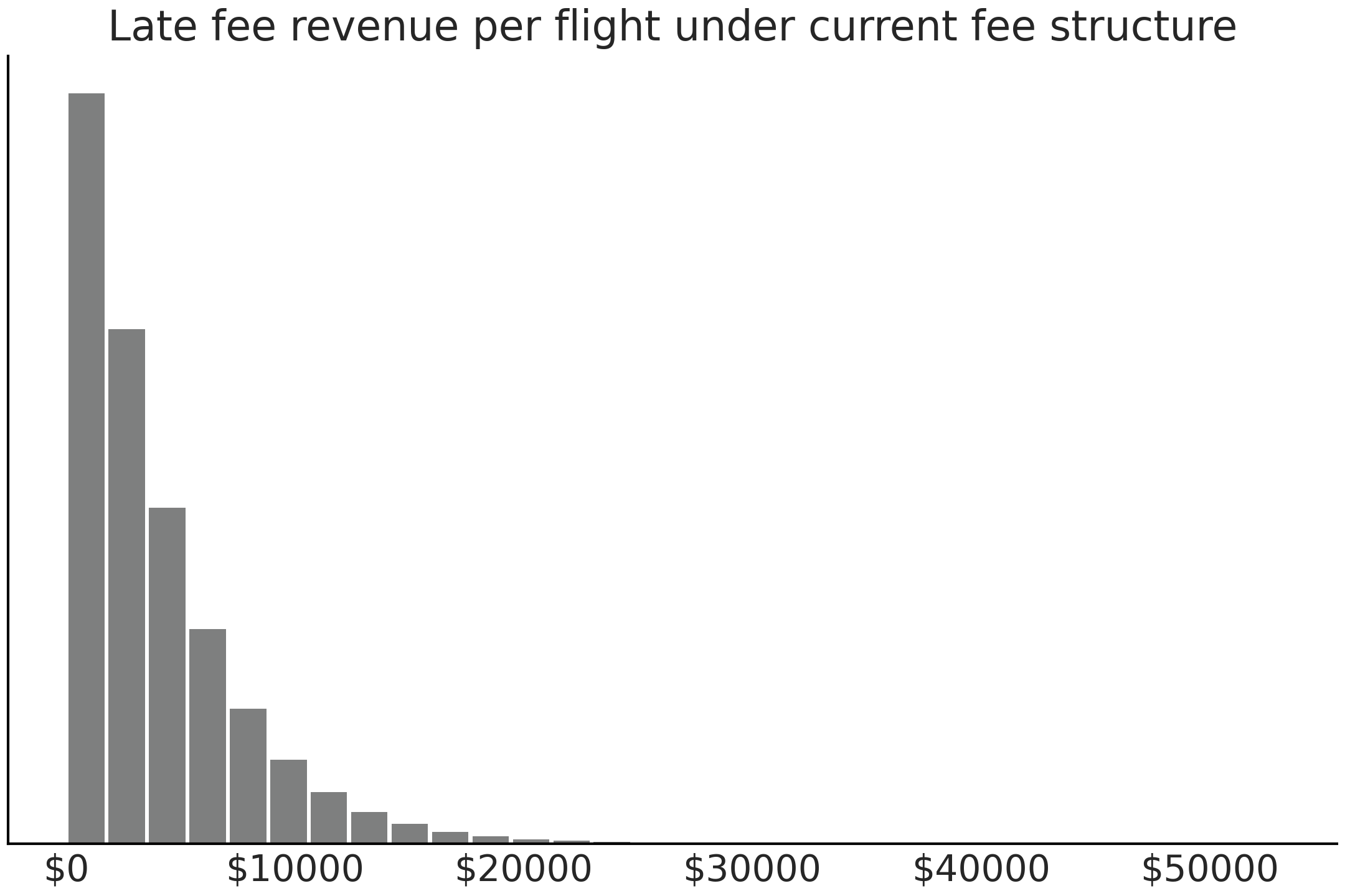
Fig. 9.13 Expected late flight revenue from current late fee structure calculated using reward function and posterior predictive distribution. There are very few very late flights hence the seemingly empty right portion of the plot.#
From the posterior predictive distribution and the current late fee structure we expect each late flight to provide 3930 dollars of revenue on average. We can also plot the distribution of late flight revenue per flight in Fig. 9.13.
Recalling the cost structure proposed by the airline, if a flight is between 0 and 10 minutes late, the fee is 1,000 dollars. If the flight is between 10 and 300 minutes late the fee is 5,000 dollars, and if more than 100 minutes late the fee is 30,000 dollars. Assuming that the cost structure has no effect on the on time or late arrival of planes, you are able to estimate the revenue under the new proposal by writing a new cost function and reusing the previously calculated posterior predictive distribution.
@np.vectorize
def proposed_revenue(delay):
    """Calculate proposed revenue for each delay """
    if delay >= 100:
        return 30000
    elif delay >= 10:
        return 5000
    elif delay >= 0:
        return 1000
    else:
        return np.nan
revenue_per_flight_proposed, average_revenue_proposed = revenue_calculator(posterior_pred, proposed_revenue)
2921.97
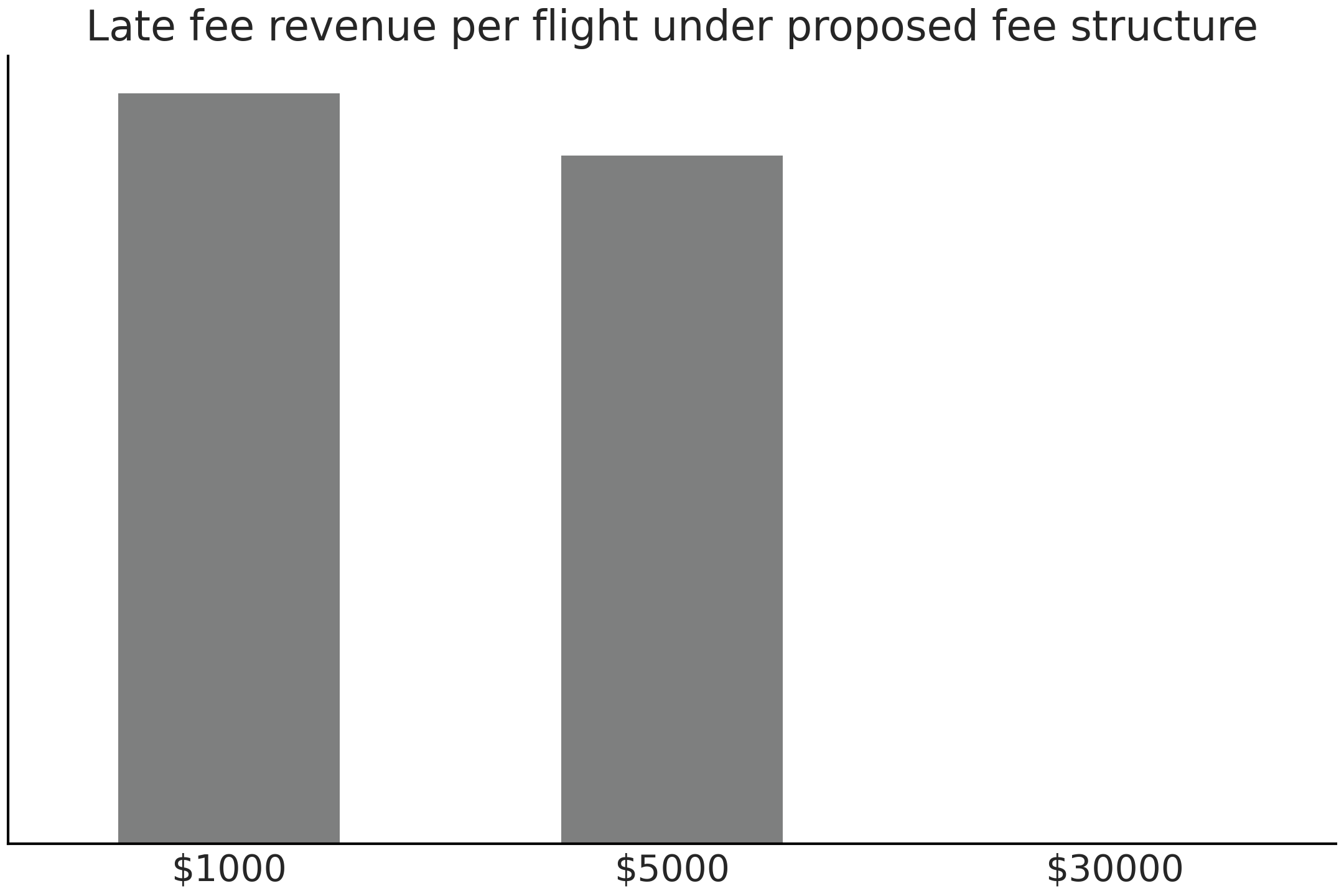
Fig. 9.14 Expected late flight revenue calculated using proposed reward function and posterior predictive distribution. Note that the posterior predictive distribution is exactly the same as in Fig. 9.13. It is simply the change in reward function which makes this plot differ.#
In the new cost structure you estimate that on average the airport will make 2921.97 dollars per late flight, which is less than the current penalty pricing structure. We again can plot the distribution of estimated late flight revenue in Fig. 9.14.
9.11. Experimental Example: Comparing Between Two Groups#
For our second applied example will show the use of Bayesian statistics in a more experimental setting where the difference between two groups is of interest. Before addressing the statistics we will explain the motivation.
When mechanical engineers are designing products, a primary consideration is the properties of the material that will be used. After all, no one wants their airplane to fall apart midflight. Mechanical engineers have reference books of weight, strength, and stiffness for materials such as ceramics, metals, woods which have existed for eons. More recently plastics and fiber reinforced composites have become available and more commonly used. Fiber reinforced composites are often made from a combination of plastic and woven cloth which gives them unique properties.
To quantify the strength properties of materials a physical test mechanical engineers run a procedure called a tensile test, where a specimen of material is held in two clamps and a tensile test machine pulls on the specimen until it breaks. Many data points and physical characteristics can be estimated from this one test. In this experiment the focus was on ultimate strength, or in other words, the maximum load before total material failure. As part of a research project [9] one of the authors manufactured 2 sets, of 8 samples each, that were identical in every way except for the weave of the reinforcing fibers. In one the fibers were flat on top of each other referred to as unidirectional weave. In the other the fibers were woven together into an interlocking pattern referred to as a bidirectional weave.
A series of tensile tests were run independently on each sample and the results were recorded in pound-force [10]. Customary to mechanical engineering the force is divided by area to quantify force per unit area, in this case pound force per square inch. For example, the first bidirectional specimen failed at 3774 lbf (1532 kg) at a cross section area of .504 inches (12.8 mm) by .057 inches (1.27 mm), yielding an ultimate strength of 131.393 ksi (kilopound per square inch). For reference this means a coupon with a cross sectional area of 1/3 a USB A connector is theoretically capable of lifting the weight of a small car [11].
Bidirectional Ultimate Strength (ksi) |
Unidirectional Ultimate Strength (ksi) |
|---|---|
131.394 |
127.839 |
125.503 |
132.76 |
112.323 |
133.662 |
116.288 |
136.401 |
122.13 |
138.242 |
107.711 |
138.507 |
129.246 |
138.988 |
124.756 |
139.441 |
In the original experiment a frequentist hypothesis test was performed which concluded in the rejection the null hypothesis that the ultimate tensile were equivalent. This type of statistical test however, could not characterize either the distribution of ultimate strengths for each material independently or the magnitude of difference in strengths. While this represents an interesting research result, it yields a non-useful practical result, as engineers who intend to choose one material over another in a practical setting need to know how much “better” one material is than another, not just that there is a significant result. While additional statistical tests could be performed to answer these questions, in this text we will focus on how we can answer all these questions using a single Bayesian model well as extend the results further.
Let us define a model for the unidirectional specimens in Code Block uni_model. The prior parameters have already been assessed using domain knowledge. In this case the prior knowledge comes from the reported strength properties of other composite specimens of similar type. This is a great case where the knowledge from other experimental data and empirical evidence can help reduce the amount of data needed to reach conclusions. Something especially important when each data point requires a great deal of time and cost to obtain, like in this experiment.
with pm.Model() as unidirectional_model:
    sd = pm.HalfStudentT("sd_uni", 20)
    mu = pm.Normal("mu_uni", 120, 30)

    uni_ksi = pm.Normal("uni_ksi", mu=mu, sigma=sd,
                        observed=unidirectional)

    uni_trace = pm.sample(draws=5000)
We plot the posterior results in Fig. 9.15. As seen many times with the Bayesian modeling approach we get distribution estimates for both the mean ultimate strength and the standard deviation parameters, which is very helpful in understanding how reliable this particular material is.
az.plot_posterior(uni_data)
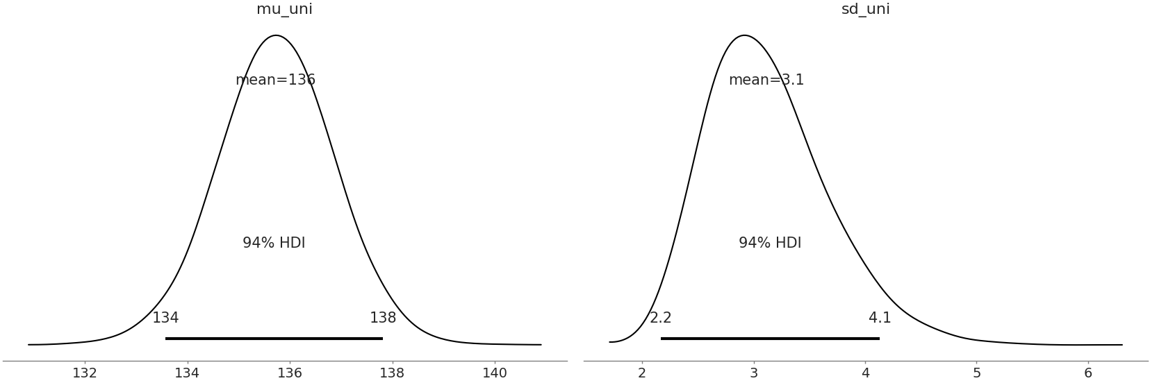
Fig. 9.15 Posterior Plot of all parameters with 94% HDI and point statistic#
Our research question however, was about the differences in the ultimate strength between unidirectional and bidirectional composites. While we could run another model for the bidirectional specimens and compare estimates, a more convenient option would be to compare both in a single model., We can leverage John Kruschke’s model framework as defined in “Bayesian estimation supersedes the t-test” [114] to obtain this “one and done” comparison as shown in Code Block comparison_model.
μ_m = 120
μ_s = 30

σ_low = 1
σ_high = 100

with pm.Model() as model:
    uni_mean = pm.Normal("uni_mean", mu=μ_m, sigma=μ_s)
    bi_mean = pm.Normal("bi_mean", mu=μ_m, sigma=μ_s)

    uni_std = pm.Uniform("uni_std", lower=σ_low, upper=σ_high)
    bi_std = pm.Uniform("bi_std", lower=σ_low, upper=σ_high)

    ν = pm.Exponential("ν_minus_one", 1/29.) + 1

    λ1 = uni_std**-2
    λ2 = bi_std**-2

    group1 = pm.StudentT("uni", nu=ν, mu=uni_mean, lam=λ1,
        observed=unidirectional)
    group2 = pm.StudentT("bi", nu=ν, mu=bi_mean, lam=λ2,
        observed=bidirectional)

    diff_of_means = pm.Deterministic("difference of means",
                                     uni_mean - bi_mean)
    diff_of_stds = pm.Deterministic("difference of stds",
                                    uni_std - bi_std)
    pooled_std = ((uni_std**2 + bi_std**2) / 2)**0.5
    effect_size = pm.Deterministic("effect size",
                                   diff_of_means / pooled_std)

    t_trace = pm.sample(draws=10000)

compare_data = az.from_pymc3(t_trace)
After fitting the model we can visualize the difference in means using a Forest Plot in Fig. 9.16, there does not seem to be much overlap between the mean of two types of samples, suggesting their ultimate strength is indeed different, with the unidirectional being stronger and perhaps even being a little bit more reliable.
az.plot_forest(t_trace, var_names=["uni_mean","bi_mean"])
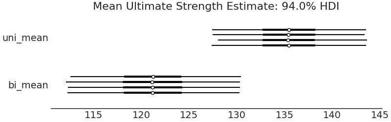
Fig. 9.16 Forest plot of the means of each group. The 94% HDI is separated indicating a difference in the means.#
There is an additional benefit to both Kruschke’s formulation, and a trick in our PPL. We can have the model automatically calculate the difference directly, in this case one of them being posterior distribution of the difference of means.
az.plot_posterior(trace,
                  var_names=["difference of means","effectsize"],
                  hdi_prob=.95, ref_val=0)
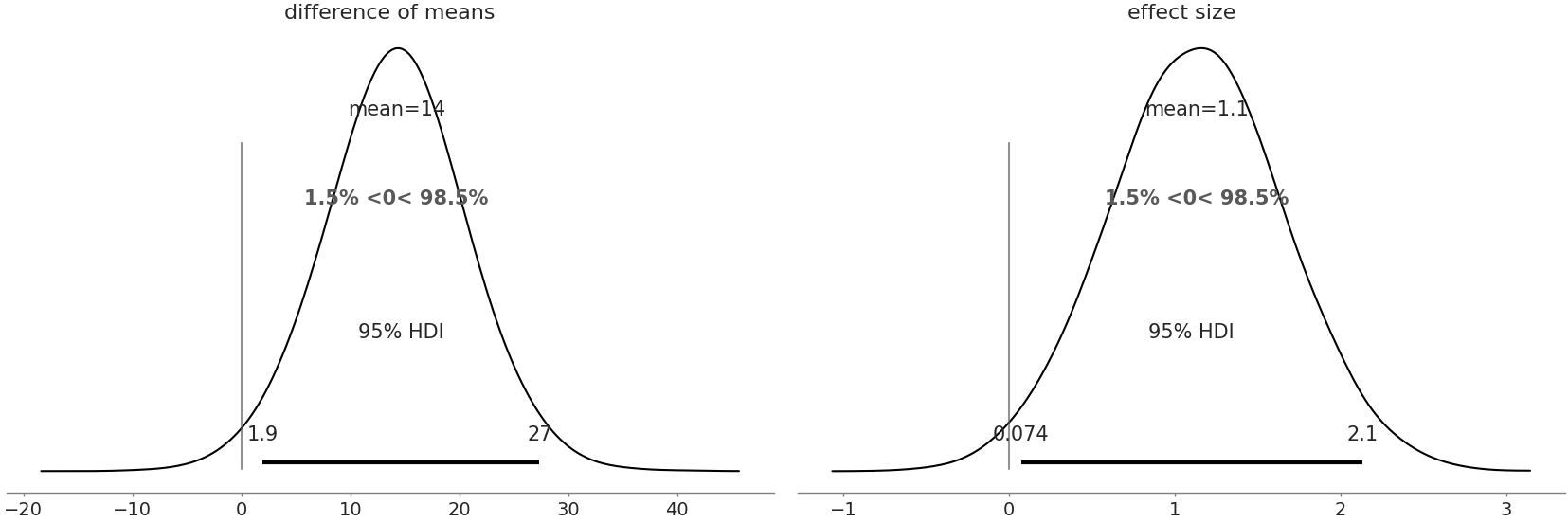
Fig. 9.17 Posterior Plot of difference of means and effect size including reference value at 0. In both the plots a value of 0 is relatively unlikely indicating there is both an effect and a difference.#
We can compare the numerical summaries for each parameter as well.
az.summary(t_trace, kind="stats")
mean |
sd |
hpd_3% |
hpd_97% |
|
|---|---|---|---|---|
uni_mean |
135.816 |
1.912 |
132.247 |
139.341 |
bi_mean |
121.307 |
3.777 |
114.108 |
128.431 |
uni_std |
4.801 |
1.859 |
2.161 |
8.133 |
bi_std |
9.953 |
3.452 |
4.715 |
16.369 |
\(\boldsymbol{\nu}\)_minus_one |
33.196 |
30.085 |
0.005 |
87.806 |
difference of means |
14.508 |
4.227 |
6.556 |
22.517 |
difference of stds |
-5.152 |
3.904 |
-13.145 |
1.550 |
effect size |
1.964 |
0.727 |
0.615 |
3.346 |
From these numerical summary and posterior plot we can be more sure there is a difference in the mean strength of the two composites which helps when making a selection between the two material types. We also have obtained the specific estimated values of strength, with their dispersion, helping an engineer understand where and how the material can be used, safely, in real world applications. It is quite convenient that one model can help us reach multiple conclusions.
9.12. Exercises#
9E1. What kind of data collection scheme would be most appropriate for these situations scenarios. Justify your choices by asking questions such as “How important is it that the information is reliable?” or “Can we collect the data in a reason time?” Explain how you would collect the data
A medical trial for for a new drug treatment for cancer patients
An estimate of the most popular ice cream flavors for a local newspaper article
An estimate of which parts needed for a factory have the longest delivery lead times
9E2. What kind likelihood is suited for these types of data? Justify your choice. What other information would be useful to pick a likelihood?
Count of customers that visit a shop each day
Proportion of parts that fail in a high volume manufacturing line
Weekly revenue of a restaurant
9E3. For our airline model provide a justification, or lack thereof, for each of these priors of the mean of a Gumbel likelihood, using your domain knowledge and a prior predictive check. Do these seem reasonable to use in a model? Why or why not?
\(\mathcal{U}(-200, 200)\)
\(\mathcal{N}(10, .01)\)
\(\text(Pois)(20)\)
9E4. For each of the priors in the exercise above perform an inference run using the Gumbel model in Code Block airline_model_definition
Are any errors raised by the sampler?
For the completed inference run generate post sampling diagnostics such as autocorrelation plots. What are the results? Would you consider the run to be a successful inference run?
9E5. For our airline delays model we initially included arrivals from the MSP and DTW airports. We are now asked to include another arrival airport, ORD, into the analysis. Which steps of the Bayesian Workflow do we need to reconsider? Why is that the case? What if instead we are asked to include SNA? What steps would we need to reconsider?
9E6. In Chapter 6 we forecasted the CO~2~ concentration. Using the figures and models in the chapter what conclusions can we reach about CO~2~? Communicate your understanding of projected CO~2~ levels, including an explanation of the uncertainty, in the following ways. Be sure to include specific numbers. You may need to run the examples to obtain them. Justify which model you chose and why
A 1 minute verbal explanation without visual aid to data scientist colleague
A 3 slide presentation for an non-statistician executive.
Use a Jupyter notebook for a software engineering colleague who wants to productionize the model as well.
Write a half page document for a general internet audience. Be sure to include at least one figure.
9E7. As the airport statistician your boss asks you to rerun the fee revenue analysis with a different cost function than the one specified in Code Block current_revenue. She asks that any minute delay that is even costs 1.5 dollars per minute of delay, any that minute delay that is odd costs 1 dollar a minute of delay. What will the average revenue per late flight be the airport be with this fee model?
9M8. Read the workflow article and paper from Betancourt[43] and Gelman[17]. From each list a step which is the same? Which steps are different? Explain why these examples workflows may be different. Do all practitioners follow the same workflow? Why would they differ if not?
9M9. In our bike rental model from Code Block splines we used splines to estimate bike rentals per hour. The bike rental company wants to know how much money they will make from rentals. Assume each rental costs 3 dollars. Now assume that the rental company is proposing that from the hours of 0 to 5 bike rentals are reduced to 1.5 dollars, but it is projected rentals will increase 20% due to the reduced cost. What is the expected revenue per hour?
Write a reward function specifically to estimate both situations above.
What is the mean projected revenue per day? What would be reasonable upper and lower estimates?
Does the estimated mean and revenue seem reasonable? Note any issues you see and explain you may fix them? (Don’t actually make any changes)
Now assume that the rental company is proposing that from the hours of 0 to 5 bike rentals are reduced to 1.5 dollars, but it is projected rentals will increase 20% due to the reduced cost. What is the expected revenue per day?
9M10. For the airline delay model replace the likelihood in Code Block airline_model_definition with a Skew Normal likelihood. Prior to refitting explain why this likelihood is, or is not, a reasonable choice for the airline flight delay problem. After refitting make the same assessment. In particular justify if the Skew Normal is “better” than the Gumbel model for the airline delays problem.
9H11. Clark and Westerberg[115] ran an
experiment with their students to see if coin flips can be biased
through tosser skill. The data from this experiment is in the repository
under CoinFlips.csv. Fit a model that estimates the proportion of coin
tosses that will come up heads from each student.
Generate 5000 posterior predictive samples for each student. What is the expected distribution of heads for each student?
From the posterior predictive samples which student is the worst at biasing coin towards heads?
The bet is changed to 1.5 dollars for you if heads comes up, and 1 dollar of tails comes up. Assuming the students don’t change their behavior, which student do you play against and what is your expected earnings?
9H12. Make an interactive plot of the posterior airline flights using Jupyter Notebook and Bokeh. You will need to install Bokeh into your environment and using external documentation as needed.
Compare this to the static Matplotlib in terms of understanding the plotted values, and in terms of story telling.
Craft a 1 minute explanation posterior for general audience that isn’t familiar statistics using Matplotlib static visualization.
Craft a 1 minute explanation to the same audience using the Bokeh plot, incorporating the additional interactivity allowed by Bokeh.