7. Bayesian Additive Regression Trees#
In Chapter 5 we saw how we can approximate a function by summing up a series of (simple) basis functions. We showed how B-splines have some nice properties when used as basis functions. In this chapter we are going to discuss a similar approach, but we are going to use decision trees instead of B-splines. Decision trees are another flexible way to represent the piecewise constant functions, or step functions, that we saw in Chapter 5. In particular we will focus on Bayesian Additive Regression Trees (BART). A Bayesian non-parametric model that uses a sum of decision trees to obtain a flexible model [1]. They are often discussed in terms closer to the machine learning verbiage than to the statistical ones [69]. In a sense BART is more of a fire and forget model than the carefully hand crafted models we discuss in other chapters.
In the BART literature people generally do not write about basis functions, instead they talk about learners, but the overall idea is pretty similar. We use a combination of simple functions, also referred to as learners, to approximate complex functions, with enough regularization so that we can get flexibility without too much model complexity, i.e. without overfitting. Methods that use multiple learners to solve the same problem are known as ensemble methods. In this context, a learner could be any statistical model or data-algorithm you may think of. Ensemble methods are based on the observation that combining multiple weak learners is generally a better idea than trying to use a single very strong learner. To get good results in terms of accuracy and generalization, it is generally believed that base learners should be as accurate as possible, and also as diverse as possible [70]. The main Bayesian idea used by BARTs is that as decision trees can easily overfit we add a regularizing prior (or shrinkage prior) to make each tree behave as a weak learner.
To turn this overall description into something we can better understand and apply, we should first discuss decisions trees. In case you are already familiar with them, feel free to skip the next section.
7.1. Decision Trees#
Let us assume we have two variables \(X_1\) and \(X_2\) and we want to use those variables to classify objects into two classes: ⬤ or ▲. To achieve this goal we can use a tree-structure as shown on the left panel of Fig. 7.1. A tree is just a collection of nodes, where any two nodes are connected with at most one line or edge. The tree on Fig. 7.1 is called binary tree because each node can have at most two children nodes. The nodes without children are known as leaf nodes or terminal nodes. In this example we have two internal, or interior, (nodes represented as rectangles) and 3 terminal nodes (represented as rounded rectangles). Each internal node has a decision rule associated with it. If we follow those decision rules we will eventually reach a single leaf node that will provide us with the answer to our decision problem. For example, if an instance of the variable \(X_1\) is larger than \(c_1\) the decision tree tells us to assign to that instance the class ⬤. If instead we observe a value of \(x_{1i}\) smaller than \(c_1\) and the value of \(x_{2i}\) smaller than \(c_2\) then we must assign the class ▲. Algorithmically we can conceptualize a tree as a set of if-else statements that we follow to perform a certain task, like a classification. We can also understand a binary tree from a geometrical perspective as a way to partition the sample space into blocks, as depicted on the right panel of Fig. 7.1. Each block is defined by axis-perpendicular splitting lines, and thus every split of the sample space will be aligned with one of the covariates (or feature) axes.
Mathematically we can say that a \(g\) decision tree is completely defined by two sets:
\(\mathcal{T}\) the set of edges and nodes (the squares, rounded squares and the lines joining them in Fig. 7.1) together with the decision rules associated with the internal nodes.
\(\mathcal{M} = \{\mu_1, \mu_2, \dots, \mu_b\}\) denotes a set of parameter values associated with each of the terminal nodes of \(\mathcal{T}\).
Then \(g(X; \mathcal{T}, \mathcal{M})\) is the function which assigns \(\mu_i \in M\) to \(X\). For example, in Fig. 7.1 the \(\mu_{i}\) values are (⬤, ⬤ and ▲). And the \(g\) function assigns ⬤ to cases with \(X_1\) larger than \(c_1\), ⬤ to \(X_1\) smaller than \(c_1\) and \(X_2\) larger than \(c_2\) and ▲ to \(X_1\) smaller than \(c_1\) and \(X_2\) smaller than \(c_2\).
This abstract definition of a tree as a tuple of two sets \(g(\mathcal{T}, \mathcal{M})\), will become very useful in a moment when we discuss priors over trees.
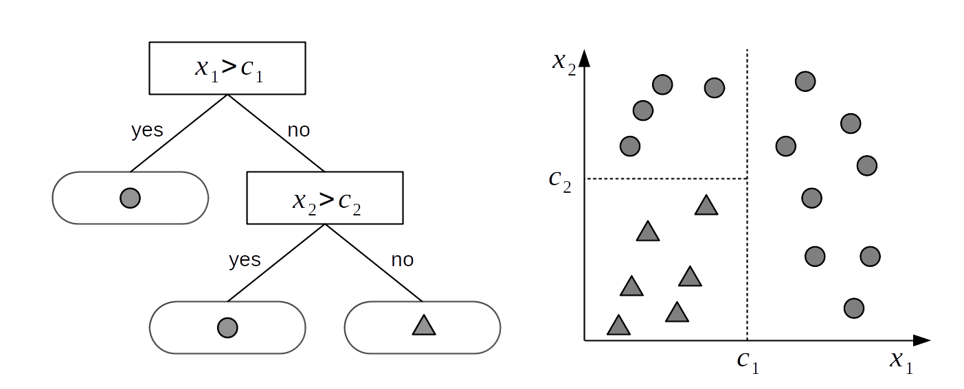
Fig. 7.1 A binary tree (left) and the corresponding partition space (right). The internal nodes of the tree are those having children. They have a link to a node below them. Internal nodes have splitting rules associated with them. Terminal nodes, or leaves, are those without children and they contain the values to return, in this example ⬤ or ▲. A decision tree generates a partition of the sample space into blocks delimited by axis-perpendicular splitting lines. This means that every split of the sample space will be aligned with one of the covariate axes.#
While Fig. 7.1 shows how to use a decision tree for a classification problem, where \(\mathcal{M}_j\) contains classes or label-values, we can also use trees for regression. In such cases instead of associating a terminal node with a class label, we can associate it with a real number like the mean of the data points inside a block. Fig. 7.2 shows such a case for a regression with only one covariate. On the left we see a binary tree similar to the one from Fig. 7.1, with the main difference that instead of returning a class value at each leaf node, the binary tree in Fig. 7.2 returns a real valued number. Compare the tree to the sinusoidal like data on the right, in particular noting how instead of a continuous function approximation the data been split into three blocks, and the average is approximating each one of those blocks.
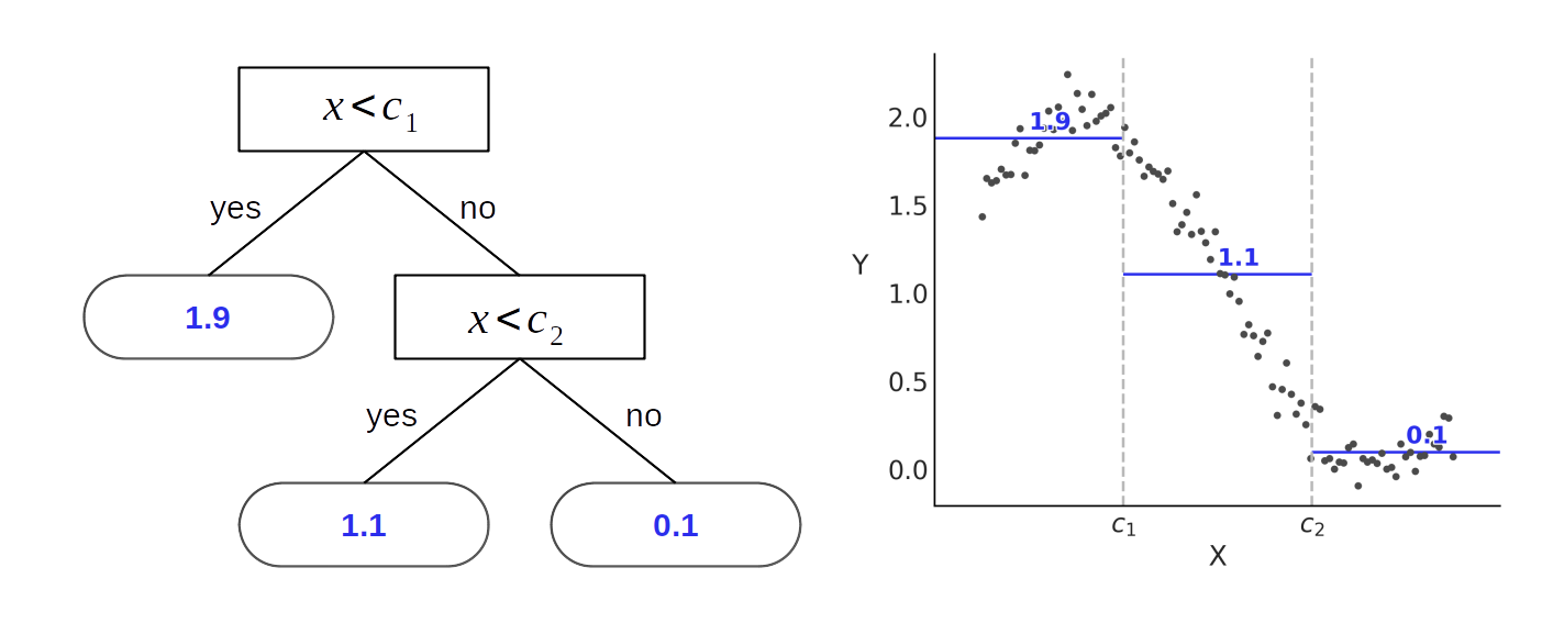
Fig. 7.2 A binary tree (left) and the corresponding partition space (right). The internal nodes of the tree are those having children (they have a link to a node below them), internal nodes have splitting rules associated with them. Terminal nodes (or leafs) are those without children and they contain the values to return (in this example 1.1, 1.9 and 0.1). We can see how a tree is a way to represent piecewise function, like the ones discussed in Chapter 5.#
Regression trees are not limited to returning the mean of the data points inside a block, there are alternatives. For example, it is possible to associate the leaf nodes with the median of the data points, or we can fit a linear regression to the data points of each block, or even more complex functions. Nevertheless, the mean is probably the most common choice for regression trees.
It is important to notice that the output of a regression tree is not a smooth function but a piecewise step-function. This does not mean regression trees are necessarily a bad choice to fit smooth functions. In principle we can approximate any continuous function with a step function and in practice this approximation could be good enough.
One appealing feature of decision trees is its interpretability, you can literally read the tree and follow the steps needed to solve a certain problem. And thus you can transparently understand what the method is doing, why it is performing the way it is, and why some classes may not be properly classified, or why some data is poorly approximated. Additionally it is also easy to explain the result to a non-technical audience with simple terms.
Unfortunately the flexibility of decision trees means that they could easily overfit as you can always find a complex enough tree that has one partition per data point. See Fig. 7.3 for an overly complex solution to a classification problem. This is also easy to see for yourself by grabbing a piece of paper, drawing a few data points, and then creating a partition that isolates each of them individually. While doing this exercise you may also notice that in fact there is more than one tree that can fit the data equally well.
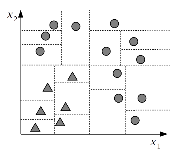
Fig. 7.3 An overly complex partition of the sample space. Each data point is assigned to a separate block. We say this is an overcomplex partition because we can explain and predict the data at the same level of accuracy using a much simpler partition like the one used in Fig. 7.1 The most simple partition is most likely to generalize than the more complex one, i.e. it is most likely to predict, and explain new data. [fig:decision_tree_overfitting]{#fig:decision_tree_overfitting label=”fig:decision_tree_overfitting”}.#
One interesting property of trees arises when we think about them in terms of main effects and interactions as we did for linear models (see Chapter 4). Notice that the term \(\mathbb{E}(Y \mid \boldsymbol{X})\) equals to the sum of all the leaf node parameters \(\mu_{ij}\), thus:
When a tree depends on a single variable (like Fig. 7.2) each such \(\mu_{ij}\) represents a main effect
When a tree depends on more than one variable (like Fig. 7.1) each such \(\mu_{ij}\) represents an interaction effect. Notice for example how returning a triangle requires the interaction of \(X_1\) and \(X_2\) as the condition of the child node (\(X_2 > c_2\)) is predicated on the condition of the parent node (\(X_1 > c_1\)).
As the size of the trees is variable we can use trees to model interaction effects of varying orders. As a tree gets deeper the chance for more variables to entry the tree increases and then also the potential to represent higher order interactions. Additionally, because we use an ensemble of trees we can build virtually any combination of main and interaction effects.
7.1.1. Ensembles of Decision Trees#
Considering that over-complex trees will likely not be very good at predicting new data, it is common to introduce devices to reduce the complexity of decision trees and get a fit that better adapts to the complexity of the data at hand. One such solution relies on fitting an ensemble of trees where each individual tree is regularized to be shallow. As a result each tree individually is only capable of explaining a small portion of the data. It is only by combining many such trees that we are able to provide a proper answer. This is data-science incarnation of the motto “for the union makes us strong”. This ensemble strategy is followed both by Bayesian methods like BARTs and non-Bayesian methods like random forests. In general ensemble models leads to lower generalization error while maintaining the ability to flexibly fit a given dataset.
Using ensembles also helps to alleviate the step-ness because the output is a combination of trees and while this is still a step function it is one with more steps and thus a somehow smoother approximation. This is true as long as we ensure that trees are diverse enough.
One downside of using ensembles of trees is that we lose the interpretability of a single decision tree. Now to obtain an answer we can not just follow a single tree but many, which generally obfuscates any simple interpretation. We have traded interpretability for flexibility and generalization.
7.2. The BART Model#
If we assume that the \(B_i\) functions in equation (5.3) are decision trees we can write:
Where each \(g_j\) is a tree of the form \(g(\boldsymbol{X}; \mathcal{T}_j, \mathcal{M}_j)\), where \(\mathcal{T}_j\) represents the structure of a binary tree, i.e. the set of internal nodes and their associated decision rules and a set of terminal nodes. While \(\mathcal{M}_j = \{\mu_{1,j}, \mu_{2,j}, \cdots, \mu_{b, j} \}\) represents the values at the \(b_j\) terminal nodes, \(\phi\) represents an arbitrary probability distribution that will be used as the likelihood in our model and \(\theta\) other parameters from \(\phi\) not modeled as a sum of trees.
For example we could set \(\phi\) as a Gaussian and then we will have:
Or we can do as we did for Generalized Linear Models in Chapter 3 and try other distributions. For example if \(\phi\) is a Poisson distribution we get
Or maybe \(\phi\) is the Student’s t-distribution, then:
As usual to fully specify a BART model we need to choose priors. We are already familiar to prior specifications for \(\sigma\) for the Gaussian likelihood or over \(\sigma\) and \(\nu\) for the Student’s t-distribution so now we will focus on those priors particular to the BART model.
7.3. Priors for BART#
The original BART paper [71], and most subsequent modifications and implementations rely on conjugate priors. The BART implementation in PyMC3 does not use conjugate priors and also deviates in other ways. Instead of discussing the differences we will focus on the PyMC3 implementation, which is the one we are going to use for the examples.
7.3.1. Prior Independence#
In order to simplify the specification of the prior we assume that the structure of the tree \(\mathcal{T}_j\) and the leaf values \(\mathcal{M}_j\) are independent. Additionally these priors are independent from the rest of the parameters, \(\theta\) in Equation (7.1). By assuming independence we are allowed to split the prior specification into parts. Otherwise we should devise a way to specify a single prior over the space of trees [2].
7.3.2. Prior for the Tree Structure \(\mathcal{T}_j\)#
The prior for the tree structure \(\mathcal{T}_j\) is specified by three aspects:
The probability that a node at depth \(d=(0, 1, 2, \dots)\) is non-terminal, given by \(\alpha^{d}\). \(\alpha\) it is recommended to be \(\in [0, 0.5)\) [72] [3]
The distribution over the splitting variable. That is which covariate is included in the tree (\(X_i\) in Fig. 7.1). Most commonly this is Uniform over the available covariates.
The distribution over the splitting rule. That is, once we choose a splitting variable which value we use to make a decision (\(c_i\) in Fig. 7.1). This is usually Uniform over the available values.
7.3.3. Prior for the Leaf Values \(\mu_{ij}\) and Number of Trees \(m\)#
By default PyMC3 does not set a prior value for the leaf values, instead at each iteration of the sampling algorithm it returns the mean of the residuals.
Regarding the number of trees in the ensemble \(m\). This is also generally predefined by the user. In practice it has been observed that good results are generally achieved by setting the values of \(m=200\) or even as low as \(m=10\). Additionally it has been observed that inference could be very robust to the exact value of \(m\). So a general rule of thumb is to try a few values of \(m\) and perform cross-validation to pick the most adequate value for a particular problem [4].
7.4. Fitting Bayesian Additive Regression Trees#
So far we have discussed how decision trees can be used to encode piecewise functions that we can use to model regression or classification problems. We have also discussed how we can specify priors for decision trees. We are now going to discuss how to efficiently sample trees in order to find the posterior distribution over trees for a given dataset. There are many strategies to do this and the details are too specific for this book. For that reason we are going to only describe the main elements.
To fit BART models we cannot use gradient-based samplers like Hamiltonian MonteCarlo because the space of trees is discrete and thus not gradient-friendly. For that reason researchers have developed MCMC and Sequential Monte Carlo (SMC) variations tailored to trees. The BART sampler implemented in PyMC3 works in a sequential and iterative fashion. Briefly, we start with a single tree and we fit it to the \(Y\) response variable, then the residual \(R\) is computed as \(R = Y - g_0(\boldsymbol{X}; \mathcal{T}_0, \mathcal{M}_0)\). The second tree is fitted to \(R\), not to \(Y\). We then update the residual \(R\) by considering the sum of the trees we have fitted so far, thus \(R - g_1(\boldsymbol{X}; \mathcal{T}_0, \mathcal{M}_0) + g_0(\boldsymbol{X}; \mathcal{T}_1, \mathcal{M}_1)\) and we keep doing this until we fit \(m\) trees.
This procedure will lead to a single sample of the posterior distribution, one with \(m\) trees. Notice that this first iteration can easily lead to suboptimal trees, the main reasons are: the first fitted trees will have a tendency to be more complex than necessary, trees can get stuck in local minimum and finally the fitting of later trees is affected by the previous trees. All these effects will tend to vanish as we keep sampling because the sampling method will revisit previously fitted trees several times and give them the opportunity to re-adapt to the updated residuals. In fact, a common observation when fitting BART models is that trees tend to be deeper during the first rounds and then they collapse into shallower trees.
In the literature, specific BART models are generally tailored to
specific samplers as they rely on conjugacy, thus a BART model with a
Gaussian likelihood is different than a one with a Poisson one. PyMC3
uses a sampler based on the Particle Gibbs sampler [73]
that is specifically tailored to work with trees. PyMC3 will
automatically assign this sampler to a pm.BART distribution and if
other random variables are present in the model, PyMC3 will assign other
samplers like NUTS to those variables.
7.5. BART Bikes#
Let us see how BART fits the bikes dataset which we previously studied in 5. The model will be:
Building a BART model in PyMC3 is very similar to building other kind of
models, one difference is that specifying the random variable pm.BART
needs to know both the independent and dependent variables. The main
reason is that the sampling method used to fit the BART models proposes
a new tree in terms of the residuals, as explained in the previous
section.
Having made all these clarifications the model in PyMC3 looks as follows:
with pm.Model() as bart_g:
    σ = pm.HalfNormal("σ", Y.std())
    μ = pm.BART("μ", X, Y, m=50)
    y = pm.Normal("y", μ, σ, observed=Y)
    idata_bart_g = pm.sample(2000, return_inferencedata=True)
Before showcasing the end result of fitted model we are going to explore
the intermediate steps a little bit. This will give us more intuition on
how BART works. Fig. 7.4 shows trees sampled
from the posterior computed from the model in Code Block
bart_model_gauss. On the top we have
three individual trees, out of the m=50 trees. The actual value
returned by the tree are the solid dots, with the lines being a visual
aid connecting them. The range of the data (the number of rented bikes
per hour) is approximately in the range 0-800 bikes rented per hour. So
even when the figures omit the data, we can see that the fit is rather
crude and these piecewise functions are mostly flat in the scale of the
data. This is expected from our discussion of the trees being weak
learners. Given that we used a Gaussian likelihood, negative count
values are allowed by the model.
On the bottom panel we have samples from the posterior, each one is a sum over \(m\) trees.
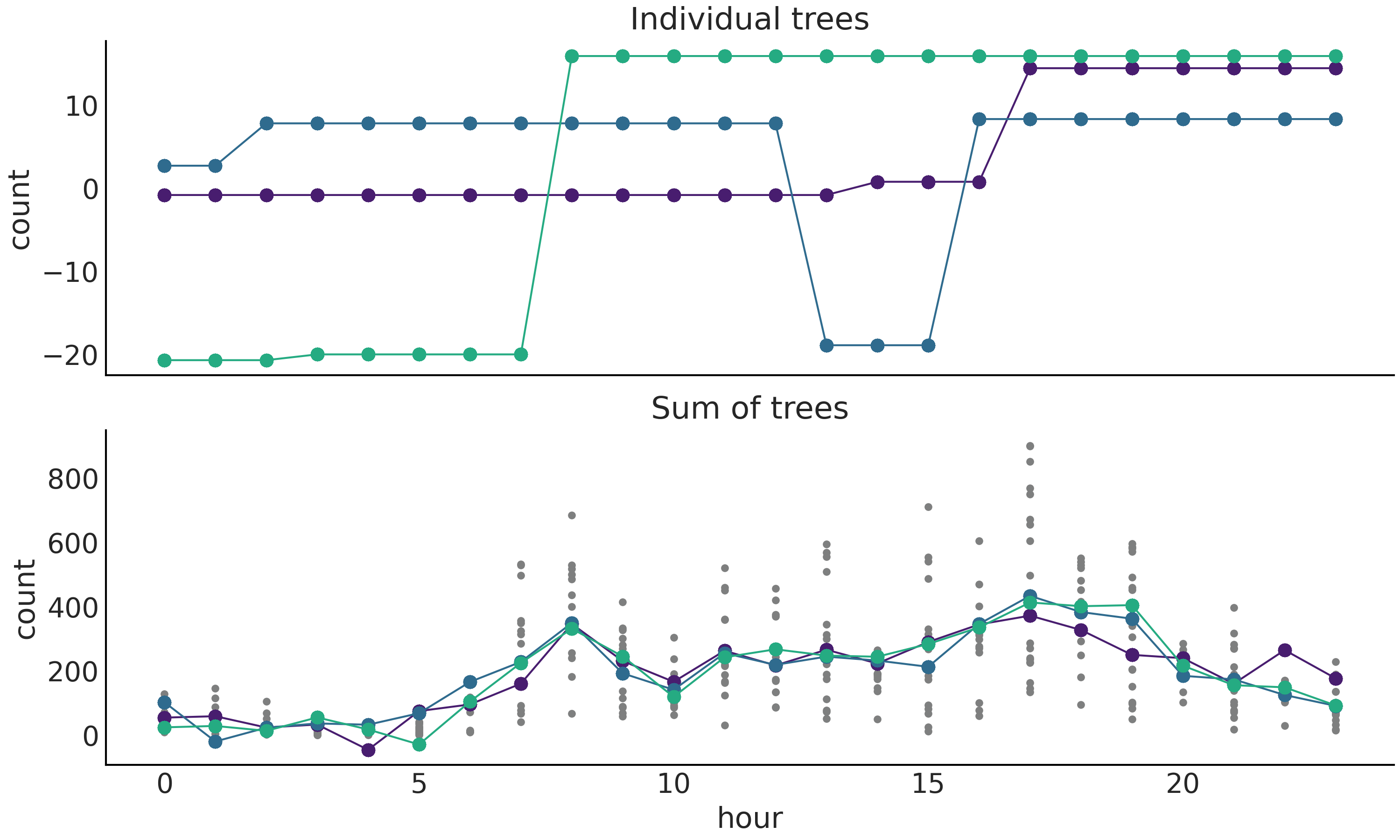
Fig. 7.4 Posterior tree realizations. Top panel, three individuals trees sampled from the posterior. Bottom panel, three posterior samples, each one is a sum over \(m\) trees. Actual BART sampled values are represented by circles while the dashed lines are a visual aid. Small dots (only in bottom panel) represent the observed number of rented bikes.#
Fig. 7.5 shows the result of fitting BART to the bike dataset (number of rented bikes vs hour of the day). The figure provides a similar fit compared to Fig. 5.9, created using splines. The more clear difference is the more jagged aspect of the BART’s fit compared to the one obtained using splines. This is not to say there are not other differences like the width of the HDI.
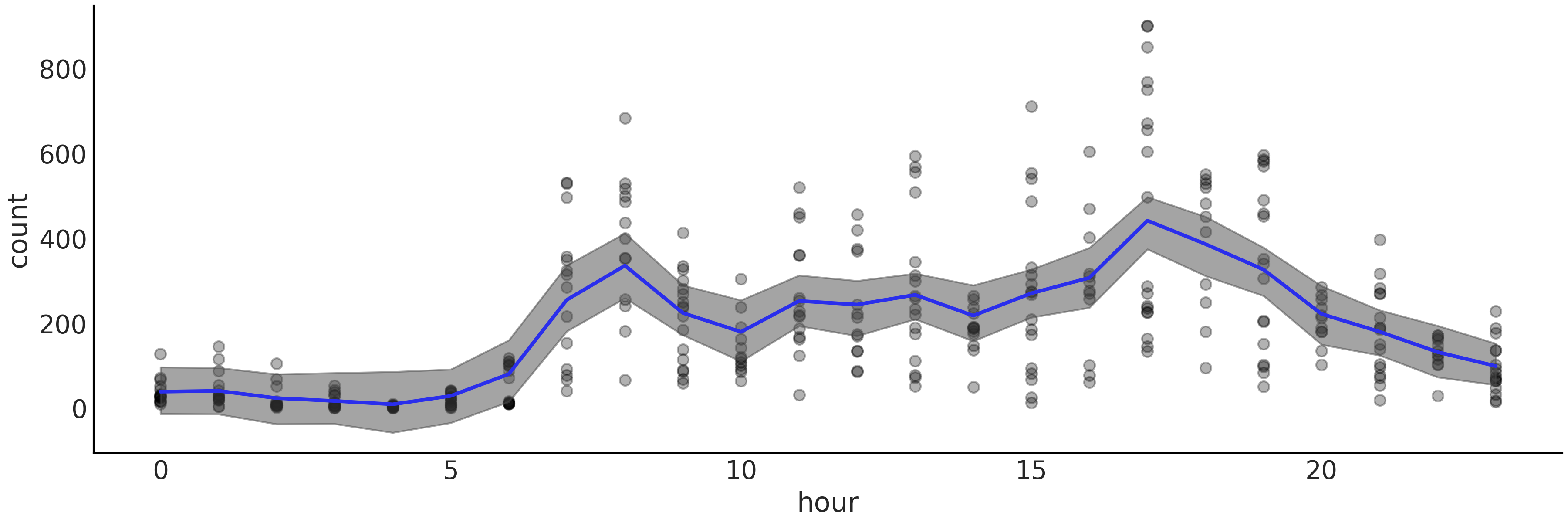
Fig. 7.5 Bikes data (black dots) fitted using BARTs (specifically bart_model).
The shaded curve represents the 94% HDI interval (of the mean) and the
blue curve represents the mean trend. Compare with
Fig. 5.9.#
The literature around BART tends to highlight its ability to, generally, provide competitive answers without tuning [5]. For example, compared with fitting splines we do not need to worry about manually setting the knots or choose a prior to regularize knots. Of course someone may argue that for some problems being able to adjust the knots could be beneficial for the problem at hand, and that is fine.
7.6. Generalized BART Models#
The PyMC3 implementation of BART attempts to make it easy to use different likelihoods [6] similar to how the Generalized Linear Model does as we saw in Chapter 3. Let us see how to use a Bernoulli likelihood with BART. For this example we are going to use a dataset of the Space Influenza disease, which affect mostly young and old people, but not middle-age folks. Fortunately, Space Influenza is not a serious concern as it is completely made up. In this dataset we have a record of people that got tested for Space Influenza and whether they are sick (1) or healthy (0) and also their age. Using the BART model with Gaussian likelihood from Code Block bart_model_gauss as reference we see that differences are small:
with pm.Model() as model:
    μ = pm.BART("μ", X, Y, m=50,
                inv_link="logistic")
    y = pm.Bernoulli("y", p=μ, observed=Y)
    trace = pm.sample(2000, return_inferencedata=True)
First we no longer need to define the \(\sigma\) parameter as the
Bernoulli distribution has a single parameter p. For the definition of
BART itself we have one new argument, inv_link, this is the inverse
link function, which we need to restrict the values of \(\mu\) to the
interval \([0, 1]\). For this purpose we instruct PyMC3 to use the
logistic function, as we did in Chapter 3 for logistic
regression).
Fig. 7.6 shows a comparison of the model in Code Block bart_model_bern with 4 values for \(m\), namely (2, 10, 20, 50) using LOO. And Fig. 7.7 shows the data plus the fitted function and HDI 94% bands. We can see that according to LOO \(m=10\) and \(m=20\) provides good fits. This is in qualitative agreement with a visual inspection, as \(m=2\) is a clear underfit (the value of the ELPD is low but the difference between the in-sample and out-of-sample ELPD is not that large) and \(m=50\) seems to be overfitting (the value of the ELPD is low and the difference between the in-sample and out-of-sample ELPD is large).
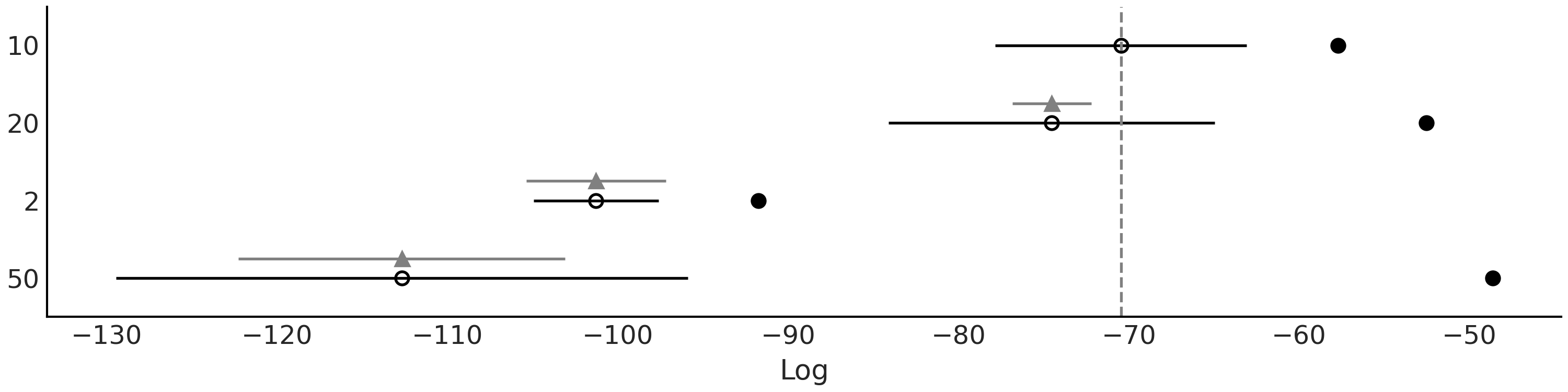
Fig. 7.6 LOO comparison of the model in Code Block bart_model_bern with \(m\) values (2, 10, 20, 50). According to LOO, \(m=10\) provides the best fit.#
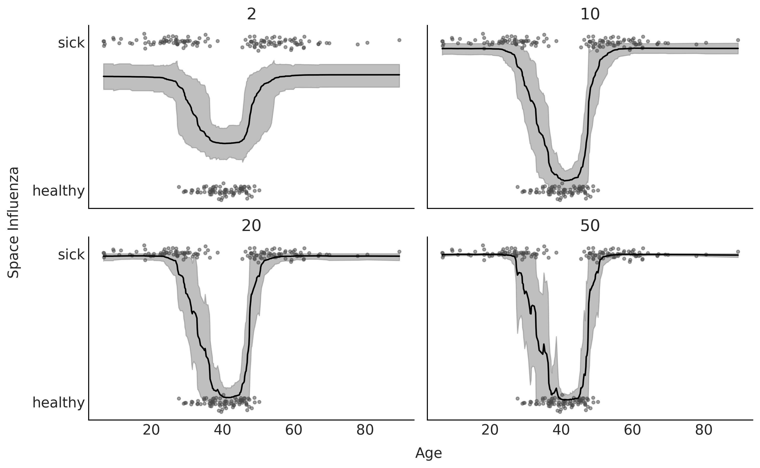
Fig. 7.7 BART fit to the Space Influenza dataset with 4 values for \(m\) (2, 10, 20, 50). In line with LOO, the model with \(m\) is underfitting and with the one with \(m=50\) is overfitting.#
So far we have discussed regressions with a single covariate, we do this for simplicity. However it is possible to fit datasets with more covariates. This is trivial from the implementation perspective in PyMC3, we just need to pass an \(X\) 2-d array containing more than 1 covariate. But it raises some interesting statistical questions, like how to easily interpret a BART model with many covariates or how to find out how much each covariate is contributing to the outcome. In the next sections we will show how this is done.
7.7. Interpretability of BARTs#
Individual decision trees are generally easy to interpret, but this is no longer true when we add a bunch of trees together. One may think that the reason is that by adding trees we get some weird unrecognizable or difficult to characterize object, but actually the sum of trees is just another tree. The difficulty to interpret this assembled tree is that for a complex problem the decision rules will be hard to grasp. This is like playing a song on piano, playing individual notes is fairly easy, but playing a combination of notes in a musical-pleasant way is both what makes for the richness of sound and complexity in individual interpretation.
We may still get some useful information by directly inspecting a sum of trees (see Section Variable Selection, but not as transparent or useful as with a simpler individual tree. Thus to help us interpret results from BART models we generally rely on model diagnostics tools [74, 75], e.g. tools also used for multivariate linear regression and other non-parametric methods. We will discuss two related tools below: Partial Dependence Plots (PDP) [76] and Individual Conditional Expectation (ICE) plots [77].
7.7.1. Partial Dependence Plots#
A very common method that appears in the BART literature is the so called Partial Dependence Plot (PDP) [76] (see Fig. 7.8). A PDP shows how the value of the predicted variable changes when we change a covariate while averaging over the marginal distribution of the rest of the covariates. That is, we compute and then plot:
where \(\tilde{Y}_{\boldsymbol{X}_i}\) is the value of the predicted variable as a function of \(\boldsymbol{X}_i\) while all the variables except \(i\) (\(\boldsymbol{X}_{-i}\)) have been marginalized. In general \(X_i\) will be a subset of 1 or 2 variables, the reason being that plotting in higher dimensions is generally difficult.
As shown in Equation (7.6) the expectation can be approximated numerically by averaging over the predicted values conditioned on the observed \(\boldsymbol{X}_{-i}\). Notice however, this implies that some of the combinations in \(\boldsymbol{X}_i, \boldsymbol{X}_{-ij}\) might not correspond to actual observed combinations. Moreover it might even be the case that some of the combinations are not possible to observe. This is similar to what we already discussed regarding counterfactuals plots introduced in Chapter 3. In fact partial dependence plots are one kind of counterfactual device.
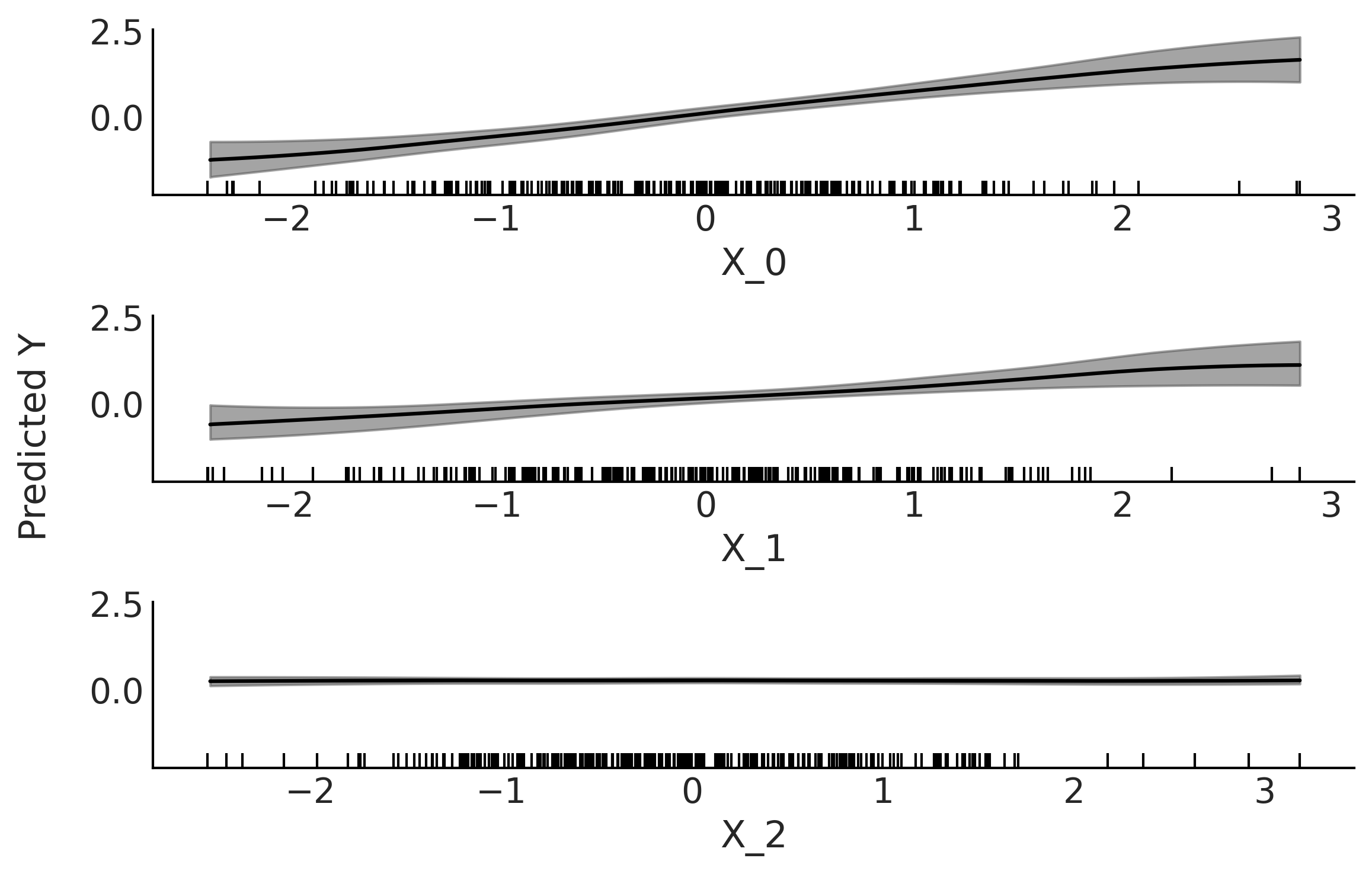
Fig. 7.8 Partial dependence plot. Partial contribution to \(Y\) from each variable
\(X_i\) while marginalizing the contributions from the rest of the
variables (\(X_{-i}\)). The gray bands represent the HDI 94%. Both the
mean and HDI bands has been smoothed (see plot_ppd function). The
rugplot, the black bars at the bottom of each subplot, shows the
observed values for each covariate.#
Fig. 7.8 shows a PDP after fitting a BART model to synthetic data: \(Y \sim \mathcal{N}(0, 1)\) \(X_{0} \sim \mathcal{N}(Y, 0.1)\) and \(X_{1} \sim \mathcal{N}(Y, 0.2)\) \(X_{2} \sim \mathcal{N}(0, 1)\). We can see that both \(X_{0}\) and \(X_{1}\) show a linear relation with \(Y\), as expected from the generation process of the synthetic data. We can also see that the effect of \(X_{0}\) on \(Y\) is stronger compared to \(X_{1}\), as the slope is steeper for \(X_{0}\). Because the data is sparser at the tails of the covariate (they are Gaussian distributed), these regions show higher uncertainty, which is desired. Finally, the contribution from \(X_{2}\) is virtually negligible along the entire range of the variable \(X_{2}\).
Let now go back to the bikes dataset. This time we will model the number of rented bikes (the predicted variable) with four covariates; the hour of the day, the temperature, the humidity and the wind speed. Fig. 7.9 shows the partial dependence plot after fitting the model. We can see that the partial dependence plot for the hour of the day looks pretty similar to Fig. 7.5, the one we obtained by fitting this variable in the absence of others. As the temperature increases the number of rented bikes increase too, but at some point this trend levels off. Using our external domain knowledge we could conjecture this pattern is reasonable as people are not too motivated to bike when the temperature is too low, but riding a bike at temperatures that are too high is also a little bit less appealing. The humidity shows a flat trend followed by a negative contribution, again we can imagine why a higher humidity reduces people’s motivation to ride a bike. The wind speed shows an even flatter contribution, but still we see an effect, as it seems that less people are prone to rent a bike under windier conditions.
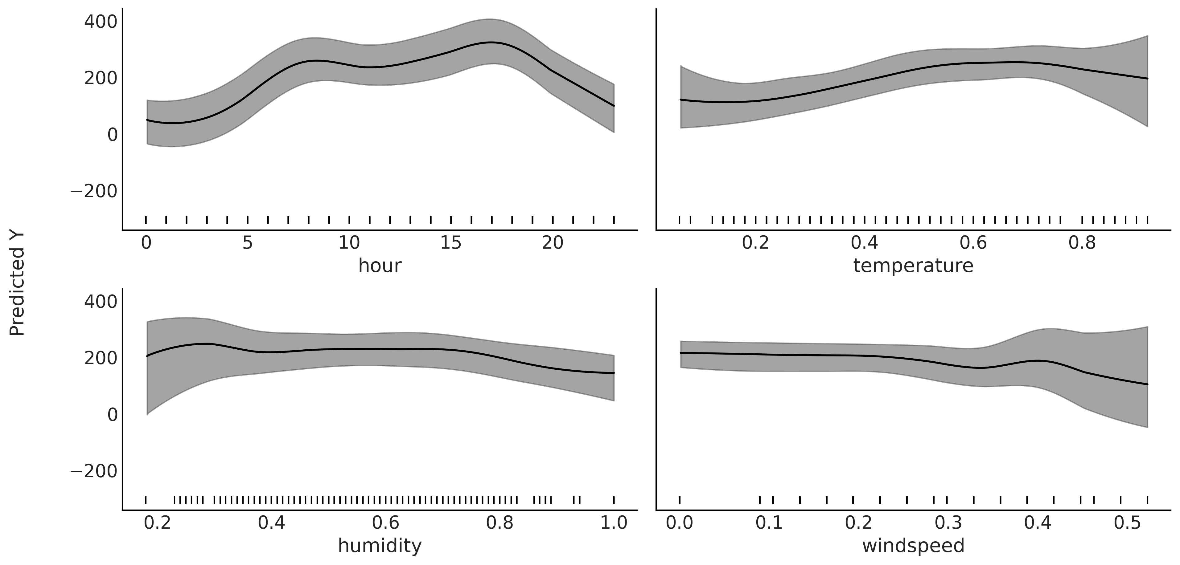
Fig. 7.9 Partial dependence plot. Partial contribution to the number of rented
bikes from the variables, hour, temperature, humidity and windspeed
while marginalizing the contributions from the rest of the variables
(\(X_{-i}\)). The gray bands represent the HDI 94%. Both the mean and HDI
bands have been smoothed (see plot_ppd function). The rugplot, the
black bars at the bottom of each subplot, shows the observed values for
each covariate.#
One assumption when computing partial dependence plots is that variables \(X_i\) and \(X_{-i}\) are uncorrelated, and thus we perform the average across the marginals. In most real problem this is hardly the case, and then partial dependence plot can hide relationships in the data. Nevertheless if the dependence between the subset of chosen variables is not too strong then partial dependence plots can be useful summaries [76].
Computational cost of partial dependence
Computing partial dependence plots is computationally demanding. Because at each point that we want to evaluate the variable \(X_i\) we need to compute \(n\) predictions (with \(n\) being the sample size). And for BART to obtain a prediction \(\tilde Y\) we need to first sum over \(m\) trees to get a point-estimate of \(Y\) and then we also average over the entire posterior distribution of sum of trees to get credible interval. This ends up requiring quite a bit of computation! If needed, one way to reduce computations is to evaluate \(X_i\) at \(p\) points with \(p << n\). We could choose \(p\) equally spaced points or maybe at some quantiles. Alternative we can achieve a dramatic speed-up if instead of marginalize over \(\boldsymbol{X}_{-ij}\) we fix them at their mean value. Of course this means we will be losing information and it may happen that the mean value is not actually very representative of the underlying distribution. Another option, specially useful for large datasets, is to subsample \(\boldsymbol{X}_{-ij}\).
7.7.2. Individual Conditional Expectation#
Individual Conditional Expectation (ICE) plots are closely related to PDPs. The difference is that instead of plotting the target covariates’ average partial effect on the predicted response, we plot the \(n\) estimated conditional expectation curves. That is, each curve in an ICE plot reflects the partial predicted response as a function of covariate \(\boldsymbol{X}_{i}\) for a fixed value of \(\boldsymbol{X}_{-ij}\). See Fig. 7.10 for an example. If we average all the gray curves at each \(\boldsymbol{X}_{ij}\) value we get the blue curve, which is the same curve that we should have obtained if we have computed the mean partial dependence in Fig. 7.9.
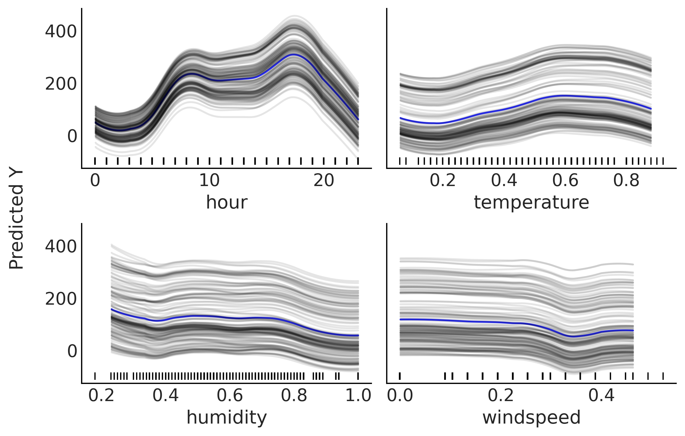
Fig. 7.10 Individual conditional expectation plot. Partial contribution to the
number of rented bikes from the variables; hour, temperature, humidity
and wind speed while fixing the rest (\(X_{-i}\)) at one observed value.
The blue curve corresponds to the average of the gray curves. All curves
have been smoothed (see plot_ice function). The rugplot, the black
bars at the bottom of each subplot, shows the observed values for each
covariate.#
Individual conditional expectation plots are best suited to problems where variable have strong interactions, when this is not the case partial dependence plots and individual conditional expectations plots convey the same information. Fig. 7.11 shows an example where the partial dependence plots hides a relationship in the data, but an individual conditional expectation plot is able to show it better. The plot was generated by fitting a BART model to the synthetic data: \(Y = 0.2X_0 - 5X_1 + 10X_1 \unicode{x1D7D9}_{X_2 \geq 0} + \epsilon\) where \(X \sim \mathcal{U}(-1, 1)\) \(\epsilon \sim \mathcal{N}(0, 0.5)\). Notice how the value of \(X_1\) depends on the value of \(X_2\).
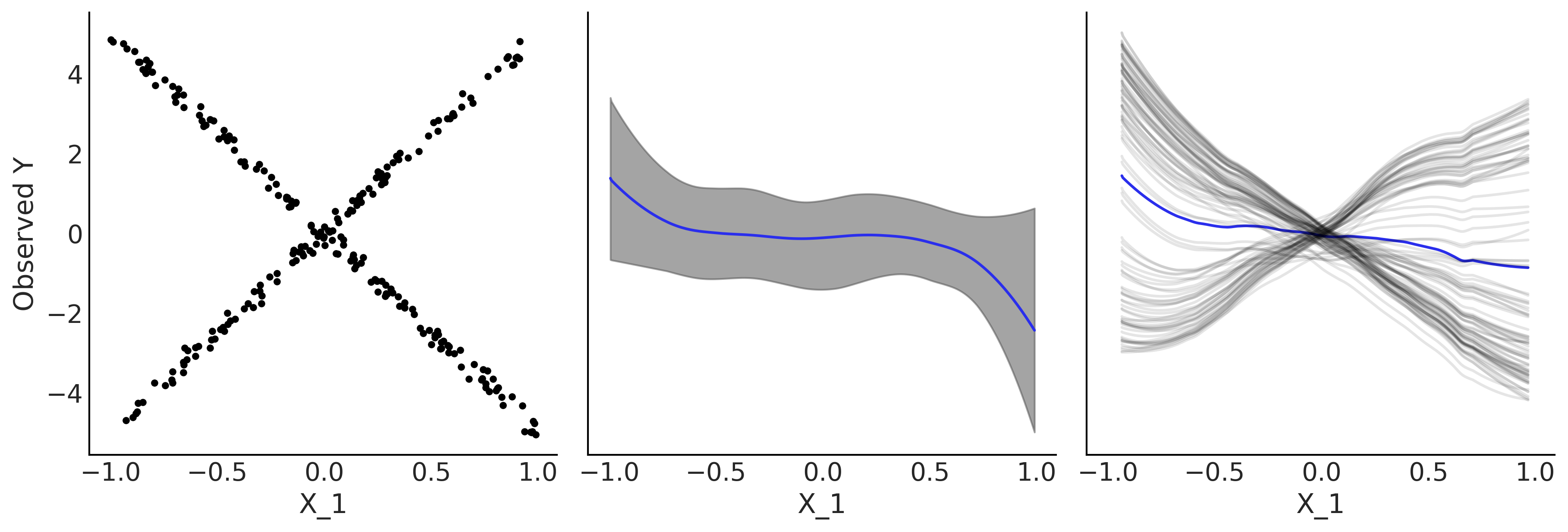
Fig. 7.11 Partial dependence plot vs individual conditional expectation plot. First panel, scatter plot between \(X_1\) and \(Y\), middle panel partial dependence plot, last panel individual conditional expectation plot.#
In the first panel of Fig. 7.11 we plot \(X_1\) versus \(Y\). Given that there is an interaction effect that the value of \(Y\) can linearly increase or decrease with \(X_1\) conditional on the values of the \(X_2\) variable, the plot displays the X-shaped pattern. The middle panel shows a partial dependence plot, we can see that according to this plot the relationship is flat, which is true on average but hides the interaction effect. On the contrary the last panel, an individual conditional expectation plot helps to uncover this relationship. The reason is that each gray curve represents one value of \(X_{0,2}\) [7]. The blue curve is the average of the gray curves and while is not exactly the same as the partial dependence mean curve it shows the same information [8].
7.8. Variable Selection#
When fitting regressions with more than one predictor it is often of interest to learn which predictors are most important. Under some scenarios we may be genuinely interested in better understanding how different variables contribute to generate a particular output. For example, which dietary and environmental factors contribute to colon cancer. In other instances collecting a dataset with many covariates may be unaffordable financially, take too long, or be too complicated logistically. For example, in medical research measuring a lot of variable from a human can be expensive, time consuming or annoying (or even risky for the patient). Hence we can afford to measure a lot of variables in a pilot study, but to scale such analysis to a larger population we may need to reduce the number of variables. In such cases we want to keep the smallest (cheapest, more convenient to obtain) set of variables that still provide a reasonable high predictive power. BART models offer a very simple, and almost computational-free, heuristic to estimate variable importance. It keeps track of how many times a covariate is used as a splitting variable. For example, in Fig. 7.1 we have two splitting nodes one includes variable \(X_1\) and the other \(X_2\), so based on this tree both variables are equally important. If instead we would have count \(X_1\) twice and \(X_2\) once. We would say that \(X_1\) is twice as important as \(X_2\). For BART models the variable importance is computed by averaging over the \(m\) trees and over all posterior samples. Note that using this simple heuristic we can only report the importance in relative fashion, as there is not simple way to say this variable is important and this another one not important.
To further ease interpretation we can report the values normalized so each value is in the interval \([0, 1]\) and the total importance is 1. It is tempting to interpret these numbers as posterior probabilities, but we should keep in mind that this is just a simple heuristic without a very strong theoretical support, or to put it in more nuanced terms, it is not yet well understood [78].
Fig. 7.12 shows the relative variable importance for 3 different datasets from known generative processes.
\(Y \sim \mathcal{N}(0, 1)\) \(X_{0} \sim \mathcal{N}(Y, 0.1)\) and \(X_{1} \sim \mathcal{N}(Y, 0.2)\) \(\boldsymbol{X}_{2:9} \sim \mathcal{N}(0, 1)\). Only the first 2 independent variables are related to the predictor, and the first is more related than the second.
\(Y = 10 \sin(\pi X_0 X_1 ) + 20(X_2 - 0.5)^2 + 10X_3 + 5X_4 + \epsilon\) Where \(\epsilon \sim \mathcal{N}(0, 1)\) and \(\boldsymbol{X}_{0:9} \sim \mathcal{U}(0, 1)\) This is usually called the Friedman’s five dimensional test function [76]. Notice that while the first five random variables are related to \(Y\) (to different extend) the last 5 are not.
\(\boldsymbol{X}_{0:9} \sim \mathcal{N}(0, 1)\) and \(Y \sim \mathcal{N}(0, 1)\). All variables are unrelated to the response variable.
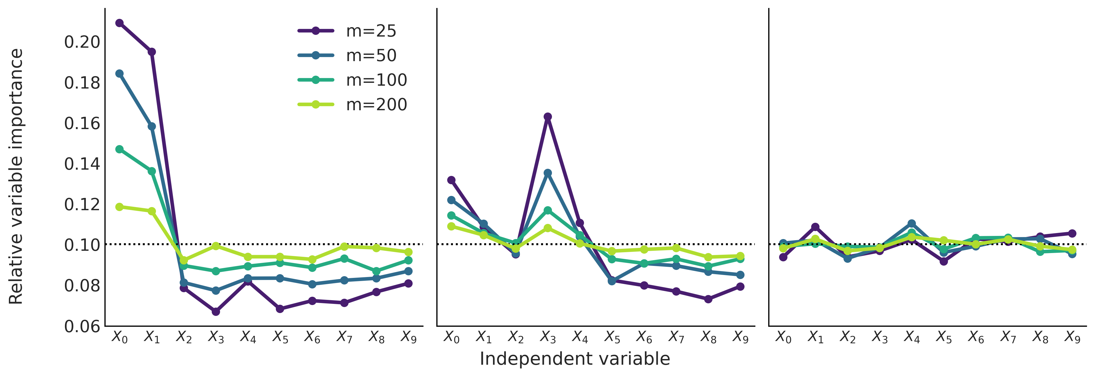
Fig. 7.12 Relative variable importance. Left panel, the first 2 input variables contribute to the predictor variable and the rest are noise. Middle panel, the first 5 variable are related to the output variable. Finally on the right panel the 10 input variables are completely unrelated to the predictor variable. The black dashed line represents the value of the variable importance if all variables were equally important.#
One thing we can see from Fig. 7.12 is the effect of increasing the number of trees \(m\). In general, as we increase \(m\), the distribution of the relative importance tends to become flatter. This is a well known observation with an intuitive explanation. As we increase the value of \(m\) we demand less predictive power from each tree, this implies that less relevant features have a higher chance to be part of a given tree. On the contrary, if we decrease the value of \(m\) we demand more from each single tree and this induces a more stringent competition between variables to be part of the trees, as a consequence only the really important variables will be included in the final trees.
Plots like Fig. 7.12 can be used to help separate the more important variables from the less important ones [71, 79]. This can be done by looking at what happens when we move from low values of \(m\) to higher ones. If the relative importance decreases the variable is more important and if the variable importance increases then the variable is less important. For example, in the first panel it is clear that for different values of \(m\) the first two variables are much more important than the rest. And something similar can be concluded from the second panel for the first 5 variables. On the last panel all variables are equally (un)important.
This way to assess variable importance can be useful, but also tricky. Under some circumstances it can help to have confidence intervals for the variable importance and not just point estimates. We can do this by running BART many times, with the same parameters and data. Nevertheless, the lack of a clear threshold separating the important from the unimportant variables can be seen as problematic. Some alternative methods have been proposed [79, 80]. One of such methods can be summarized as follow:
Fit a model many times (around 50) using a small value of \(m\), like 25 [9]. Record the root mean squared error.
Eliminate the least informative variable across all 50 runs.
Repeat 1 and 2, each time with one less variable in the model. Stop once you reach a given number of covariates in the model (not necessarily 1).
Finally, select the model with the lowest average root mean square error.
According to Carlson [79] this procedure seems to almost always return the same result as just creating a figure like Fig. 7.12. Nevertheless one can argue that is more automatic (with all the pros and cons of automatic decisions). Also nothing prevents us for doing the automatic procedure and then using the plot as a visual check.
Let us move to the rent bike example with the four covariates: hour, temperature, humidity and windspeed. From Fig. 7.13 we can see that hour and temperature are more relevant to predict the number of rented bikes than humidity or windspeed. We can also see that the order of the variable importance qualitatively agrees with the results from partial dependence plots (Figure Fig. 7.9) and individual conditional expectation plots (Figure Fig. 7.10).
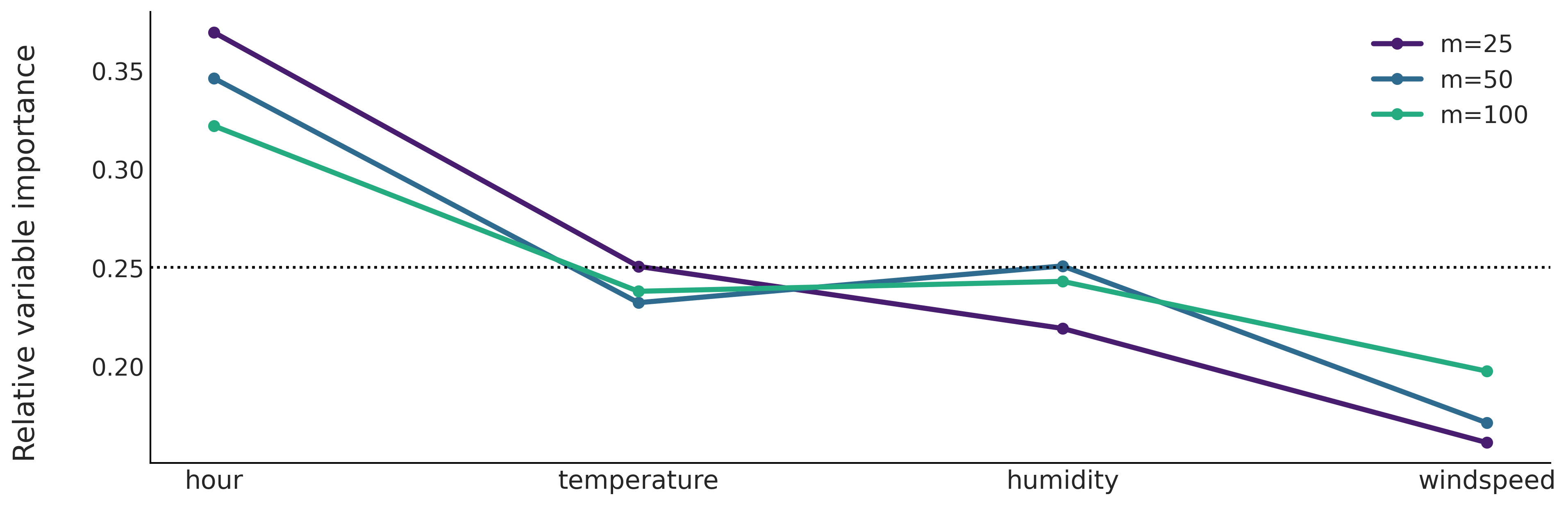
Fig. 7.13 Relative variable importance from fitted BARTs with different number of trees. Hour is the most important covariate followed by the temperature. The humidity and windspeed appear as less relevant covariates.#
7.9. Priors for BART in PyMC3#
Compared to other models in this book, BARTs are the most blackboxsy. We are not able to set whatever priors we want to generate a BART model. We instead control predefined priors through a few parameters. PyMC3 allows to control priors for BARTS with 3 arguments:
The number of trees \(m\)
The depth of the trees \(\alpha\)
The distribution over the split variables.
We saw the effect of changing the number of trees, which has been shown to provide robust predictions for values in the interval 50-200. Also there are many examples showing that using cross-validation to determine this number can be beneficial. We also saw that by scanning \(m\) for relative low values like in the range 25-100 we can evaluate the variable importance. We did not bother to change the default value of \(\alpha=0.25\) as this change seems to have even less impact, although research is still needed to better understand this prior [72]. As with \(m\) cross-validation can also be used to tune it for better efficiency. Finally PyMC3 provides the option to pass a vector of weights so different variables have different prior probabilities of being selected, this can be useful when the user has evidence that some variables may be more important than others, otherwise it is better to just keep it Uniform. More sophisticated Dirichlet-based priors have been proposed [10] to achieve this goal and to allow for better inference when inducing sparsity is desired. This is useful in cases where we have a lot of covariates, but only a few are likely to contribute and we do not know beforehand which ones are the most relevant. This is a common case, for example, in genetic research where measuring the activity of hundreds or more genes is relatively easy but how they are related is not only not known but the goal of the research.
Most BART implementations have been done in the context of individual packages, in some cases even oriented to particular sub-disciplines. They are typically not part of probabilistic programming languages, and thus users are not expected to tweak BART models too much. So even when it could be possible to put a prior directly over the number of trees, this is not generally how it is done in practice. Instead the BART literature praises the good performance of BART with default parameters while recognizing that cross-validation can be used to get some extra juice. The BART implementation in PyMC3 slightly departure from this tradition, and allows for some extra flexibility, but is still very limited, compared to how we use other like Gaussian or Poisson distribution, or even non-parametric distributions like Gaussian Processes. We envision that this may change in the not so far future, partly because of our interest in exploring more flexible implementations of BART that could allow users to build flexible and problem-tailored models as is usually the case with probabilistic programming languages.
7.10. Exercises#
7E1. Explain each of the following
How is BART different from linear regression and splines.
When you may want to use linear regression over BART?
When you may want to use splines over BART?
7E2. Draw at least two more trees that could be used to explain the data in Fig. 7.1.
7E3. Draw a tree with one more internal node than the one in Fig. 7.1 that explains the data equally well.
7E4. Draw a decision tree of what you decide to wear each morning. Label the leaf nodes and the root nodes.
7E5. What are the priors required for BART? Explain what is the role of priors for BART models and how is this similar and how is this different from the role of priors in the models we have discussed in previous chapters.
7E6. In your own words explain why it can be the case that multiple small trees can fit patterns better than one single large tree. What is the difference in the two approaches? What are the tradeoffs?
7E7. Below we provide some data. To each data fit a BART model with m=50. Plot the fit, including the data. Describe the fit.
x = np.linspace(-1, 1., 200)andy = np.random.normal(2*x, 0.25)x = np.linspace(-1, 1., 200)andy = np.random.normal(x**2, 0.25)pick a function you like
compare the results with the exercise 5E4. from Chapter 5
7E8. Compute the PDPs For the dataset used to generate Fig. 7.12. Compare the information you get from the variable importance measure and the PDPs.
7M9. For the rental bike example we use a Gaussian as likelihood, this can be seen as a reasonable approximation when the number of counts is large, but still brings some problems, like predicting negative number of rented bikes (for example, at night when the observed number of rented bikes is close to zero). To fix this issue and improve our models we can try with other likelihoods:
use a Poisson likelihood (hint you will need to use an inverse link function, check
pm.Bartdocstring). How the fit differs from the example in the book. Is this a better fit? In what sense?use a NegativeBinomial likelihood, how the fit differs from the previous two? Could you explain the result.
how this result is different from the one in Chapter 5? Could you explain the difference?
7M10. Use BART to redo the first penguin classification
examples we performed in Section Classifying Penguins (i.e. use
“bill_length_mm” as covariate and the species “Adelie” and “Chistrap” as
the response). Try different values of m like, 4, 10, 20 and 50 and
pick a suitable value as we did in the book. Visually compare the
results with the fit in
Fig. 3.19. Which model do
you think performs the best?
7M11. Use BART to redo the penguin classification we
performed in Section Classifying Penguins. Set
m=50 and use the covariates “bill_length_mm”, “bill_depth_mm”,
“flipper_length_mm” and “body_mass_g”.
Use Partial Dependence Plots and Individual Conditional Expectation. To find out how the different covariates contribute the probability of identifying “Adelie”, and “Chinstrap” species.
Refit the model but this time using only 3 covariates “bill_depth_m”, “flipper_length_mm”, and “body_mass_g”. How results differ from using the four covariates? Justify.
7M12. Use BART to redo the penguin classification we performed in Section Classifying Penguins. Build a model with the covariates “bill_length_mm”, “bill_depth_mm”, “flipper_length_mm”, and “body_mass_g” and assess their relative variable importance. Compare the results with the PDPs from the previous exercise.